GFX
-
Posts
24 -
Joined
-
Last visited
GFX's Achievements
")


-
Thank you!!, there was a debate by the publisher since they didn't find the original cover too appealing so they asked me if I wanted to give it a shot :), and I thought about making it as a fairy tale book with subtle bright colors. I hope Ken and Roberta get to see it.
-
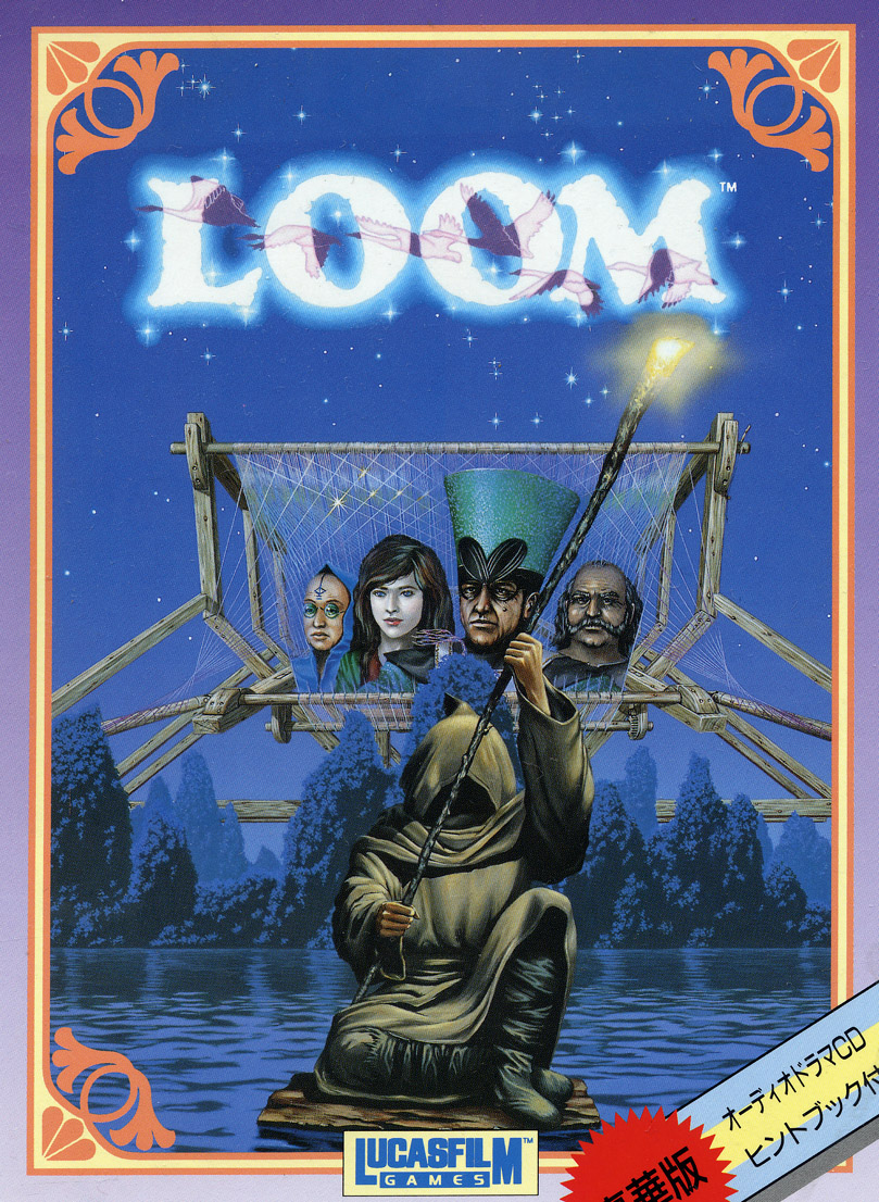
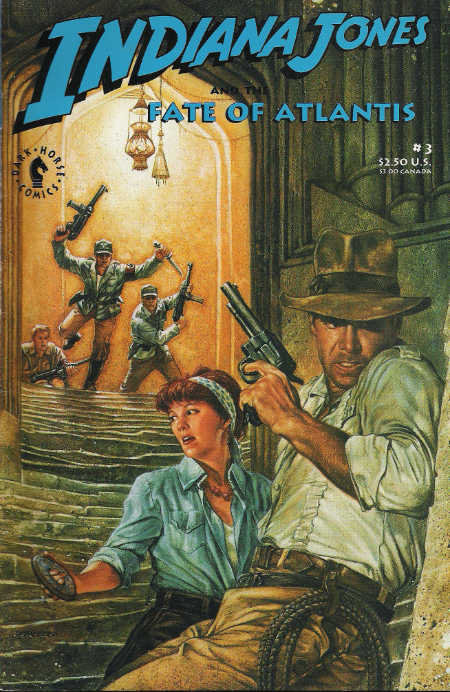
Thank you for the suggestion I will be doing that :), I kind of forgot this is mostly a forum and had this topic as an only posters pin. By the way, while I was looking at some cover art I found an artist which has a couple of pieces you might find useful as a source for your AI training (I actually don't know enough about how that works), so here is the link for one of his pieces: https://www.artstation.com/artwork/48vkB4 I also found this Loom cover, I can't remember if it was mentioned before but I don't remember seeing it at all, I think it's an FM town version. And I also found about a Fate of Atlantis comic book mini-series that was released back in 1992 with great cover art (not sure if those covers are made by the same artist as the game's cover), I don't know if you guys knew about those 😛

-
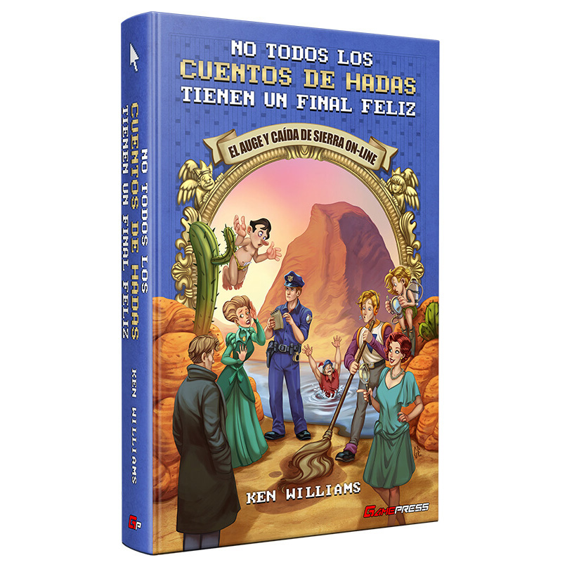
I painted the cover for the Spanish version of this book , but I still haven't read it as it's still at the print.
-
Don't worry Jan, a few replies won't damage the thread, and I promise I won't post my own covers here again so you don't feel I'm hijacking it.
-
Hi, this is a tough one, I made these with the borders, logos and titles so they clearly relate to the games since the art was heavily cropped for the covers and in some cases it would be hard to tell what games they are from, I also really feel that without those elements I'm bordering on pirating the art since I think those paintings where not specifically created for the games. But I would like to know how the rest of you guys think about this. On a side note, I just added another for one of the cover variations of Shadow of the Comet, since I had to paint most of the top I made a version without the title.
-
I do but since these artists have done tons of art for D&D and fantasy in general, without the titles they tend to look just like any other fantasy art so I kept the titles and logos to make it less like ripping those artists works and more like relating these to the games (which had heavily cropped or edited versions of the art)... Not sure if I made sense haha.
-
Haha thank you, I'm glad people liked those I think I did see something from Ultima Underworld, I remember seeing the original sketches, I kind of skipped it since I never played any of the Ultima games 😛 (not that I didn't want to play them haha). I'm making other covers for Prisoner of Ice, Shadow of the Comet, Waxworks and Amazons (these last two have been somewhat of a pain but hope it will be worth it :P). I also uploaded another for Veil of Darkness (the Japanese cover that was far better looking).
-
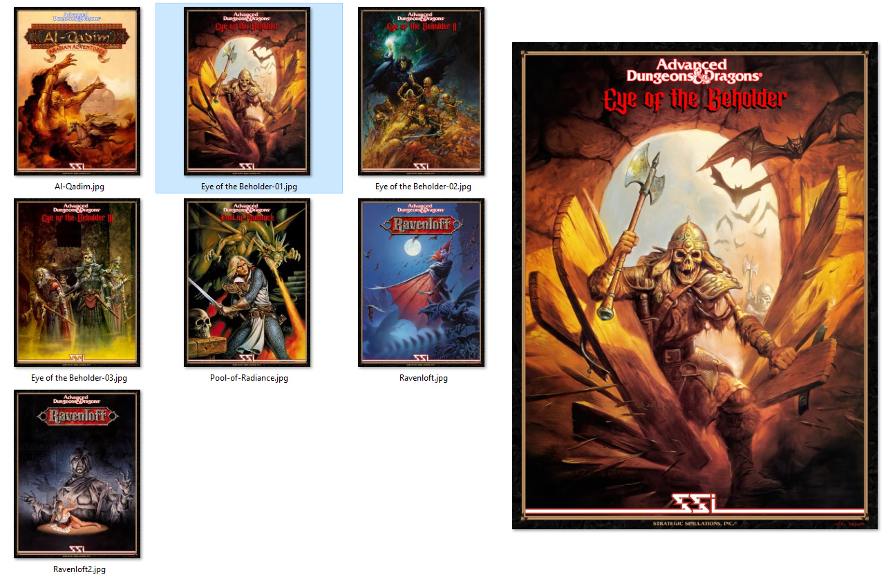
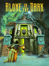
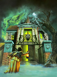
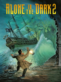
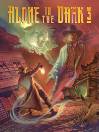
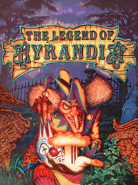
I have tried my hand at making a few for myself though they are not great since I rely on whatever I find over the internet which is not that good, so far I made the three Alone in the Dark and Kyrandia 3 but they are far from perfect (though they look great on print ;P). I also recently made a small amount of posters from some of the old SSI and D&D games I found the art of at a really nice quality so I made them for the Eye of the Beholder 1-3 games, Al-Qadim, Pool of Radiance and 2 for Ravenloft and I really like how they came out. I mostly wanted to display the original art and not the cropped versions used on some of the covers since I loved the art but those covers were kind of ugly, but I made a frame to simulate the feel of the original box a bit with the titles (some with a different font) and I added the much needed artist credits. You can find them here if you are interested in those: https://drive.google.com/drive/folders/1Sq-jQPewL6O9f9q2IeccjkpPuTulB4Px?usp=sharing This is how they look if you don't want to browse the link.
-
That is really cool Jan, that is one of my favorite images so it's great to see it in much better quality and the contrast between the blue and orange that wasn't in the previous version, so cool.
-
I wouldn't add brushstrokes or textures if they aren't present in the original art. The paper texture is way too strong and noticeable and is removing a lot of the original textures anyway like the splashes on the walls (you can easily see it in the office), the whole office building lost it's grimy details and you can't even see the oil splashes in the pavement. It also de-saturates the colors quite a bit. I wouldn't add a texture but If you really want it I would suggest to make it barely seen like an 8% since it shouldn't be as prominent or you will lose actual details.
-
This is great though I'm not fond of the brush strokes at all and the paper textures seem to be a bit too prominent and more watercolor paper than proper marker paper which is very smooth. The thing with the link of Peter Chan's backgrounds for Dott is it shows a lot of texture because the exposure in the scans are way blown out, or it could be that over the years they have faded quite a bit since marker paintings are not good for storing and even less for displaying as the colors will fade really fast, but originally those should have looked much more strong and fairly even looking and the paper texture wouldn't be as noticeable or at all specially if they use layout paper (or paper best suitable for markers which is very smooth). You might add a little bit of paper texture but that brush stroke just looks terrible to be honest, it reminds me of that cheap gimmick used to turn photos into "paintings" that adds brush strokes everywhere even though real paints don't work or look like that. If you see Steve Purcell's work you might see there are no noticeable brushstrokes, that is because he uses either acrylic, gouache and/or watercolor paints and neither of those leave noticeable brush marks on the paper, you might see some here and there depending on how dry the brush was while painting but never consistently all over the piece.
-
 GFX changed their profile photo
 -
That is really sad, man I was hoping it would be hanging somewhere at Disney/Lucasarts so people working there could be able to take pictures of it. Steve could have some photos of it before selling it so there is some hope 😛.
-
It could be cool to have a raw or unedited version for studying purposes, the details in the brush strokes are really cool to see . Paintings even on paper don't deteriorate too much if they are handled mildly responsibly, that means not trowing them to gather dust and humidity in an open space. The more delicate pieces are the ones made with markers though, if they are not covered from light sources (specially the sun) the colors fade away really fast. Watercolors and acrylic paints can be displayed without problems other than having the paper yellowing (direct sun light without UV filters can yellow the paper, also depends on the paper quality too), gouaches can be displayed too but a drop of water can do a bit of damage if it's not sealed or covered. Oils don't have much of a problem, usually the varnish is the one that gets really yellow and dark and it can be removed and replaced, but I think modern varnishes have less yellowing problems. *On a side note, I was looking for a better version of the Edison's portrait but couldn't find one, I only found a photo posted by Purcell a few years ago, I'm guessing this one was never made public, right? So I took the photo and cleaned it up the best I could and turned out to have really nice colors and details I didn't know it had, it's a shame it looks a bit blurry though, we might need to send a ninja to take photos wherever the original painting is haha!.
-
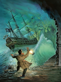
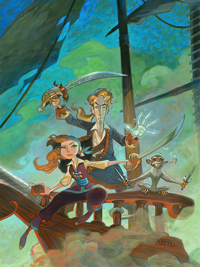
The colors on the AITD 3 image was a version used on the Spanish magazine "ok PC", I was more familiar with that one since I had the Magazine back then and those colors stuck on my mind. I sent you the raw file I found of it which was the base I used to make it. For Kyrandia 3 and Tales of MI it would be great if you have a proper source, I had to paint a lot on those and even though I tried to keep it as close to the original art it might have still ended up being a fanart of sorts. I also didn't paint on a few parts like the background which had a texture to it I couldn't remove or refine or the trees in the k3 one which still bother me (though I'm kind of proud for the bottom part which I had to fill almost completely ). I know they are not great but at least it's better than nothing .
-
Cool!, since you posted these a few years ago I always wanted a poster of the Kyrandia book 3 art and the Purcell version of Tales of MI but it never happened, so a few months ago I tried my best to make them myself using multiple images from the internet, I upscaled those and patched the best parts together and ended up painting quite a bit. I tried to keep them as close to the originals though they are not perfect. I also made the same for Alone in the Dark. Here they are if you guys want to check them out. (hope you guys like these). Tales of MI File Kyrandia 3 File Alone in the Dark (with Title) Alone in the Dark (clean) Alone in the Dark 2 (with Title) Alone in the Dark 2 (clean) Alone in the Dark 3 (with Title) Alone in the Dark 3 (clean)