


DM81
-
Posts
19 -
Joined
-
Last visited
Content Type
Profiles
Forums
Events
Posts posted by DM81
-
-
I've just finished the game.
It's GREAT.
And I love the ending, it made me cry.-
 2
2
-
 1
1
-
-
11 minutes ago, Romão said:
That looks and specially "feels" fantastic. From what we've seen thus far, this really feels like an amalgamation of a lot of previous styles in the MI games. Premature as it might be at this point, this might be my favorite look of a Monkey Island game
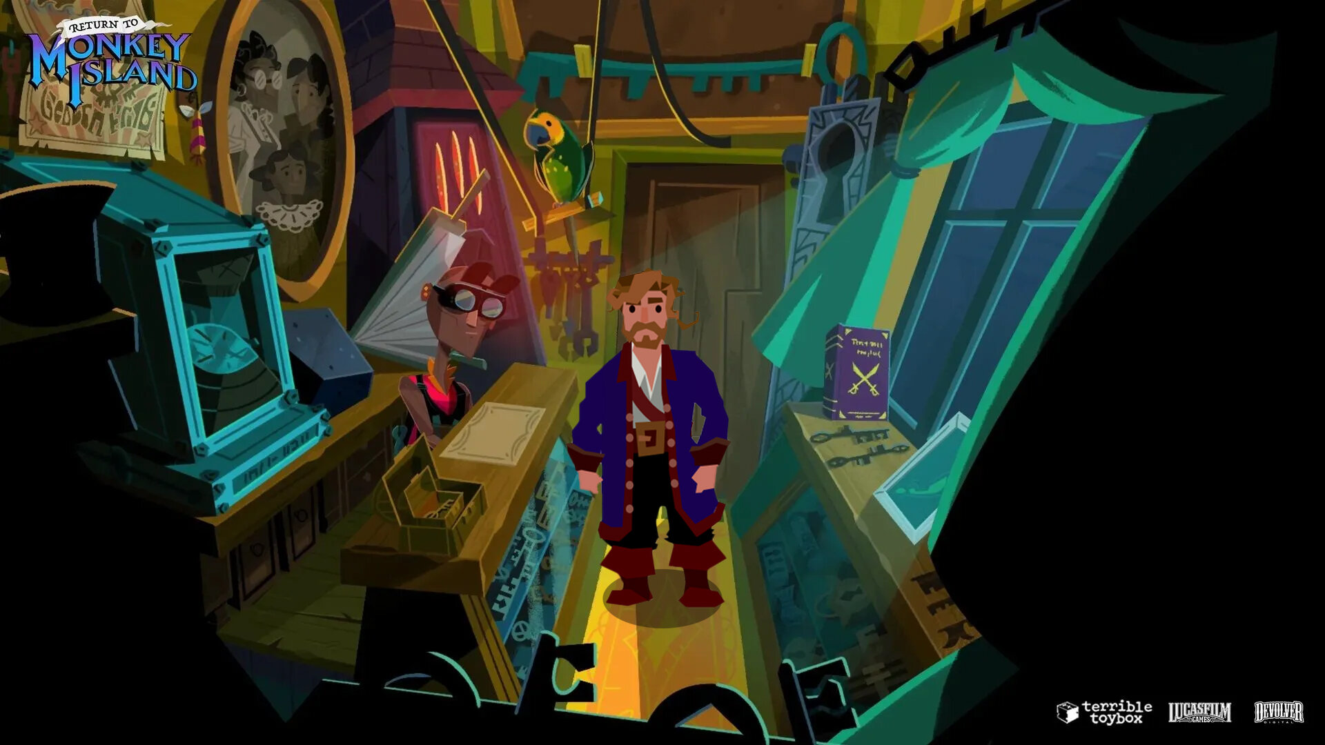
I was thinking the same. It's incredible. From the beginning where I was a bit skeptic about graphic this art style had grew so much in me that now it's almost my favourite in the series. It's unbelievable.
-
2
-
1
-
-
8 hours ago, KestrelPi said:
Heh. Maybe ron should just add a pixellate filter in graphics options. It's amazing how just by pixellating it, my gut reaction shifts from 'this is new and scary' to 'this is old and familiar'. (I love the art style if it wasn't already clear, but it's also very new and so it always feels a little odd at first, just like CMI did I suppose.)

Same for me


-
2
-
-
Guys...this is SO good. If I was been a little skeptical after the trailer about some little details, this clip just blow me out.
I'm thinking that this art stile is like a cup of coffe without sugar: it may taste a little bitter at the beginning and takes time to get used to, but once you are, you start to enjoy the bitter taste and you can't go back to that artificial swetness anymore.
Now...It's like if everything just click.
I'm 100% in.-
1
-
-
5 minutes ago, OzzieMonkey said:
I found the Reddit thread this is from and Dom is actually just responding to the question posed by the OP which was "are you also going crazy from not hearing more news about the game" so all this means is he is just as desperate as us...impressive since he still knows more than we do 😂
Yes, sorry, I thought that he was answering to the Pax West thing.
This waiting is killing me
-
1
-
-
-
40 minutes ago, KestrelPi said:
OK I'll do that but first, some of these are incredible:
30 years ago, an april's fool of an italian magazine hipotized the same connection...
-
2
-
-
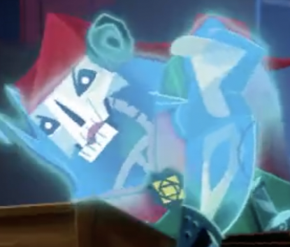
Someone on reddit tried to redraw guybrush from pixel to vector and tried to recreate the style of Rex Crowle.
I've tried to add it to the new background and...for me it works great!
Original post here-
4
-
-
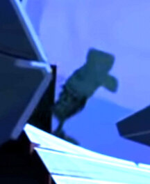
...kind difficult to say, but boosting the exposure on, seems like a skull.
-
1
-
 1
1
-
-
10 hours ago, ThunderPeel2001 said:
Assuming the title is accurate, has anyone considered why we might need to return to Monkey Island?
Here's my theory: the story starts at the amusement park, with the goal of getting Guybrush to run away from Chuckie again. In this phase we control both Guybrush as a child and Elaine wich still is in the "world of Monkey Island". At that moment someone (Largo ?) Sees Elaine and discovers the true power of Big Whoop.
This prologue ends with the beginning of Curse, with Guybrush in the autoscript car lost in the ocean.
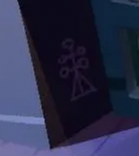
There is a time jump of many years, and now we are in the real world. Guybrush, now 50 years old (here is that insistence of the biographical element to which Dave always mentions ...) is recalled by Murray to "return to Monkey Island": in fact, during his absence a form of cruel dictatorship has been established that uses the powerful black magic of the seals (Goetia) and that has imprisoned Lechuk, taking over his crew of ghosts. This interpretation is deducible from the strange seals that appear in several images (the ghost that loads the ship, the courthouse, the streets of Melee) attributable to this species of new culture or power that has settled in the Caribbean and that gives great importance to the keys, as seen in the blacksmith screen and the painting in the courtroom. Maybe they are the keys to accessing the true power of Big Whoop, which has to do with time?
Anyway this 50-year-old Guybrush returns to Melee, having forgotten most of his past as a pirate, and must therefore first try to remember who he was and then try to end the power of this new dictatorship, with the help of Elaine and Lechuck himself.
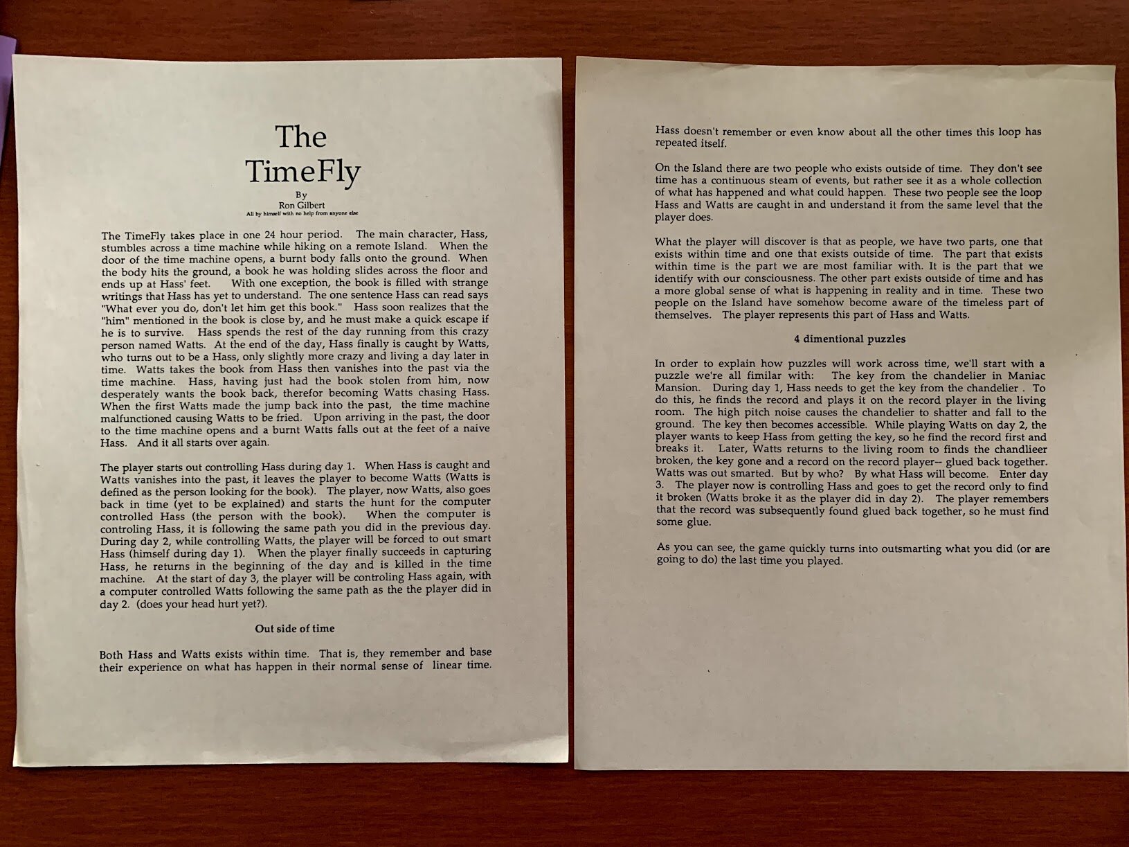
I imagine there may be numerous "time travel" or paradoxes, similar to that old design document posted by Ron in 2020, "Time Fly".
-
2
-
-
1 hour ago, TimeGentleman said:
I think it was statements like "we can say with a reasonable security that if Ahern and Chan had worked on Monkey 3 in 93/94, following their research and the trend of those years, they would have chosen the same, deformed and expressionist style" and the argument that therefore a 1993 Monkey Island 3 would have looked just like RtMI does, that muddied the waters a little. But yeah I think we're all in agreement that a 1993 MI3 would have moved the style on somehow, quite possibly in a more stylised direction, and that not having the exact same art style as MI2 is not some betrayal on Ron's part.
I made that statement -which probably translated from Italian to English sounds a little too peremptory and absolutist- because it seemed useful draw attention to two important points, to spread some light of past controversies on graphics. Specifically I wanted:
1) Denying and demonstrate that the style of RTMI was "modern" or linked only to the cartoons of the 2000s. We have seen instead that it has roots well planted in the past both of the art history and of the Lucas adventures;
2) Indicate how, paradoxically, was pixel-art "wrong" and not philological for the hypothetical Monkey 3 ( meaning by pixel art a graphic similar to Monkey 2, not only the 320x200 resolution).
Thank you for allowing me to clarify my thoughts.-
1
-
-
1 hour ago, Lagomorph01 said:
Great quote from this post which should put the whole “MI3a would absolutely positively have looked like Day of the Tentacle” thing to rest:
27 minutes ago, Jake said:I don’t think anyone argued it would look like Day of the Tentacle, but that DOTT was an example of the sort of thing the art team was interested in doing, as opposed to just repeating themselves. Gilbert says almost exactly that in the blog before the part you quoted.
“If I had stayed and done Monkey Island 3 it wouldn't have looked like Monkey Island 2. We would have kept pushing forward, and Day of the Tentacle is a good example of that.”
This.
And there is also this quote from Steve Purcell, back to 2000, that could be used to push the speculations about "Monkey 3" art style:
"When I saw the style Larry Ahern and Bill Tiller set for the game I was impressed. It looked fantastic. They did what we would have wanted to do on One and Two. Ron Gilbert always wanted the games to a have a storybook feel. We got close on the backgrounds of Monkey 2 but we were still had graphics limitations. One thing that's fun about the Monkey Island series is that visually each one is a departure from the last".
And is curious that he use the same words "storybook feel" that Dave uses in the last interview.
https://web.archive.org/web/20010405020541/http://lucasfans.adventuregamer.com/index2.html
-
1
-
-
6 minutes ago, Thrik said:
Man, this one really drives home the DOTT-esque aspect of MI2's graphics.
... as something that was already there, and that was growing ... just waiting for the right time. -
25 minutes ago, Jake said:
This image was recovered as part of the VGHF dive into the Monkey Island 1 and 2 source, and nobody was able to divine what it means or what it’s from so please don’t draw conclusions. It’s NOT from any Monkey 3 project. Its impossible to say what it was for beyond a quick style exercise. It was actually found in the source files for Monkey 1, and the reason for that is hard to know (it could have just been a filing mistake, or not?) but it shows that even during production of Monkey Island 1 and 2, the artists were starting to explore pushing into more stylized looks. It really does feel like once scanning paintings was added to their repertoire, the sky was the limit on style exploration.
Very, very interesting.
-
51 minutes ago, Lagomorph01 said:
I love the artwork you’re referring to, but these assumptions are very farfetched. Different designers and project means different direction.Going by what you’re saying it’s a wonder The Dig and Full Throttle didn’t look like Looney Tunes cartoons.
Of course, they are speculations, approximations to a truth that is possible but not certain.
It must be said, however, that The Dig, although it is from 1995, adopted some previous graphic expedients - we all remember its troubled production led by Brian Moriarty and started in 92-93.
And Full Throttle is from 1995, and was affected by the graphics research done for Indiana Jones and the Iron Phoenix. And the graphics of both, although not deformed like those of Dott and Sam & Max, are definitely definable as cartoonish.
What I'm trying to say is that, due to internal request within the Lucas company (the graphic designers wanted bigger characters), external influences (the Sierra cartoon adventures) and a number of technical innovations (Cd-Rom, 386, etc.) the graphic style of Lucas games typical of the years 89-92 (Indy3-Loom-Monkey1,2-Indy4) that we now identify as "pixelart" was necessarily destined to be abandoned in favor of a more streamlined and abstract style (which among other things it is the one that today suffers less in terms of restyling, just look at the remastered versions of Dott / Full Throttle).
In this aesthetic movement that is partly conscious and partly unconscious (there is still a spirit of the time, even in video games ...) how are Monkey Island 1 and 2 positioned?Well, in my opinion a progressive "cartoon" trend was already evident.
We look to the governor of Phatt. To the guard. A Largo. To Eleine's cook.
Let's look at Guybrush.
The cartoonish graphics were already there. And, compared to the first chapter, it is definitely more present. Only it was limited by the technique of the time.
"But there are Guybrush close-ups that ..."
Yes, but we know that Ron Gilbert didn't appreciate them, because they were too distant from the rest of the game.
And in fact in the second game there are no more.
Maybe it's excessive speculation, but ... I really think that if it had been done in 93, as mentioned above, Ron and the graphics would have accentuated the cartoon aspect and not the realistic one, keeping an artistic direction not too dissimilar to what we see now. -
On 4/15/2022 at 9:26 PM, Rum Rogers said:
It wasn't written in stone that the game after Indy4 would have adopted the style that DOTT eventually adopted.
Certainly true.
But we can make assumptions, based on what we know for sure. And the assumptions, if correct, can bring us closer to the truth.
What do we know for sure?We know that in 1993 Larry Ahern, animator of Monkey 2, and Peter Chan who together with Purcell had designed the backdrops, for the graphics of DooT - the first Lucas adventure to have a real artistic direction - chose the Warner cartoons of the years as a reference. 1950s, in particular "What's Opera Doc", which in turn was strongly influenced by the aesthetics of German expressionism of the 1920s (Metropolis, Dr Caligari etc.).
Why did they follow this line? Not by chance. If you remember in those years - before full motion video games like Phantasmagoria - the software house experimentation was directed towards cartoon style games. Sierra had experimented with Leisure Suit Larry 5 (1991) and Willy Beamish (1991).
So, knowing all of those informations, we can say with a reasonable security that if Ahern and Chan had worked on Monkey 3 in 93/94, following their research and the trend of those years, they would have chosen the same, deformed and expressionist style.
That is what we have now, more or less.
I said all this again to say that the style of Return to Monkey Island is everything, but not "contemporary".It is strongly, totally, definitely retro.
Thank's God.
-
1
-
-
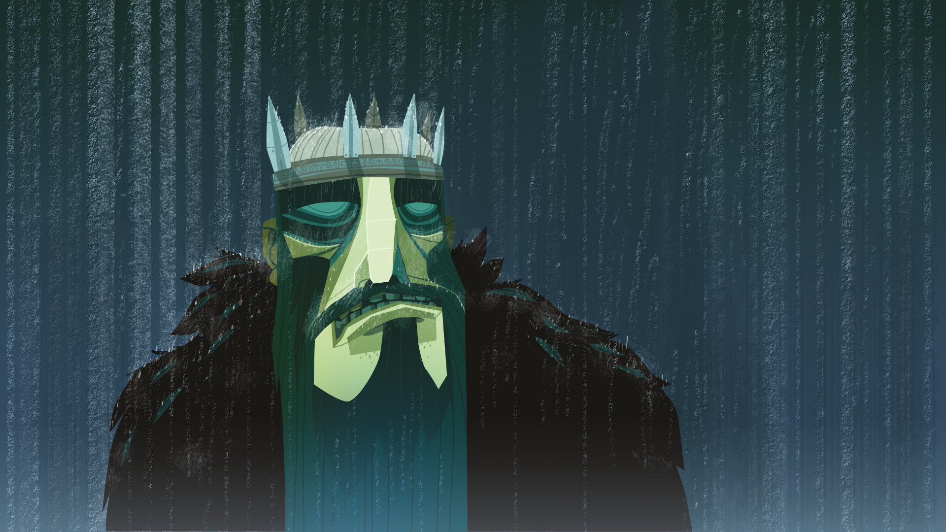
Regarding the debate about the new art style, expecially the "adult" aspect of the first two Monkey Island - which I also love - does not mean that it cannot be continued with this artistic direction as well.
There is an image of Rex Crowe in particular that could be very suitable for explaining this concept:
The style is similar the same of the new Monkey Island, and it is by no means "childish". On the contrary, it contains in a very elegant way a nuance of emotional states that could hardly be synthesized in a face drawn in a more traditional way.-
2
-
-
Hi guys,
let me share wiht you some speculations about the art syle. I'm one of those old school guys who initially, as soon the first images of the game appeared, complained about "not be in pixel art, or too far from the style of Monkey 2, etc. etc."
But, at a second glance, I just persuaded myself that this is the style wich the "real" Monkey Island 3 would have been made if it come out in 1993.Follow me on this point: what's the game that follow Monkey 2? It was Day of the tentacle (let don't count Indy 4 who started with the same pipeline of monkey 1).
Day of the tantacle has the same "expressionist style" of Return to Monkey Island, as many of us has spotted.
This similarity is even more closer if we look to the remastered version of DOTT.
I really think that, if Return to Monkey Island would have done in 1993, could have a visual style more similar to Day of the Tentacle than to Monkey 2 and the actual visual style fits to this perfectly -resolution apart-.So...it's a glorious moment. This is the real Monkey 3.
-
2
-


Your favorite Monkey Island game
in General Discussion
Posted
Same for me.
But I really, REALLY enjoyed Return. I have the feeling that will grow with time, and it could overcome even MI2.
Now I just want to play it again slower, and discover every little detail.