

Laserschwert
-
Posts
1738 -
Joined
-
Last visited
-
Days Won
168
Content Type
Profiles
Forums
Events
Posts posted by Laserschwert
-
-
3 hours ago, Lagomorph01 said:
They did ask for your permission, didn't they?
Nope. I guess this is too much of a legal gray area for them to care - after all, I can't claim any copyright on these. And Tim hating my guts over these posters probably doesn't help either. This makes it all the more amazing how fair and gratefully Limited Run Games handled the situation.
-
On another note: I was surprised to find two of my posters in the recent "Art of Double Fine" book:

-
 3
3
-
-
Ignore the logo for now. It will be color-corrected and cleaned up separately.... and ideally removed as an option. But that's obviously a big task. Color of the artwork itself on the other hand is very hard to pin down, as all sources look different. The only image on the web of the textless artwork looks like this:
It's almost as dark as a renaissance painting, so there's no definitive answer here.
-
1
-
-
Re-visiting an old friend...
Raw 600dpi scan:
AI-supported filtering:
Color-correction test:
There's still a lot of material missing to properly clean this up, but there doesn't seem to be much out there.
-
3
-
-
It's a mix of both. The MI1 marbling uses the scanned sides of the big box (when taking off the lid), upscaled with an AI model. I then utilized Photoshop's "content aware fill" to build a huge, seamless pattern out of those scans. So in this case it's not exactly what was scanned, but a new pattern built out of those shapes.
MI2 mixes a sandstone texture with the cracks and shading of the scanned game manual (the Korean version, if I remember correctly).
-
 1
1
-
-
For completion, I've added several different versions of the MI1 and MI2 posters with their respective box borders. Sorry for going overboard with options, but these are the two most important games of this whole project.
-
1
-
2
-
-
On 10/21/2021 at 3:56 PM, QueZTone said:
That's incredible, amazing work Laserschwert! Looking forward to the version including logo!
Dare I ask if you have a cleaned up version of the MI SE collection cover where you use your latest ai restoration technique?
The version with the logo is already there. The one with the border is still in the making.
Regarding the SE Collection artwork, I guess I need to tinker with it a bit more, as it isn't exactly suitable for printing it at poster size yet.
-
1
-
-
They are only approximations, though. Both the SEGA CD and FM Towns version seemed to have a darkened sky on their boxes, which I didn't do for my versions, to keep things simple. There are other versions out there that have "interesting" coloring, but for most of them it looks more like sloppy work by the printers instead of creative decisions. I'm not sure why I felt these two qualified as options.
-
It's done! I've added three versions of the "Secret of Monkey Island" artwork to the project, each one in three different color versions (Regular, SEGA CD, FM Towns). Eventually I'm going to add versions with the marbled border as well, but this'll have to do for now.
HUGE thanks to Jake, who helped me to bring this project full-circle at last. MI1 and MI2 were the first posters I worked on, from which the LucasArts Posters project eventually was born. And now we finally have both artworks at amazing quality. So this is a major milestone!
-
6
-
2
-
-
Yes, I'm going to make a bunch of different versions, including that one.
-
3
-
1
-
-
On 5/15/2021 at 2:03 PM, knolll said:
Wow! That new scan pops!
On 10/9/2021 at 7:07 PM, knolll said:That new version pops!
On 5/17/2021 at 11:58 PM, ThunderPeel2001 said:Where once I was blind, now I can see.
On 9/25/2021 at 10:55 AM, Lagomorph01 said:The difference is amazing! I was blind but now I see! 😳
 Obviously there's only so much you can say about these.
Getting there:
It's weird to see so much more on the sides when you've gotten used to the cropped art over the years.
-
3
-
1
-
-
The restoration is coming along nicely:
I was a little scared about painting out the logo, but besides using some great sources for the palm trees (unlike 13-or-so years ago, when I didn't have much to work with), I just went and repainted most of the sky. After all, it's just splotches of color, which can be conveniently sampled from inbetween the letters. Adding the appropriate amount of texture on top of it, it works quite well. However, I think I'll still include a logo-less version with a cloud overlay, like in my old versions. The bottom half of the artwork is still missing a bit of material to remove stickers and logos, but I have a few sources that I have yet to train AI models on.
-
3
-
2
-
-
1 hour ago, Lagomorph01 said:
I’m curious, how many layers do your Photoshop files have, and do you keep the sources in the PSD’s ‘clean’ so you can swap them out when better images become available?
It depends on the image, and how many sources I can collect. Apart from actually fixing dirt and damage to a scan, piecing together different sources is the most work in a restoration. And you're right: Color-correcting each one so that they all match can often be tricky. Usually I start out with the best quality source, and try to match everything else to that. Sometimes I need to color-correct different parts of the same scan with different settings, which in turn ups the layer count. Once everything is pieced together in a homogenous way, cleanup and color-correction of the complete image can happen. Regarding keeping my sources clean, in terms of color correction I usually use adjustment layers, so that the source itself isn't changed. But when aligning different scans, the pieces hardly ever fit together without warping or distorting them ever so slightly. That's why a simple swap of sources usually isn't possible.
Luckily, aligning can be automated with a bunch of different tools. Most of the time Photoshop's own automatic alignment tool is good enough. In the case of the MI1 poster, which was made up of 15 separate scans, it worked right away. The Rebel Assault 2 poster on the other hand failed miserably (because of so much black space), so I resorted to Hugin, an open-source image stitching tool that can align images by manually placing marker pairs in the different images. It took a few hours of manual work, but the stitched image turned out great.
-
2
-
1
-
-
3 hours ago, Scummbuddy said:
It was sold, sure, but I believe that buyer was generous enough to provide some scans within the last few months here and now we have the work/poster that Laserschwert has made available for us.
Nope, the poster was only using scans of game releases. Mainly the manuals of the Korean and Taiwanese version of MI2, plus several box scans. If I had access to scans of the original painting, the quality would be much, much higher.
Noteworthy: The Korean manual seems to be the only available source of an unobstructed "LeChuck's Revenge" banner.
-
1
-
1
-
-
31 minutes ago, Thrik said:
It might even be preferable to the original art itself given physical degradation may have occurred to that.I guess it depends on what was used for the paintings. Acrylic paint basically turns into plastic once dried, so that should last a while. Oils are obviously more problematic, although it's not like these are renaissance paintings from a few hundred years ago. The painting surface can be the weak spot though... canvas, cardboard or MDF usually aren't water proof unless sealed.
But as I understand it, the Lucas archive is a professionally cared for, temperature-controlled facility, so most stuff should be safe.
As a matter of fact, Craig Derrick told me he's planning a trip to the archives soon. I asked him to especially look for boxart - originals and slides/transparencies - to at least make sure these are properly stored and modern scans could be made. I doubt that he's in a position to share anything for the poster project, but it would at least ease my mind a bit if these works can be confirmed to be safe.
As for the quality of slides: Just look at the quality of the new MI poster. That one was most definitely created from a slide. The detail is very good, but as I mentioned above, there's still room for improvement. But that would require going back to the original painting, because all those shortcomings are now baked into those slides.
-
1
-
1
-
-
52 minutes ago, Jake said:
I hope you do a version with the warmed up colors like you’ve done in the past too (sega cd style?), because I agree with you that it looks great like that.
Yeah, MI1 is important enough to warrant multiple versions.
-
1
-
-
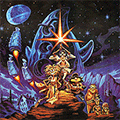
The big thing I'm thinking of are of course the original paintings. At least we know that MI2, FOA and Rebel Assault 2 are still in Purcell's and Eaken's possessions. As for stuff like MI1, MM, Zak or The Dig, they must be stored somewhere... I hope. Loom is an interesting one, because it's not a painting but a coloured pencil drawing. So most likely it was done on paper and is thus not as sturdy as paintings made on cardboard, MDF or canvas.
Interestingly, GameHistoryOrg's Frank Cifaldi did initially have the MI1 poster photographed at a specialized vendor, but the quality couldn't compete with a flatbed scan, so he ended up scanning it on his A3 scanner.
Edit: According to Frank, Steve Purcell confirmed that the poster's colors are accurate. So that settles that.
-
2
-
-
As great as this version of the artwork is, you can see the shortcomings of 80s physical film/optics and digital scanning technology. Some colors bleed into one another and edges aren't as refined as they could be. The MI2 artwork we derived from the magazine poster already looks more detailed. (Edit: Having finished the restoration by now, I've got to retract that statement. The MI2 art is a much rougher painting, with generally less detail than the finer brushwork of the first artwork. Of course, this might be due to being a cheaper reproduction as a magazine pack-in.)
I'd wager that a modern scan of the artwork (or as I understand it, paintings are most of the time photographed instead of flatbed-scanned) would result in even more detail and much better colour reproduction.
Color-correcting this will be a challenge too, since the different releases use many different color schemes for the art. Personally I'm partial to the Sega CD version's colors (which my current restorations leaned on heavily), though with this poster being a more definitive source, the end result will probably land somewhere inbetween.
-
Just now, TimeGentleman said:
Fantastic! What do you mean by "the official poster", out of interest?
It's the officially released promo poster, available back in the day through the Lucasfilm merch store.
-
1
-
-
Thanks to Jake, I finally got a chance to scan the official Monkey Island poster:
Now there's a lot of cleaning up to do. Plus this is merely a starting point for creating a much better expanded and textless artwork.
-
1
-
5
-
-
I still haven't played much of the first game, because the controls feel so incredibly janky. So I'm afraid to not get the full dose of familiarity with returning characters and plot threads, thus diminishing my enjoyment. Is the sequel heavy on nostalgia for the first game?
-
My best guess is they shot themselves in the foot by promising certificates hand-signed by Ron Gilbert, and then accidentally selling multiple thousands of boxsets.
-
 1
1
-
-
Sorry, I had nothing to do with it.
-
1
-
-
1 hour ago, TimeGentleman said:
Nice! (It just redirects to this thread, but I think that's probably the best way to do things, and it's nice to have the url back regardless.)
It's only been gone for a month or so, but it's still good to have it back.


LucasArts Posters: The Revenge
in General Discussion
Posted
Yes, I still have your scans. I'll be working on that poster somewhere down the line.