

TimeGentleman
-
Posts
217 -
Joined
-
Last visited
-
Days Won
23
Content Type
Profiles
Forums
Events
Posts posted by TimeGentleman
-
-
Whatever that is, it's not working!
-
 1
1
-
-
On 5/27/2024 at 12:55 AM, Scummbuddy said:
Missed your chance to get some primo/questionable boxed LucasArts LimitedRun Games releases?? Monday, May 27th 10am ET, they are seemingly clearing out their extra stockages of LucasArts games as well as 21 pages of other inventory. Forget all those others; here's the ones we care about:
* Day Of The Tentacle PC (Xbox version)
* Full Throttle PC box ("special" dark art edition)
* Maniac Mansion NES
* Maniac Mansion NES Premium edition
* Monkey Island Collection 30th Celebration (with typos)
* Monkey Island Anthology Upgrade Kit (to fix the typos and give you ReMI ( @Remi ) )
* Secret of Monkey Island (Sega CD)
* Return to Monkey Island (Xbox disc edition)
* Sam and Max Save The World (PC) (Switch) (Switch Premium)
* Sam and Max Beyond Time and Space (PC) (Switch)
* Sam and Max This Time It's Virtual (PCVR)
Honorable Mentions:
* Lair of the Clockwork God (PS4 and Switch, physical and collectors editions)
* Knights and Bikes (Switch)
This is not an exhaustive list and I got lazy with the non-boxed copies for sale and the Star Wars releases (sorry).
About 4 hours left of this! And apologies for the tacky self-promotion, but I do recommend any LOTCG fans consider the collector's edition, it's got loads of exclusive content and no cheap fluff!
-
 1
1
-
-
Ahh, I see, thanks!
-
Am I missing something? All but 14 of these are marked as sold out and don't seem to have any way to purchase them. Did all 21 pages of leftover stock sell out in the past six hours?
(Thank you for the honourable mention regardless!)
-
I personally would have left the Rebel Assault II cover art off my non-adventure honourable mentions, for a reason you can probably guess from the rest of my list!
-
Oh yeah, I was going to give Outlaws and Dark Forces honourable mentions! Rebel Assault and Pipe Dream aren't in the Remasters thread so I didn't see them originally but looking at them now I agree, very effective too.
-
First off, a nod to Laserschwert's thread of remasters, the best place to go to peruse these posters.
Okay, my personal ranking of the Lucas adventures' cover art. I'm not taking the logos/text into consideration when ranking, and I'm also forgiving any empty spaces in the composition designed to put said logos.
1) Monkey Island 2: LeChuck's Revenge
Perfect. Absolutely stunning art. A great composition, wonderful use of light. Dramatic yet with notes of goofiness, matching the game. I spent a lot of money having Laserschwert's no-titles version of this printed on canvas and put in a big old frame so it looks like a lost 19th century painting.
2) Sam & Max Hit the Road
Gorgeous. Stands alone as a great Sam & Max piece, and works great as box art as well. It gets in a bunch of the stuff from the game, acting as a kind of trailer to keep the player excited to progress, and there's so much detail in there to gaze at while stuck on a puzzle, without feeling too busy. The only thing I could possibly criticise it for is that it doesn't include a classic Sam & Max rat, but the jackalope makes a fine stand-in.3) Zak McKracken and the Alien Mindbenders
I love the clean, bold cartoon style here. A lovely companion piece to Hit The Road. Great composition and use of colour, lots of lovely detail, and a cheeky evocation of the classic Luke & Leia pose. Better than the game, and I've probably spent more time on it too!4) Day of the Tentacle
This was a surprise to me, because I had assumed I'd be ranking it second. It's from my favourite game of all time, it's iconic, the linework and character art is delicious, it cleverly imitates Chuck Jones cell art by giving a slightly more painterly detailed look to the mansion in the background. The only thing that knocked this down a few places is that it's very simple and I suspect my love for it is more driven by nostalgic association than some of the other covers here.5) The Curse of Monkey Island
A really nice composition, very clean, matches the game well. Good use of colour. Guybrush looks a tiny bit off in the face, somehow?6) Labyrinth
Standing on the shoulders of the movie's artists, of course, but this is still a great fantasy painting and a smart choice to show restraint and simply portray a wide view of the labyrinth with an owl in the foreground rather than overworking it with a bunch of different elements.7) The Dig
The more I look at this, the more I like it. It really nails that Bob Peak 80s family sci-fi mystery movie vibe, which ties in nicely to the Spielberg association. It walks a fine line between mysteriously minimal and bland, but for me it lands on the former.8 ) Loom
Very similar strengths to The Dig, but I'm going to place this below because all the elements feel a bit cramped.9) The Secret of Monkey Island
I love Guybrush here, and obviously Purcell is a great artist, but the overall composition is just too vague for me. I assume it's intentionally evoking old adventure movie posters, but I'm personally just not a big fan of that 'slap all the things on there and call it a day' style. It took seeing Laserschwert's no-titles version for me to realise that there's three quarters of a crossbones in there!10) Grim Fandango Remastered
A lovely piece of art, and far superior to the original cover. It loses a few places due to being a little too busy, and (possibly due to it being all pencils, an admittedly classy and interesting move) feeling more like a limited edition A5 print than cover art.11) Indiana Jones and the Fate of Atlantis
Perfect emulation of the Struzan style. Unfortunately, this means it has that typical Struzan muddled composition. It's better than Struzan's art for Infernal Machine, though!12) Maniac Mansion
I appreciate that it captures the cheapo 80s horror vibe quite well, but that also means that intentional or not it feels a little ugly and cheap to me!13) Full Throttle
While this is a cool image, it seems to be some kind of filter over 3D art. Whether I'm right about that or not, it feels like it is, which is the important thing. (The explosion also feels like a stock image.) It worked as a promotional image, it doesn't work as a piece of art, and that's a real shame when it's the cover for such a beautiful game. It's such a shame that they didn't use the Mignola-esque version of this by Peter Chan that we've seen elsewhere.14) Full Throttle Remastered
This might have overtaken the original, as I prefer the 2D art style, if it weren't for the utter lack of energy and the slightly off anatomy. They also did a reworking of the original as promotional art and it is miles better than both this and the original - an odd choice not to use it.15) Escape from Monkey Island
Some fairly cute bits and pieces of character art in here, but a muddled composition, a weird mish-mash of 2D and 3D, and Guybrush has a queasy Margaret Keane look about him.16) Day Of The Tentacle Remastered
This feels like perfectly adequate fan art achieved mostly by dragging around and tweaking existing assets. A lot of the characters look off-model, the linework is inconsistent, the composition is messy and the posing is odd. This puts the restraint and casual mastery of the original into stark contrast!17) Grim Fandango
Just a bunch of models slapped on a black background. So lazy! I think it's supposed to be evoking Casablanca et al, but for one thing I personally don't like a lot of those posters and for another they could have at least done a painted version in that style. This is clearly designed purely to shout "it's in 3D, this isn't your grandma's adventure game!" from the shelves. Particularly embarrassing next to the amazing wall mural artwork used on the CD slipcase.18) Monkey Island 2 Special Edition
Blasphemous, but one of the two versions in Laserschwert's thread (the one with the wider LeChuck eyes) is a better piece of art on its own terms than the SOMI:SE one so I'll count that one and put it here. (The other one is dreadful and would go second last.)19) The Secret of Monkey Island Special Edition
An absolute sin. Like a microcosm of the SE itself.20) Indiana Jones and the Last Crusade
The laziest possible option, and just in case it didn't have enough 'cynical corporate synergy' vibes, they put two versions of the IP's logo on it right next to each other!What do you all think? This is all subjective opinion, of course, and I'd be interested to hear how close others' are to mine. How do other related game covers compare (like Lucasarts non-adventures or non-Lucasarts adventures, say)?
-
8
-
-
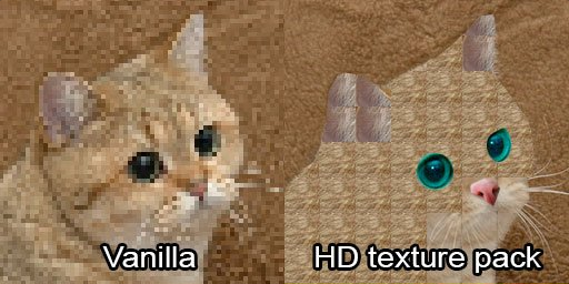
As reported on this here site, a new HD mod has entered the arena, this one providing upscaled 4:3 backgrounds and (reportedly) working with the Steam version.
-
3
-
-
Yeah, but I couldn't find an existing thread about it here, and it just got a little internet buzz with that article, so I figured it was worth starting one.
-
1
-
 1
1
-
-
Quote
Ron Gilbert is working on a new game, which he describes as "Classic Zelda meets Diablo meets Thimbleweed Park".
https://www.eurogamer.net/monkey-island-creator-ron-gilbert-has-a-2d-pixel-art-game-in-the-works
-
1
-
-
Maybe worth contacting customer service, as with Loom? See if there's a Dropbox of extras for this one too so you can delete all the zip folders off the USB stick and put the extras on there instead!
-
Yeah, I've always preferred SoundBlaster over Roland. Might be because that's how I originally played them, but to me it sounds beefier and more organic. Roland is too weedy and synthy for my tastes.
-
For anyone wondering why this thread is specifically non-Monkey, it's because these other threads were going at the time:
-
You might be better off posting this in the latest DREAMM topic, in case Aaron has notifications set up:
-
1
-
-
Yeah, I didn't want to be too negative in this thread, buuut...

-
 3
3
-
-
For anyone not wanting to click through blind, it's a 14-page chapter excerpt of the Rogue Leaders book as a pdf on (presumably LoneWulf79's) Google Drive.
-
2
-
-
That track seems to have disappeared from your account...
-
Or this?
EDIT: No, wait, sorry, that's a grate circle.
-
7
-
1
-
-
This looks fun: https://jazbina.si/collections/najbolj-prodajano/products/odcepnik-in-triglava-opica-zlata-doba-racunalniskih-pustolovscin-zbirateljska-izdaja
null
It seems to be (as far as I can tell from Google Translate!) a retrospective book about adventure games called The Corkscrew And The Three-Headed Monkey: The Golden Age Of Adventure Games, written by a group of Slovenian games journalists. There's a 'big box' edition with some extras, and some nice cover art that, for once, seems not to have been stolen from Laserschwert!
-
1
-
 1
1
-
1
-
-
-
2
-
-
You could interpret it as being Indy's march (rather than that of the movie "Raiders Of The Lost Ark" or of the multiple raiders of the lost ark in the movie) and therefore referring to him as the singular habitual raider...
-
2
-
-
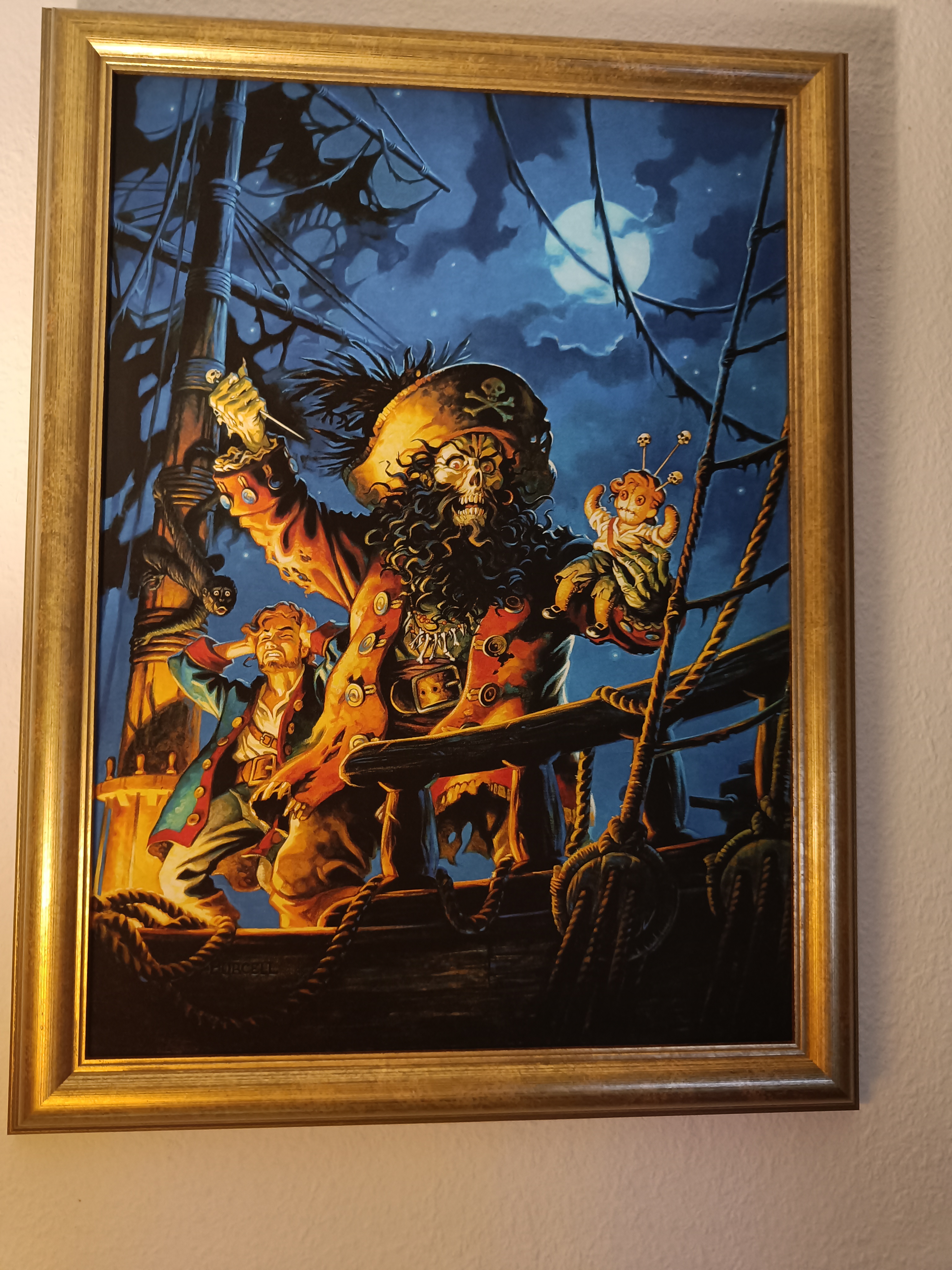
Hmmm, might have to put my framed print-out in the sun for a while, let it fade a little...
-
2
-
-
There aren't any plans mentioned in the video description so I guess you'll have to contact Double Fine or Disney. If they don't get back to you then I suppose you could download it as an mp3 yourself somehow, but how to do that I couldn't possibly say.
-
1
-
2
-
-


LOOM Collector's Edition from Limited Run Games
in General Discussion
Posted
Ahh, it's the 8th best Lucas adventure cover art!