

Laserschwert
-
Posts
1735 -
Joined
-
Last visited
-
Days Won
167
Content Type
Profiles
Forums
Events
Posts posted by Laserschwert
-
-
37 minutes ago, Marius said:
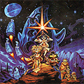
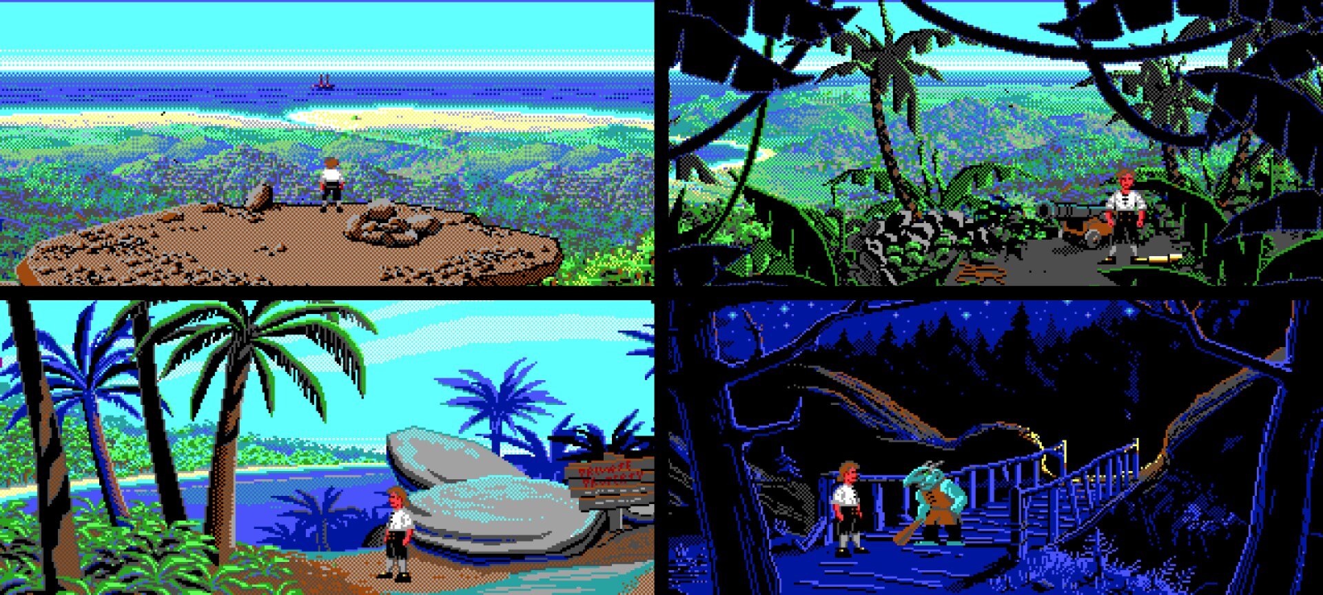
Monkey 1 has some amazing views. I love how much of the screen they occupy.

Still amazing how much subtle coloring they managed to pull out of that EGA palette (like the distance haze).
-
 1
1
-
-
Technically back then there wasn't a way to filter halftone out, short of blurring the image, so yeah, it might have been another reason why it's blurred.
Depending on which fuzzyness you mean though, it's either the camera noise or the halftone from printing the box.
-
1
-
-
Done!
I've updated the previews above and added a link, and I'll add them to the opening post eventually. This looks like a very minor cleanup, but filtering out this heavy halftone was tricky. Plus a lot of work painting out 99% of dust, dirt and scratches. Thanks @Jake for great scans and a suffering wallet.
-
2
-
 3
3
-
-
Just now, ThunderPeel2001 said:
Ha. And that's not in the original image?
No... looks like Eaken wasn't around in the 1800s.
-
And clean-up of @Jake's scan is coming along nicely as well.
Original colors:
Approximating the box/manual colors:
It's weird how the box "feels" almost monochromatic, when there's actually still a lot of color in there. I guess the colorful artwork and design elements of the box just cause the map to become less prominent.
Edit: All done! 600 dpi PNG versions can be downloaded HERE.
-
2
-
1
-
-
-
Oh yeah, better look:
-
2
-
-
There's also this on the manual. Is it EAKEN? Has Bill Eaken colored that map?
-
1
-
-
Reported.
-
 5
5
-
-
26 minutes ago, Vainamoinen said:
No, they're two different companies. On the left is some guy from Damned Heists of LeChuck (DHL) and on the right is a ghost pirate from Undead Pirate Shipments (UPS).
So I guess the guy from Free Etheral Delivery Exhumation (FedEx) had his day off?
-
1
-
5
-
-
Here's the FOA map (1200 dpi versions can be found HERE) :
Once I've cleaned it up properly (removing the centerfold and any dirt and damage), I'll add several versions of it to the main post.
Again, thanks to everybody who donated!
-
3
-
3
-
-
11 hours ago, Jake said:
the red index numbers above the roads
Those are actually distance markers (in miles). So they usually change when a road gets an extension (or a reroute), or new roads get added (since these mark the distances between the "red dots" on the map, which are usually placed at intersections).
Also, thanks a LOT for the hassle to get to those scans. I'll clean this up nicely.
-
2
-
-
Sneak peek. Don't have time for more right now.
-
5
-
-
When done right, yeah. I can't fully see Indy working as a shooter (he's pretty well defined as not killing everyone in sight), though Emperor's Tomb at least had the right idea (if a bit comically executed) regarding hand-to-hand combat.
If the game focuses more on the puzzles and action setpieces, I'm in. Ah, who am I kidding, I'll get this no matter what.
-
1
-
-
To be honest, I'm fully expecting a wannabe Uncharted from this. But what I AM really excited about (weirdly, just like with the fifth Indy movie) is the soundtrack. The last Indy game was Staff of Kings, which got a hybrid orchestral/samples soundtrack. By now, fully orchestral soundtracks are the norm for AAA games, and someone like Gordy Haab could surely compose something that at least sounds really close to John Williams.
-
45 minutes ago, CalisDraws said:
Oh by the way speaking of using his work @Laserschwert do you think it's okay to use your restored artworks for the boxes ?
As long as you don't sell them for profit, I don't mind.
-
1
-
-
-
2
-
-
Yeah, I think discussions about custom boxes should better be moved to their own thread. Also because it's a fascinating topic that should get its own spotlight.
-
I'm using a chain of several models, so that helps keeping detail.
-
1
-
-
Yeah, and possibly to avoid copyright trouble. Who would have though, someone like Crumb would dig the source out 30 years later 😆
-
2
-
1
-
-
1 hour ago, Blondebeard said:
I am sure Laserschwert could do much better
Not much. Yours looks great!
-
2
-
-
15 minutes ago, Blondebeard said:
Also, where can I find the other “Cursed” soundstracks? I have only heard the one from MI1. I didn’t know there where others from the other games.
I think this is the original YouTube channel: https://www.youtube.com/user/wdrpgwd
-
1
-
1
-
-
Regarding track listings, for my old soundtrack covers I used the inside of the front cover as a mini booklet to include them:
Granted, the design is roughly 2 decades old, so I would probably make them a bit nicer today.
-
2
-
-
We'll see. Maybe some proper cleanup and some AI tinkering will make this good enough (the original was rather blurry - I assume it was a photograph rather than a flatbed scan).


LucasArts Posters: The Revenge
in General Discussion
Posted
I've added all the maps (at their current states) to the opening post. I'll probably update the FOA map eventually with cleaner versions, and further color options (based on the box/manual and poster).