ATMachine
-
Posts
429 -
Joined
-
Last visited
-
Days Won
3
Content Type
Profiles
Forums
Events
Everything posted by ATMachine
-
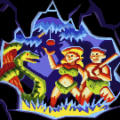
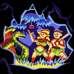
The Monkey Island box set from Limited Run Games
ATMachine replied to Udvarnoky's topic in General Discussion
I can identify a mistake in the Ultimate Insult poster: the hat should be labeled "Bronze" (as it is in game), not "Badass". -
An interesting article from The Verge: This bit seems particularly significant: Interesting.
-
I remember there was an earlier version of this advertisement - the ad copy originally misspelled a word ("debonaire").
-
Legend adds canons to your browser...
ATMachine replied to ThunderPeel2001's topic in General Discussion
I think that bit in the original game may be bugged in ScummVM - when I tried it I got an error message in the backend window about "can't play sound, too many ports". EDIT: is it a stock sound clip of a screaming woman? I think I remember hearing that among the sound effects in DOTT or Sam & Max Hit the Road also. -
Legend adds canons to your browser...
ATMachine replied to ThunderPeel2001's topic in General Discussion
Is there supposed to be a special sound, like a tiger roaring or something? Otherwise I have no idea what the jungle Easter Egg is. Unless you're just referring to the cannonballs disappearing into the foliage without a boom or splash. -
Legend adds canons to your browser...
ATMachine replied to ThunderPeel2001's topic in General Discussion
Do you mean Do you mean the Shift-V key to automatically win? I tried it and it didn't seem to work. (I went looking on Archive.org for what Mojo's World of MI hosted site said about secrets in CMI because their archives were ridiculously comprehensive.) Another thing I recall from the original game is that the complaining skeleton pirates have different voices, depending on whose boat your cannon shot is nearest to. That doesn't seem to be implemented here. -
Looks like the Indy LC guide still has its vintage errors in the Grail Temple section - in the actual game the third Grail Trial depends on crossing the chasm right away, not where on the far side you click; and there isn't actually a "ring mark" denoting the correct Grail on the Amiga version AFAIK. (This idea possibly derives from the fact that one or two of the glowing Grails' images aren't completely erased from the background when Indy picks them up. It would be an awesome real feature though.)
-
The archaeological discoveries of the LucasArts projects
ATMachine replied to Nano's topic in General Discussion
Interesting. As I'd suspected, the effect is similar to the imperial Tyrian purple of ancient Rome. (As I noted above, the purple/black logo on the released version matches the restrictions of the palette in the EGA game.) Thanks for the recreation, @Laserschwert! -
The archaeological discoveries of the LucasArts projects
ATMachine replied to Nano's topic in General Discussion
Notice the logo is suppposed to be cerise with a purple shadow (with a black outline instead on the side labels). On the published box it became simply purple with a black shadow, the same as in-game where there was only an EGA palette in the first release. Also, the "yellow" side label background color became more of a cream on the printed box. -
The archaeological discoveries of the LucasArts projects
ATMachine replied to Nano's topic in General Discussion
The thing with the burnt-up body of a time traveler returning to the point where they started reminds me a bit of the "Heaven Sent" episode of the Doctor Who revival. But I honestly doubt it's anything more than just a genuine coincidence. -
MI2 ending and the departure of Ron Gilbert from LucasArts
ATMachine replied to Totem's topic in General Discussion
Correct me if I'm wrong, but wasn't the first game that Lucas Learning actually published Star Wars Droidworks in 1998? (Aside perhaps from the mysterious Paul Parkranger and the Mystery of the Disappearing Ducks, of which only one copy has ever turned up on eBay, from the personal collection of LucasArts package designer Terri Soo Hoo.) -
MI2 ending and the departure of Ron Gilbert from LucasArts
ATMachine replied to Totem's topic in General Discussion
That's rather odd considering that Brian Moriarty allegedly chose to work on educational games at Lucas Learning instead of making the LOOM sequels. -
The Monkey Island box set from Limited Run Games
ATMachine replied to Udvarnoky's topic in General Discussion
Right, and it might have been originally where Herman Toothrot showed up after you got the banana picker and were ready to trade it to him. -
If so, it doesn't show up in any published games AFAIK. It'd be an interesting case of "hiding your light under a bushel." Like the overall argument proposed in the rest of this thread.
-
Maybe so. But The DIG apparently supported that in-game somehow at least. On the other hand, as Marius posted in another thread, screenshots on the MI1 German version box instead go with a font that is totally different for the inventory, while keeping the same font that's in-game for the verb bank. Plus a dialog font that was seemingly ripped straight from DPaint - but nonetheless has only one space between letters, like the font in MI1 proper, instead of the erratically wide letter spacing of actual DPaint text.
-
Here's a screenshot from the manual of the Spanish translation of Monkey Island 1, showing a different font than in the published version: It looks like the GUI was pasted onto the lower area of the screenshot. But the text is fairly accurate (though not exact) to the game. What's more interesting is that the font looks very similar to, but not quite the same as, the font used in the published game - like an in-house variant of the same design. In the second line the "h" in "Oh" has a tall stem to match the capital O next to it; in the fourth line, where it's not next to any capitals, the "h" has a shorter stem. Likewise, the "u" in "Cuanto" on the third line has a pixel in the lower-right corner that's absent in the "u" letters seen elsewhere. Now this could be a SCUMM feature that never appears AFAIK in any published games: letters whose design varies based on the surrounding letters, for the sake of legibility. Or it could be just a simple Photoshop job. In fact, I'd have opted for the latter, if the same feature didn't appear elsewhere - in early screenshots of The DIG, no less. Here the letter "r" in Brink's surname is shorter than the "r" in "tourniquet". Mind you this is supposed to be a screenshot of actual gameplay. (Aside: there's also a graphic filter that's visible in this image; probably the same one that was put into various LucasArts adventure-game Macintosh ports by Aaron Giles, which he later imported into MAME as the Advanced Mame 2000 filter.) It'd make sense, in an in-joke-y sort of way, for Brink to have a letter glyph in his name that differs from other instances of that letter - because Toshi Olema's surname too has a very un-Japanese L in it. But that would require special coding, and probably isn't the sort of thing one might do for a one-off gag. It'd make far more sense as a borrowing from an already existing codebase - like that in the Spanish MI1 image above. That in turn raises the question of why this feature doesn't appear in other LucasArts games. Not least the published version of MI1 in Spanish. Too buggy? Too much work to program? A combination of these with wanting to save some stuff especially for a crazy "secret library archive project" time capsule thing? Hardly conclusive evidence, but it does make me wonder.
-
The earliest design doc we have for that version is dated December 1990, while the infamous kickoff meeting (the one with the Loma Prieta earthquake) took place on October 17, 1989. That's over an entire year, at a time when it wasn't unheard of for LucasArts to put together entire games in nine months.
-
You dont' have to be psychic to guess that putting an ABBA reference in the Rending Draft (the one that tears apart the Loom and kills Hetchel) is not meant to be flattering. And as for the influence of retro SF films, including Soviet/East German ones, on The DIG - I've been talking about that for years, since long before this Secret Project business came to my radar. I even mentioned it in my old Mojo article.
-
Some food for thought: Several of the drafts in LOOM are in-jokes or puns of some sort: eg, the Closing Draft is DECE (as in "deceased"), while two possible combinations for the Rending Draft are ABBA and BAAB (suggesting that Brian Moriarty doesn't much care for Swedish pop music or similar songs like Sonny and Cher's "I Got You Babe"). But the Waking Draft includes the combinations EFGA (AGFE backwards) and DEFA - allusions to German Agfacolor film stock, which was used by famed Soviet director Sergei Eisenstein for a scene in Ivan the Terrible; and to East German film company DEFA, which made the SF film The Silent Star, which influenced The DIG in things like the naming of Ludger Brink. The use of these combinations for the Sleep/Waking Draft suggests that Moriarty may have intended them as allusions to a future project he wanted to do. Which naturally brings to mind The DIG, since as I've said in the past his design for that game was heavily influenced aesthetically by East German and Soviet SF films. But according to the official narrative of LucasArts history, Moriarty had no intention of taking up The DIG at that time, since Noah Falstein was supposed to be working on it. (Though between Last Crusade and doing The DIG at the same time as MI2, what was Falstein working on exactly?) And yet, here's Moriarty with science fiction on the brain already.
-
The Monkey Island box set from Limited Run Games
ATMachine replied to Udvarnoky's topic in General Discussion
I personally think the falsified GUI (which doesn't appear on other LucasArts boxes of the era) might be a hint to the Secret/"no man is an island" Guybrush gender-reveal thing. (Basically, that what's "below the belt" isn't as advertised.) Also, the fake GUI bits were done on a PC of some sort - if you look at the box closely enough you can see they were done at apparently a 640x400 resolution. -
The Monkey Island box set from Limited Run Games
ATMachine replied to Udvarnoky's topic in General Discussion
Jake reminded me (in that roundabout, lady-doth-protest-too-much way of his) that the closeup of Spiffy is the only screenshot on the MI1 box that isn't a digital fake: The other screenshots all have a fake high-res GUI that is clearly a photoshop job of some sort. In fact, it's a screamingly obvious one: the spacing is completely inconsistent, and the letters in the fake GUI don't even have the same design from word to word (check out the L's in "Pull" vs. "Walk to"). However, the UK White Label box shows these screenshots in their original form - including Spiffy, who is unchanged. -
The Monkey Island box set from Limited Run Games
ATMachine replied to Udvarnoky's topic in General Discussion
Thanks! 😁 -
The original novel by Rafael Sabatini is also excellent. Tim Powers has cited it as a major inspiration for On Stranger Tides.
-
The Monkey Island box set from Limited Run Games
ATMachine replied to Udvarnoky's topic in General Discussion
Marius, could you scan the other screenshots from that German box? I've been trying to find high-quality look at them for ages. -
The Monkey Island box set from Limited Run Games
ATMachine replied to Udvarnoky's topic in General Discussion
Pretty much. The closeups of the navigator head and Elaine & Guybrush in the finale do use that fullscreen style.