Bob Gnarly Posted April 16, 2003 Share Posted April 16, 2003 im thinking of also roughning up the edges to add more effect, as you may know its from the book 1984, and its for a book report Link to comment Share on other sites More sharing options...
BCanr2d2 Posted April 16, 2003 Share Posted April 16, 2003 Just place that eye a little more to the left, and it would be close to being true, with the Pine Gap installation in the middle of nowhere in Australia that is a US military installation that does "surveillance" That's right, the kangaroos and koalas have their eye on you... Link to comment Share on other sites More sharing options...
Lynk Former Posted April 16, 2003 Share Posted April 16, 2003 Hey look it's Fiji, where I was born! *waves to Fiji* hey every1 Link to comment Share on other sites More sharing options...
ckcsaber Posted April 16, 2003 Share Posted April 16, 2003 It looks cool KingPin, except that the big U seems kinda out of place..... Link to comment Share on other sites More sharing options...
Bob Gnarly Posted April 16, 2003 Author Share Posted April 16, 2003 i added the big U to make it as if its stressing on every single one of you Link to comment Share on other sites More sharing options...
Jedi_Monk Posted April 18, 2003 Share Posted April 18, 2003 That's sweet! How'd you do the type? whips out pad and pen to take notes. Link to comment Share on other sites More sharing options...
Acrylic Posted April 18, 2003 Share Posted April 18, 2003 Originally posted by Jedi_Monk That's sweet! How'd you do the type? whips out pad and pen to take notes. Could it be.....you're.....back? Link to comment Share on other sites More sharing options...
Bob Gnarly Posted April 18, 2003 Author Share Posted April 18, 2003 Originally posted by Jedi_Monk That's sweet! How'd you do the type? whips out pad and pen to take notes. explain your question clearly plaes, i dont understand, sorry Link to comment Share on other sites More sharing options...
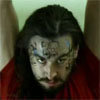
TheJackal Posted April 18, 2003 Share Posted April 18, 2003 Okay, here's my opinion. remember I'm a graphic design student so this will most likely help you out. The background blue is quite BRIGHT for a poster that is supposed to "scare you" the "big brother is watching you" needs to be centered. and why do you have a big U "be good today get rewarded tomorow" -->(both lines same size. should be centered) "BIG BROTHER IS WATCHING YOU" -->(two lines. big brother should be very big. I'd say about 10% or more bigger than the other part. The eyes get repetitif (sp?) Maybe get a better quality picture then that. If not, at least make it look more evil. The green eyes make it look softer and the guy just looks plain tired. try using brown eyes. The darker they are the more "evil it is" but dont go overboard. The wrinkles are nice touch though. Link to comment Share on other sites More sharing options...
RpTheHotrod Posted April 18, 2003 Share Posted April 18, 2003 well, uh, I did this for fun... I'm an admin in a CS server...so I want to make sure people know that... "Big Brother is watching...." Link to comment Share on other sites More sharing options...
Bob Gnarly Posted April 18, 2003 Author Share Posted April 18, 2003 ok i changed it all around, and made it black and white, the U is taken out, it just says now Big Brother Is watching you, and i got a pic of hitler and superimposed it abit put some other guys head and change the costume around, i also took out Rewarded thing and put a quote from the book "ignorance is Strength" thanks Jackal, you made it look better now Link to comment Share on other sites More sharing options...
Bob Gnarly Posted April 18, 2003 Author Share Posted April 18, 2003 Originally posted by RpTheHotrod well, uh, I did this for fun... I'm an admin in a CS server...so I want to make sure people know that... "Big Brother is watching...." wow, man i love that pic, do mind if i use it? not for any comercial **** or anything just to get 70+ Link to comment Share on other sites More sharing options...
Acrylic Posted April 18, 2003 Share Posted April 18, 2003 Yes, make some different eyes.....and get rid of that really big one, it has bad pic quality at that size. Link to comment Share on other sites More sharing options...
RpTheHotrod Posted April 18, 2003 Share Posted April 18, 2003 lol...sure...but I'll confess that it's putting together parts of things I've found in the past. Take this, do this with it, take that, put it in, change a bit, add this too, put a few effects in, add some text, you get the idea. sorta like this one (cept Hotrod Demo will be taken out) but I did that pretty much from scratch Link to comment Share on other sites More sharing options...
TheJackal Posted April 18, 2003 Share Posted April 18, 2003 KingPin, post an update on your poster as soon as you can if you dont mind Link to comment Share on other sites More sharing options...
Bob Gnarly Posted April 19, 2003 Author Share Posted April 19, 2003 sure no problem EDIT: ok, before posting anothe rone im gonna explain it first i changed it again, now adding a cityscape (toronto ) and making it all black, i tryed puting up some old mans face that would look scary but couldnt find one, so i just put text, eyes over toronto and text Link to comment Share on other sites More sharing options...
Bob Gnarly Posted April 19, 2003 Author Share Posted April 19, 2003 new one up at top to save space Link to comment Share on other sites More sharing options...
Acrylic Posted April 19, 2003 Share Posted April 19, 2003 Change the text at the top, it looks poorly hand drawn....use a Technoish font...Or the Metallica font! (Look at me sig pic) I love the Metallica font...it makes everything so, awesome! Link to comment Share on other sites More sharing options...
Bob Gnarly Posted April 19, 2003 Author Share Posted April 19, 2003 to me the text gives me feeling, so i have to shoose the right one, but then i thought...my writing would look good, and just wrote it on, i though it looked good.... Link to comment Share on other sites More sharing options...
TheJackal Posted April 20, 2003 Share Posted April 20, 2003 i got a few good fonts but on the MAC. I'm gonna look around if they are available on the PC. BTW, you live in Toronto? Ottawa here baby (sorry to hear about the leafs ) Link to comment Share on other sites More sharing options...
Bob Gnarly Posted April 20, 2003 Author Share Posted April 20, 2003 sure, you didnt know? not a big fan of our hockey team, so dont worry Thanks for the fonts Jackal Link to comment Share on other sites More sharing options...
Ratmjedi Posted April 20, 2003 Share Posted April 20, 2003 Nice image man. Looks very good. I liked the book alot and was only one of the few. Awesome work on the Picture though man Link to comment Share on other sites More sharing options...
TheJackal Posted April 20, 2003 Share Posted April 20, 2003 Here's what else you can do to that poster: the eyes: you should copy and paste the right eye. Mirror it and place it as the left eye. This should make them more similar and more level. try to remove the wierd after effects from the eye layers in that (the white white stripe at the left and right) fonts: Try using on the fonts I PMed you. See how it looks. And for the bottom part (big brother is watching you) is a nice selection. Big bold font. Try switching it with one that doesnt have serif (the little fancy stuff at the end of each letters). See how it looks. here's a general rule about fonts: Sérif = more classical look. easier to read when small case fotns (look at the newspapers) Sans-Sérif = More modern neat look. Very bold and black fonts like these can look more menacing than any other fancy fonts. Link to comment Share on other sites More sharing options...
Bob Gnarly Posted April 20, 2003 Author Share Posted April 20, 2003 thanks Jackal, ill fix it up in awhile the repost a new image Link to comment Share on other sites More sharing options...
Recommended Posts
Archived
This topic is now archived and is closed to further replies.