TimeGentleman
-
Posts
231 -
Joined
-
Last visited
-
Days Won
28
Content Type
Profiles
Forums
Events
Everything posted by TimeGentleman
-

Mojo Book Club | On Stranger Tides | Chapter 17
TimeGentleman replied to Gins's topic in General Discussion
No, but should get to it over the long weekend. -
Mojo Book Club | On Stranger Tides | Chapter 17
TimeGentleman replied to Gins's topic in General Discussion
I enjoyed chapter 8 but it was mostly fulfilling the set-up of chapter 7. I was a little surprised when it ended, but then I saw that we're onto 'Book 2' after this, and this chapter made more sense as a sort of denouement for Book 1 - it resolves the previous actions, establishes Shandy as being well and truly in the pirate's life now, and sets into place what will presumably be the dynamic of the next book, with Davies now set against Leo Friend and wanting his ship back. -
Mojo Book Club | On Stranger Tides | Chapter 17
TimeGentleman replied to Gins's topic in General Discussion
Folks, please ALSO be careful with RTMI spoilers! I haven't played it yet! -
Have you mentioned this before? What's the context, is it just a one-off you made for yourself? (Looks great, whatever it is!)
-
Mojo Book Club | On Stranger Tides | Chapter 17
TimeGentleman replied to Gins's topic in General Discussion
Loved chapter 7 - it moves so fast! I only really expected Shandy to get captured by the end of this chapter, never mind talk his way out of it and then do *another* turn and start shooting Navy captains! Gripping! I also love that throughout the whole thing he's still referred to as Shandy - the narrator knows what's up even if Shandy doesn't. Also, we're getting to the stuff about Blackbeard involving marriage and killing his crewmembers in his rituals to increase his voodoo power, which are echoed in LeChuck to varying extents. -
Mojo Book Club | On Stranger Tides | Chapter 17
TimeGentleman replied to Gins's topic in General Discussion
Really enjoyed chapter 6, it evoked the dread of ship battles and just horror of war in general brilliantly. The stuff about how the cool collected Englishman realises that actually he was in shock last time and now he's on the verge of crying, vomiting and pissing himself all at once in sheer terror was great. And a tantalising cliffhanger! -
Indy Indiana Jones And The Jpeg Of Tininess.
-
Mojo Book Club | On Stranger Tides | Chapter 17
TimeGentleman replied to Gins's topic in General Discussion
Thanks -
Mojo Book Club | On Stranger Tides | Chapter 17
TimeGentleman replied to Gins's topic in General Discussion
Finished chapters 4 and 5. Really enjoying it still. I like how the details of the magic are slowly creeping in, and the sense that there's a lot of stuff that Shandy doesn't know but also even some stuff Shandy has witnessed that even the reader isn't made privy to. Also agreed that the Leo Friend section is really effective - absolutely want this guy to meet a nasty end. It's also great how he's thinking about how he needs sugar for his blood energy and how people are envious of his strong and nimble body, and in everyone else's narration he's this waddling panting creep. Please be careful with spoilers, everyone - I was wondering if so it's a bit frustrating to have it revealed ahead of time that that's not the case. -
Mojo Book Club | On Stranger Tides | Chapter 17
TimeGentleman replied to Gins's topic in General Discussion
I'll try to catch up this weekend. I wouldn't mind stopping for a week but I'm also happy to move on to chapter 6! -
Agreed with Andy. Presumably people are buying them, because LR keep doing new ones! And even if it's all scalpers, well then people must be buying them off the scalpers, because otherwise the scalpers would stop buying them! The real question here is why anyone would like compromises
-
Mojo Book Club | On Stranger Tides | Chapter 17
TimeGentleman replied to Gins's topic in General Discussion
I got a bit behind as I'm currently addicted to the Wild Cards series so it's hard to tear myself away! But I'll be reading chapters 4 & 5 soon! I guess it's just us two still reading it..? -
A Conversation with James "Purple" Hampton, Larry The O, Julian Kwasneski, Peter McConnell, Mike Levine, Darragh O'Farrell, Khris Brown, Clint Bajakian, Michael Land, Steve Purcell, Mark Ferrari, Ron Gilbert, Dave Grossman & more (Updated: Nov. 17th)
TimeGentleman replied to danielalbu's topic in General Discussion
Surely the mega-thread will get bumped when you post it in there, and doing it this way just means the mods have to clear up after you every time? But I'll leave it up to you and them! (PS : mods - feel free to delete my posts if merging/cleaning up!) -
A Conversation with James "Purple" Hampton, Larry The O, Julian Kwasneski, Peter McConnell, Mike Levine, Darragh O'Farrell, Khris Brown, Clint Bajakian, Michael Land, Steve Purcell, Mark Ferrari, Ron Gilbert, Dave Grossman & more (Updated: Nov. 17th)
TimeGentleman replied to danielalbu's topic in General Discussion
Very exciting! But shouldn't these go in the mega-thread to avoid clogging up the forum? -
Return to Monkey Island 🚨GAME-WIDE🚨 Spoiler Chat
TimeGentleman replied to Jake's topic in General Discussion
Note how I changed the reddit thread title phrasing "designed for" to "supports" for my post!- 703 replies
-
- 2
-

-
- return spoilers
- late game
- (and 1 more)
-
Return to Monkey Island 🚨GAME-WIDE🚨 Spoiler Chat
TimeGentleman replied to Jake's topic in General Discussion
Apologies if this has been discussed already (I actually haven't played more than a few minutes of the game yet and am staying out of this thread until I do), but: RTMI supports 4:3, which reveals portions of the image hidden in 16:9 mode and arguably looks better..?- 703 replies
-
- 1
-

-
- return spoilers
- late game
- (and 1 more)
-
Mojo Book Club | On Stranger Tides | Chapter 17
TimeGentleman replied to Gins's topic in General Discussion
Chapter 3 is fun - rather lusty! I like how the protagonist is slowly getting sucked into the pirate way of life while still not understanding the voodoo stuff yet. -
Mojo Book Club | On Stranger Tides | Chapter 17
TimeGentleman replied to Gins's topic in General Discussion
Gins, that is disgraceful. I myself have now read up to the end of chapter 2! And yeah, really enjoying it. The narrative is really unpredictable, there's great use of sounds and smells to conjure up an atmosphere, and it's fun spotting all the Monkey Island-ish touches like voodoo powders and cheerful almost childish bloodthirsty pirates. -
Mojo Book Club | On Stranger Tides | Chapter 17
TimeGentleman replied to Gins's topic in General Discussion
I just got around to starting the book today, so will hopefully get through the prologue and first two chapters quickly so I'm caught up! -
Mojo Book Club | On Stranger Tides | Chapter 17
TimeGentleman replied to Gins's topic in General Discussion
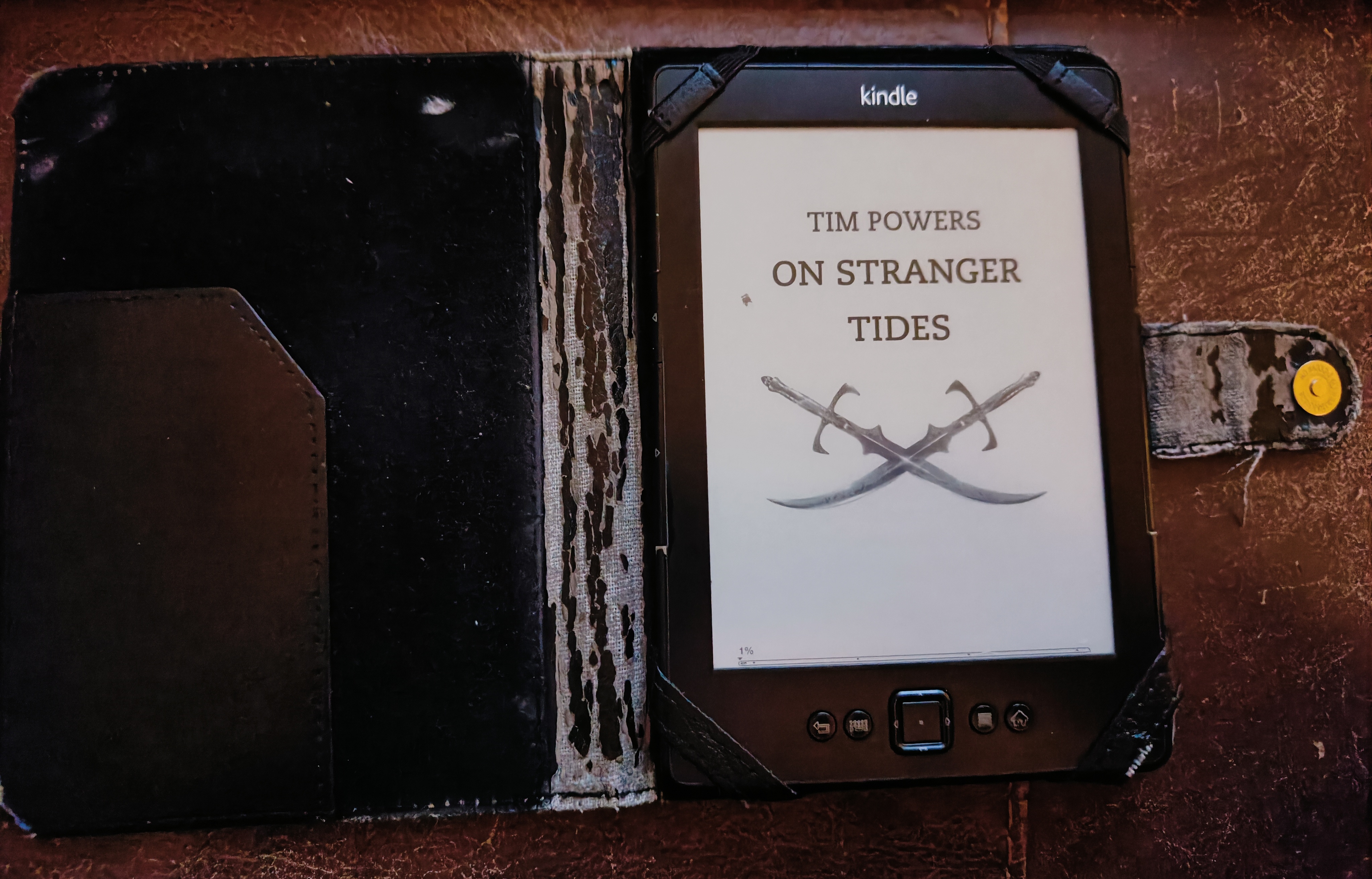
Yes, my Kindle is 15 years old.
-
Mojo Book Club | On Stranger Tides | Chapter 17
TimeGentleman replied to Gins's topic in General Discussion
I have purchased the e-book! Looking forward to getting started! -
Mojo Book Club | On Stranger Tides | Chapter 17
TimeGentleman replied to Gins's topic in General Discussion
I guess if he's going to keep getting brought up, I should mention that the other thing Orson Scott Card is known for is being a massive homophobe. What's this thing about him being a friend of Mojole? I hope this site isn't associating with him... -
Mojo Book Club | On Stranger Tides | Chapter 17
TimeGentleman replied to Gins's topic in General Discussion
Shouldn't all in favour say arr? But yeah, this is a great idea, I've wanted to read this for, I dunno, twenty years, since I first read Ron mentioning it as an inspiration for Monkey Island. Maybe after this I'll finally get past the first few chapters of Treasure Island as well! -
You're welcome! I guess they are referring to the game's world as a whole as a single 3D environment, rather than the individual rooms. That does feel like a stranger way of phrasing it to me, but I had considered it as an option which is why I tried to check the original box. Didn't think to search specifically for the DOS one!
-
Just watched it, very interesting! Thanks for sharing your processes, really cool to see! Incidentally, if you're looking for a new entry to work on, I'd love to see a high quality recreation of the landscape 2D Full Throttle cover that Peter Chan did, using the various available sources: