-
Posts
115 -
Joined
-
Last visited
-
Days Won
5
Content Type
Profiles
Forums
Events
Everything posted by Jayel
-
I liked it, but I feel like I played it wrong by playing it as a stealth game. Its stealth mechanics are... like salad at a steakhouse to put it kindly.
-

George Broussard's tweet about the future of PnC adventures
Jayel replied to TimeGentleman's topic in General Discussion
Sometimes even when I'm not stuck on a puzzle, it feels like everything stops! I was playing The Book of Unwritten Tales 2 recently and I think 90% of my time was spent waiting for characters to walk slowly across the screen, do a little turn, do a little side step to position themselves, then playback interaction animation or whatever. It's so infuriatingly slow I wanted to claw my own skin off. And yeah I agree with PnC adventure games not being very cinematic. I might have said that this genre is the best vehicle for storytelling in games at one point. I don't know if I believe that anymore. I'm sure some of it has to do with production values, but traditional PnC games are just tiny figures standing in still dioramas and I can hardly read their facial expression or body language. it's like watching a community theatre from the back row - it asks just too much of me and I've been thoroughly spoiled by more accessible forms that require less imagination on my part. -

Return to Monkey Island 🚨GAME-WIDE🚨 Spoiler Chat
Jayel replied to Jake's topic in General Discussion
I agree. Even if they're not gameplay relevant they make the world more tangible. I don't have numbers to prove it but I think LucasArts adventure games tended to have fewer interactable hotspots compared to games from other studios (for example, look at some of early 90's Sierra games where there isn't a single pixel in a room that doesn't have some sort of text description), perhaps to reduce players wasted time using everything on everything when they're stuck on a puzzle and don't know what to do next. Their worlds felt less rich as a result of it. Puzzles in adventure games aren't satisfying to solve for the most part - there's no out of the box creative problem solving like emergent sandbox games - so I'd rather that they stay on lite side and give as many interactable (or "look-at"able) hotspots/items as possible that are not tied to puzzles.- 706 replies
-
- return spoilers
- late game
-
(and 1 more)
Tagged with:
-

Return to Monkey Island 🚨GAME-WIDE🚨 Spoiler Chat
Jayel replied to Jake's topic in General Discussion
I had to resort to hint for this puzzle. Upon reading the solution, my reaction was neither "aha why didn't I think of that" nor "I never would've thought of that", but worse - it was "I tried that already!" I might have miscounted or did in the wrong order? It was perhaps my least favourite puzzle which is unfortunate because it's the very last puzzle and left the impression that it didn't quite stick the landing.- 706 replies
-
- 1
-

-
- return spoilers
- late game
-
(and 1 more)
Tagged with:
-

Control scheme for Switch **chefs kiss**
Jayel replied to Kingharrison's topic in General Discussion
The controls were great. Probably the best implementation of gamepad controls I've seen in a point & click adventure. If I had one thing to nitpick, I never fully got the hang of inventory - I'm not sure how it could've been done better/differently, but every time I had to dismiss the inventory screen after grabbing an item, or cancel grab to grab a different item, I had to pause for a few sec and think about which button to press (or just mash B until everything is clear and start over). Also whenever I finished interacting with a hotspot, all the hotspot would disappear until I moved Guybrush, so I'd often have to keep wiggling the left analog stick if I'm near multiple hotspots, but I think that's just a bug. -

Return to Monkey Island 🚨GAME-WIDE🚨 Spoiler Chat
Jayel replied to Jake's topic in General Discussion
I finally finished the game last night. My read of the ending was similar to what some of you noted already, in that it's mainly a meta thing. Not necessarily "Guybrush was in a theme park all along", but rather that it's the players that have been on a ride (called The Secret of Monkey Island). And each game in the series is different just like how your childhood favourite ride is updated and different each time you revisit as an adult years apart. Anyway I liked the ending, though it felt abrupt and not necessarily connected to the rest of the game. Yeah I thought this was what the entire game was going to be about. Like, the secret has something to do with the blind pursuit of (former) glory leading to lives ruined, big confrontation at the end, lesson learned, character arc resolved, etc. I don't know if it's an unfinished plot thread or maybe a meta reflection on the developers (or the players)...- 706 replies
-
- return spoilers
- late game
-
(and 1 more)
Tagged with:
-
I'm just glad that they didn't bring back Orson Scott Card to help with the writing.
-
If they're holding back release for marketing reasons even though the game is already done... ooooh I'm so mad.
-
Yeah curious about the Switch controls too because that's my preferred platform. I really hope it's not controlling the cursor with analog sticks. The last game I played that did that (Later Alligator) I wanted to throw the Switch against the wall.
-
I finally finished playing through Insecticide on DS and now I'm ready. That's what we all were doing, right?
-
-
Did Ron or anyone involved with the first game ever talk about how they decided which character would get the full portrait treatment? It's odd that it's so front-loaded starting with 3 very unimportant pirates in the Scumm Bar, then so sparse afterwards.
-
That's interesting! Brr Muda might be my favourite so far but for the same reason. It's clearly supposed to be a very hostile environment, and all the jagged edges and unstable angles are successful at reinforcing that feeling. The bear trap with severed human leg and dried up blood is also a nice touch. If I had one criticism of CMI's (and later games') background art, is that every location felt like they were sanded down and made child-proof - it was all so darn ...pleasant. I'm glad to see that there are locations in ReMI that gives me unease makes me feel unwelcome for a change.
-
Same. I remember it feeling like an open world teeming with stuff (though it's just an illusion). I also loved how each island felt very distinct: Scabb/Woodtick was cozy, Phatt was seedy, Booty was festive... I feel like in later games, all the locations kinda blur together (maybe that's my unpopular opinion!)
-
As the guy who did the header image for that article, I think ReMI looks great! Its art feels very much like work of an accomplished and technically competent artist going for a particular style (and it is - looking at Rex Crowle's previous works they're jawdroppingly good. Knights and Bikes in particular, you can really tell it was his passion project). No one's wrong to dislike it or disagree with it stylistically, but half the fun in appreciating art is engaging with stuff you don't like, wouldn't you agree
-
I thought I preferred Elaine's voice in EMI but I played through it last week (for the first time in 2 decades) and she sounds very different from what I remember. I think I was mixing it up with the Dainty Lady Figurehead's voice in my memory.
-
The lookout point on the peak of the hill with the winding path down to the docks is such an iconic imagery (it's the first thing you see when you launch the original game) that I can't believe they decided to do away with all of it in EMI. But I do appreciate some of the changes they made - for example how they decided to make every location easily accessible. In the first game, to reach the governor's mansion from the map screen you had to go through the docks (which is like 3 screens wide), through the town, then through more town and a cliff path (also like 3 screens wide). It probably takes no more than a minute to traverse in reality, but when I was a kid it felt like a journey.
-

International Release Big Box Differences (and Oddities?)
Jayel replied to Jayel's topic in General Discussion
Hah, you're right! I never noticed that one before. Also worth noting that that's the whole solution to the puzzle - they only list half of the insults and comebacks (the next page has the solution for the Swordmaster fight). I don't really understand why. Perhaps whoever wrote the walkthrough was savescumming and managed to get by with those few. -

International Release Big Box Differences (and Oddities?)
Jayel replied to Jayel's topic in General Discussion
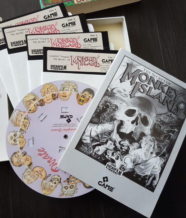
Bonus Monkey Island 1 (VGA) This one is quite boring. They didn't bother translating any of the text (not even the title! how were they supposed to know what the game is even called??) Again distributed by Dong Seo Game Channel. 90 or 91? who can say. Curiously the text is all misaligned, but otherwise the same as North American release. ₩20000 (Approx $15 USD not adjusted for inflation) The reference card is clearly a cheap photocopy. Disappointing. I'm surprised that they bothered with the full-colour printing of copy protection wheel. The manual is in black and white and very cheap. 4 high density 5.25" floppies. The manual contains full walkthrough (not a separate book like MI2). The solution to the insult swordfighting puzzle photographed here. -

International Release Big Box Differences (and Oddities?)
Jayel posted a topic in General Discussion
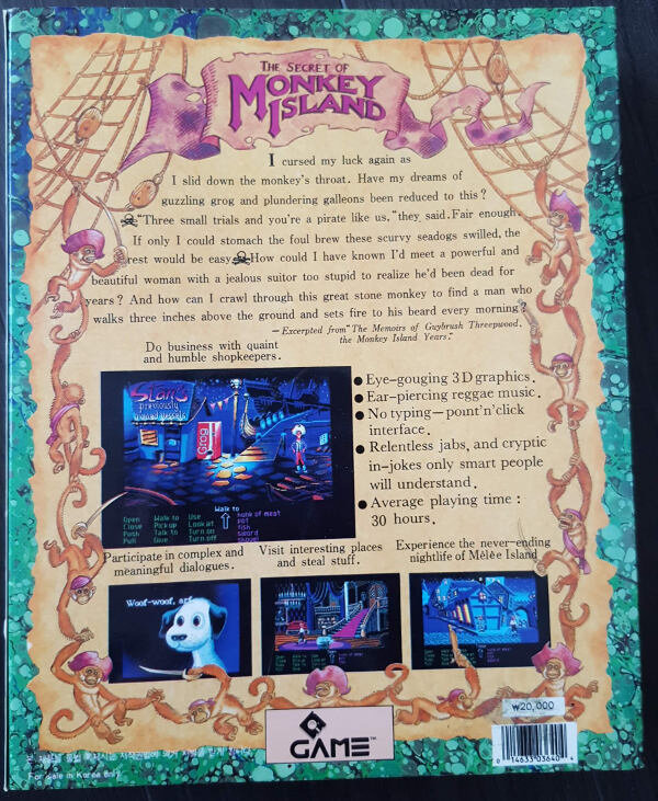
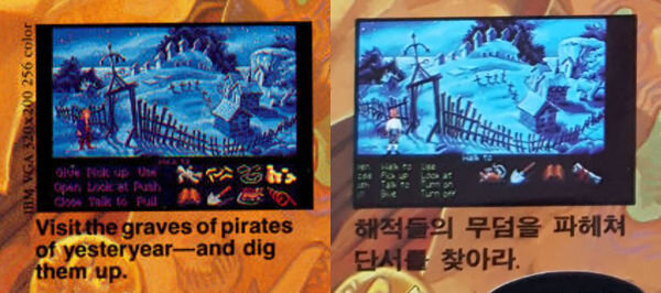
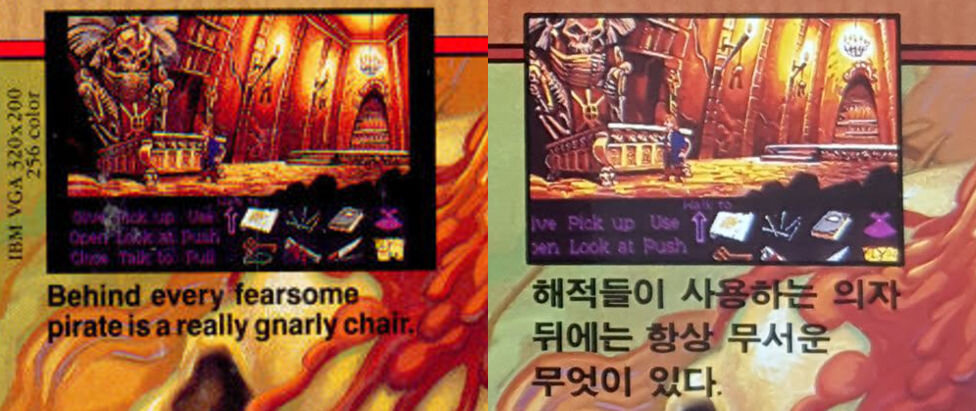
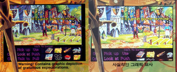
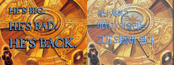
I saw that post about CMI cloth map which lead me to riffle through my Korean big box collection and figured hey, why not take some photos and post it here (since detailed look at international releases are hard to come by and I find it interesting). If you have other interesting international release(s) you want to share please feel free to post here! Monkey Island 2. One of my most prized possessions. The name of the Korean distributor is Dong Seo Game Channel. I don't know the exact release date... probably 91 or 92? I appreciate the font treatment. Back cover. ₩25,000 (approx $19 USD, not adjusted for inflation). Some interesting differences compared to North American release (which I'll go into later). The cover is actually a thin paper sleeve that goes over the featureless cardboard box. Reference card, printed on a thick, quality, textured cardboard stock. I like. The manual and Mix N' Mojo copy protection wheel. In offensive xerox-proof burgundy. Was it also burgundy in other regions? 6 high-density 5.25" floppy disks. Nothing unusual here. It says "Hintbook" but it's actually the whole walkthrough. Back in those days games almost never got localization treatment in Korea, so it was pretty common for an adventure game to ship with a full walkthrough. (the last paragraph in the walkthrough says that the joy of adventure games is figuring out on your own without looking stuff up. Now they tell me!) The back cover has pretty faithful translation by and large, but with some weird (sometimes inexplicable) differences: The first 2 lines are kind of adjectival? They loosely say "Arrogant" and "Disgusting". The "He's Back" part is the same. No, it does not rhyme. The excerpt has no source! Who's speaking?!? The bulletpoints are pretty dry and humourless. "Interactive Jamaican music" without the accent. "Separate mode for beginners and magazine reviewers" but written completely seriously. No "void where prohibited" (I guess the phrase doesn't translate well) Weird. Obviously the same screenshot, but it's cropped differently. The caption simply says "realistic graphics". Nothing about expectorations. Again, pretty humourless. Again cropped differently. "There's always something scary behind a pirate's chair"? Not quiet the same meaning, but fine... This one an odd one out. It's not uncommon for boxes or promotion materials to use work-in-progress screenshots, so I didn't think much of it, until I saw scans of the North American release, and it's completely different! Korean release uses a screenshot with MI1 interface and Guybrush. The caption says "Dig up graves of pirates to find clues". What clues!? I guess whoever translated it thought that it's too rude to dig up graves without a good reason or something. As far as international game covers go, not bad. The humour is completely gone, but nothing grievously misleading (I've seen worse) -
I didn't know CMI received official Korean localization until today! The first 2 games were released there but they weren't localized. I looked up some korean playthroughs and it's pretty jarring. In particular, Elaine uses "polite speech" towards LeChuck and Guybrush, while Guybrush uses impolite speech towards Elaine. Because of casual Korean misogyny I guess. (if you're not familiar with polite speech, it's a form of speech that exists in Korean and Japanese and maybe other languages as well, used towards elders, teachers, strangers, people you respect etc. I can't imagine Elaine using polite speech towards anyone, let alone Guybrush)
-
The new Scumm Bar has very different tone for sure. I always thought of it as warm and jovial place, in stark contrast to very blue and very empty dock, with upbeat music and pirates drinking and having fun. The new one appears to be a dark and brooding place. If it that art was used as a drop-in replacement in the first game it wouldn't work for me at all. It could be perfectly fine in the context of the new game.
-
Inventory combination, I could take it or leave it. I guess those puzzles are kind of like "skill check" because when you have a dozen or more items in your inventory, combinatorial explosion of possibilities make it difficult to solve accidentally, so the player really has to understand what they're trying to accomplish... but at the same I don't want to get stuck then waste hours combining everything with every other thing, or deal with frustrating limitations (eg "why can I combine nail and hammer but not nail and rock?"). I have enough faith in designers involved in ReMI so that I don't foresee it being an issue, but I doubt the game will be any lesser without it.
-
- 101 replies
-
- 15
-

-

-

-
Same... I grew up with VGA floppy version and never played the EGA version. It surprised me the other day to read that Ron doesn't like the VGA portraits. Have I been playing the non-director's cut all this time? I just started playing the EGA version last night (using Aaron Giles' excellent DREAMM) and I actually prefer the EGA backgrounds. The VGA version looks like somebody went hogwild with gradient fill and look almost amateurish (felt the same way about Loom VGA conversion). I think I might still prefer the VGA portraits though...


