-
Posts
1800 -
Joined
-
Last visited
-
Days Won
203
Content Type
Profiles
Forums
Events
Everything posted by Laserschwert
-
I would love to get an artbook for this game, both to see the evolution of the designs and to get a good look at some full backgrounds.
-
By the way, I *think* it might have been possible to get Norman Matt for those few lines, since he's a fan of MI himself. A few years ago I got him to do a few minutes of Guybrush narration for an audio-birthday-card I gave to a friend, which he was totally up to.
-
Only now I realize that his front piece of hair has the exact same shape as in that old art by Rex. Like 100% identical.
-
Something along those lines is still what I believe. The narrative framing à la Guybrush telling MI2 to Elaine. The scrapbook concept in the trailer just supports this even more.
-
Craig has already confirmed to me that it's not licensed merch, but going after them is like decapitating Hydras. I'm still in contact with them though, and they are still trying to come up with proof of their Mobygames-based source (which isn't possible). Best quote from them: Surely the words of an innocent man.
-
"Imitation" as in "not produced in 1990"? Yeah...
-
They still claim that they are based on their own restorations based on several Mobygames scans, but come on. I'm on vacation right now, so I don't have access to my files and Photoshop, else I'd put up comparisons. This is what I managed to whip up on my phone: The second one has a spot next to Guybrush removed on their version, but the palm tree at the top clearly shows a bit missing where my "The Secret of" has been painted out, plus some clone-brushed takelage where the MI logo was. Also the colors are way too close to mine to be a coincidence.
-
No idea if there's any possibility this was cleared by Lucasfilm.
-
Let's hope it's not this: Because these assholes are, again, using my old MI1 poster on their stuff.
-

Monkey Island Soundtracks – Album Covers
Laserschwert replied to BillyCheers's topic in General Discussion
Regarding the Special Edition soundtracks (from the retail version), I've augmented my playlists with a few tracks ripped from the game that weren't included: The Secret of Monkey Island - Special Edition: Monkey Island Main Theme (Menu Version) - A minimalistic version of the main theme, with a marimba (or xylophone?) instead of a flute playing the main melody. Monkey Island 2: LeChuck's Revenge - Special Edition: Monkey Island 2 Main Theme (Game Version) - A slightly different instrumentation of the main titles (most notably the bass line) Woodtick Suite (Extended) - Edited from the ripped music segments, I've tried to include each variation of the track (which the official track didn't) Chapter Screen - The same version as used in the SoMISE, but since it's used in this game as well, it should be included Indiana Threepwood - The short quote of Williams' Indy theme wasn't used on the official "album", probably because of copyright issues LeChuck Interlude - LeChuck's appearance in the Underground Tunnels, but as a separate cue All tracks can be found HERE. -

Day of the Tentacle Remastered physical editon by LRG
Laserschwert replied to Sopabuena's topic in General Discussion
The above image for the PC version says "PC Game & Original Soundtrack" above the CD, which suggests this to be a data CD. So maybe the soundtrack is just a bunch of MP3s on the disc. Both the PS4 and XBox versions have "Original Soundtrack" written on the CD cover, which on the other hand sounds like it's an audio CD. Confusing. -
To be fair, I think only CoMI had different tunes per title card, so that would be really repetitive. Speaking of which, I really hope (and am quite confident) that they'll vary the cue for each chapter card in RtMI.
-
THE MUSIC!!! AAAHHHHH!!!!
-
A great hour-long interview with @Dmnkly, over at Laura Cress' Twitch channel: https://www.twitch.tv/videos/1527971822?t=63m55s Poor Dom, dying to talk more about RtMI 😄
-
So the secret was never about Monkeys, but about a Frenchman looking for "Mon key!"
-
-
I'm sorry.
- 3913 replies
-
- 16
-

-

-

-

-

-

-
You mean like this? (Made by Jason Lewis)
-
I'm still convinced that the framing of the game is Guybrush narrating his adventures. The scrapbook in the trailer supports this theory, so I guess with Guybrush making stuff up, changing stories, etc. the timeline of the games is very much in flux throughout. Somehow like most of MI2 being told by him to Elaine, but dialed up to 10.
-
Tales was a good example of stories that could be told outside of the actual island of Monkey Island.
-
Let it go.
-
What do we think of this? Just marketing messing up?
-
The latest Mojo article states that the trailer mentions (twice) that The Secret will be revealed in this game. But actually, it doesn't. The narration said that Guybrush "finds" the Secret, the on-screen text says that it's "waiting to be discovered". Maybe this is nitpicking, but there might be ways for Guybrush to find the Secret, without revealing what it really is...
-
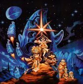
Keyart in UHD: EDIT And in portrait orientation:
-
I still hope that they somehow coughed up enough change to get some live orchestra recordings in there. If Broken Age can do it, Monkey Island should the hell do it even more so!


