.png.27778bd189063ef176c68042f0c9300a.png)
Jake
-
Posts
2647 -
Joined
-
Last visited
-
Days Won
102
Content Type
Profiles
Forums
Events
Everything posted by Jake
-
 It’d be worth it for a specific type of nostalgia because so many people played the game with that sound chip, and it’s the sound they associate with 90s PC gaming (I am one of those people). Hearing this sounds like coming across a “lost” version of the score, it’s really cool. (That said, it’s worth pedantically pointing out that the composers composed on, optimized it for an MT-32. Or at least I’m 99% sure that’s the case. So this wouldn’t actually be a “lost restoration,” more of a “what if?” situation.) I’d love to hear more!
 -
I wonder if it’s a process test thing? To my eyes the top one looks fully painted, the bottom one looks like markers or water colors. Maybe the bottom one gives a good not approximation of the top one, but was quicker to produce? The other reason might be, it’s not a crop but is a stretch - the top and bottom of the compositions are the same but one is taller. Maybe the original painting was done at “square pixel” aspect ratio and the second one was done at the true 320x200 full screen 5:4 tall pixel aspect ratio? Those are my two theories at least 😛
-
That’s cool! Wish the PDF had been exported at higher res. Wish the real print was one was available digitally somewhere.
-
I really like the machinegames Wolfenstein games, they are good at making pulpy action adventures where you beat up a bunch of ridiculous nazis who are up to absurd genre-influenced shenanigans. Seems like a good fit. I love a first person single player campaign too so I’m looking forward to that. It’d be cool to see an Indy game in the exact mold of Uncharted or Tomb Raider but I’m also glad that they’re trying to differentiate themselves from that.
-
Hey it is!
-
Is it somehow related to this https://en.m.wikipedia.org/wiki/Great-circle_navigation
-
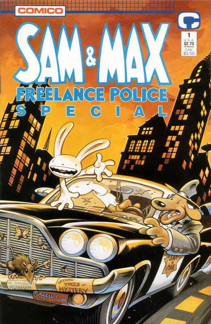
Telltale's Sam & Max games getting remastered
Jake replied to Udvarnoky's topic in General Discussion
Mojo Has Fallen -
Yeah, I noticed and appreciated it . The SCUMM version has some embellishments with extra angles and swoops added in places, probably in part to make it read more dynamically as a pixel art font, but is definitely Lithos-inspired.
-
Love to see they used Lithos for the title of the Fate of Atlantis comic. Thats clearly the typeface that inspired the MI2/FOA-era SCUMM font used in the credit sequences.

-
I’ve always enjoyed how vibrant your rendition of the MI2 box is, but that is definitely looking closer to the original.
-
Telltale's Sam & Max games getting remastered
Jake replied to Udvarnoky's topic in General Discussion
It’ll be good. -
Telltale's Sam & Max games getting remastered
Jake replied to Udvarnoky's topic in General Discussion
yep it keeps hypnotizing her and is why she’s holding the audience hostage I think (I should know this) edit: oh I see there is what looks like an earlier version of the bear in some shots. Is that what you mean? The final game has the blue one seen in some images here. -
It seems like Ron had some scenes and moments and a vibe that existed concretely in his head for the third game, and beyond that not much else other than the confidence that chasing those ideas would result in a good game. My guess is that’s how he started on the previous two and it’d worked out well. Not everyone works by plotting out all the details of their world in advance, and basically no one works by figuring out a bunch of symbolism and “what it all means” before putting pen to paper* - interpreting a work is usually a fan or critic’s job - so it seems very likely that nobody knew the answers to these things until the next game was made. *I’m aware that people like Tolkien and Lucas seem to work this way, and their process is legendary among nerds like us, so people who are into nerdy things think that their worldbuilding-and-symbolism-first approach is a normal way to tell a story, but at least historically it’s actually highly irregular!
-
We keep meaning to but life has gotten in the way. It’s be fun to hang out in melee again so we should do it soon.
-
The sterner expression was mostly a telltale era thing. Sam with his mouth closed existed in a lot of Steve drawings around that time. But usually he’s more like
-
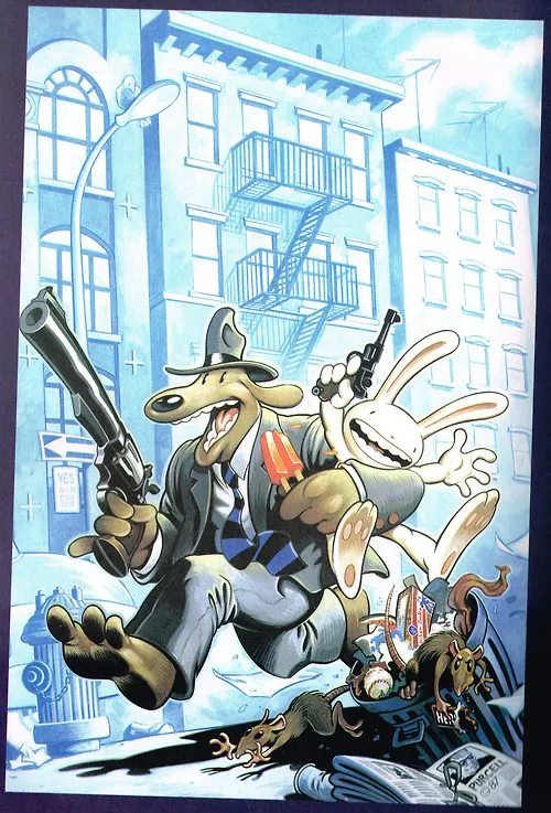
Such a good cover!
-
Telltale's Sam & Max games getting remastered
Jake replied to Udvarnoky's topic in General Discussion
Same! Season 3 has been a significantly more rude game to remaster, technically. It did things with the Telltale Tool that are basically unsupported in modern versions that use a more modern rendering pipeline. We have conscripted three ex-Telltale engine/graphics programmers to help bend the modern engine to our will, but it has taken a lot of annoying and uncertain experimentation. -
Does the writers cut of Return to Monkey Island have a scene where Eowyn makes Aragorn a gross-tasting soup? If so, I wouldn’t play it.
- 706 replies
-
- 1
-

-
- return spoilers
- late game
- (and 1 more)
-
👕 I beat #MojoleXtreme #551 and all I got was this stupid t-shirt. 4/6 🖤🖤🖤🖤🖤💚 🖤💛🖤🖤💛💚 🖤🖤🖤💚💚💚 💚💚💚💚💚💚 https://funzone.mixnmojo.com/Mojole/
-
That fake DOTT box is fantastic.
-
Anything that depends on animation timing needs to have the voices early, not late. Depending on a games specific needs and production pipeline, voice can happen in many points in production. Odds are good they did all 3 chapters of this a long while back though. My guess is content for an MMO like this needs a lot of testing before release.
-
Not sure if this is a deep-cut joke or not, but in case it’s not: Hercules is an old 1-bit graphics standard that some of the older games supported, for a black and white mode.
-
Is that approximately how Return places it too? I always read it as being behind the church like that.
-
a comprehensive collection of all LucasArts background art (1987-2000)
Jake replied to JPL's topic in General Discussion
I’m friends with the guy who made the Winamp skin museum and Webamp (Jordan Elderedge) and can put you two in contact if that’d be useful. -
🤷♂️ I beat #MojoleXtreme #495 and all I got was this stupid t-shirt. 4/6 🖤💛💛🖤🖤💚 💛💛🖤🖤🖤💚 🖤🖤💚💚🖤💚 💚💚💚💚💚💚 https://funzone.mixnmojo.com/Mojole/