Laserschwert
-
Posts
1802 -
Joined
-
Last visited
-
Days Won
203
Content Type
Profiles
Forums
Events
Everything posted by Laserschwert
-
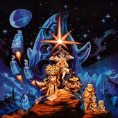
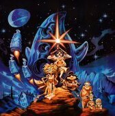
I've added 5 color variations of the Fate of Atlantis map to the project.
-
As long as you credit "LucasArts Posters" and add the link poster.mixnmojo.com below each image, I'm fine.
-
A Conversation with Matthew Alan Kane, George Sanger, Dave Grossman, Greg Hammond, Vince Lee, Alexandra Boyd, James Hampton, Larry The O, Peter McConnell, Clint Bajakian, Michael Land, Steve Purcell, Mark Ferrari, Ron Gilbert & more (Updated: May 18th)
Laserschwert replied to danielalbu's topic in General Discussion
Not even war can stop Daniel from delivering the goods. Great stuff, as always! -
The poster.mixnmojo.com URL is giving an "unsecure connection" error right now. Any chance to fix it? Edit: And it's back. Thanks!
-
Well, that's a lot of material! I haven't thought about using Displate as an image source. I hate them with a passion, as they allow countless sellers selling my posters there, as long as I can't prove I own the copyright (which I obviously can't). It's just weird that they don't need to prove that THEY own the copyright to sell them. Ah well, at least now I don't mind taking images off of their site for the project. The Rebel Assault one is a great version of the full art, so I might give that a shot. Heritage Auctions is always a good source, and my TIE Fighter poster is already based on one of their auction photos. By now I've got my hands on the original rendering for it though, so sooner or later I'll update that anyway.
-
So they released only one game before being in trouble again?
-
The Legend of Monkey Island (Sea of Thieves)
Laserschwert replied to Gins's topic in General Discussion
Has anybody here tried to rip the music from the three LoMI chapters? I know there are a few rips on YouTube, but ideally I'd like to have them not-recompressed. Since I don’t have the game (nor do I want to), I hoped someone here has done it. -
I've finally added the new Outlaws poster to the thread. Unfortunately, I don't know who painted the artwork. Any idea? Edit: Kevin Schmitt, one of the designers on the game, suggests it was painted by (lead artist) Adam Schnitzer.
-
- 657 replies
-
- 13
-

-

-

-
Actually, you can also buy it on Qobuz, and not just stream it. Even in lossless, which the other platforms don't support (I think?)
-
About that, almost done:
-
Well, you can see the playlist here: But I haven't had time to inspect it closer.
-
And there it is: This is releasing tomorrow, and can be pre-ordered, for example, here: https://www.qobuz.com/nz-en/album/return-to-monkey-island-michael-land-peter-mcconnell-clint-bajakian/yner99r4v2o2b It's been condensed down to roughly 70 minutes, which is rather good for a single-CD release, but I wonder what was left off for that. But either way, the first actual official soundtrack release for a Monkey Island game!!! (well, ignoring the SE soundtracks on the retail DVD)
-
The cover even says "Original floppy version on CD-ROM" 😉 null There are fan-made patches for most LucasArts games that patched the German subs into "better" versions of the games, so I guess it was just one of those versions. https://www.la-patches.de/patches.php
-
Thanks for the offer! I already have a few scans for SWOTL, but none of them are really clean. If you manage to make a good quality scan, I'll happily take it. My current best quality version of the artwork is the one featured on The Adventure cover, which I've already started cleaning up, but the box might provide some more detail for some parts: And the logo is pretty much done as well: "Their Finest Hour" is more problematic, as the quality of the art on the boxes is really bad. I got a photo of the original painting hanging at Larry Holland's place, but he stopped replying to my mails, so I guess he's not interested in supporting the poster project. The logo is done, though (with high-res assets - minus the Swastika):
-
By the way, I'm pretty sure there was no German version of "Fate of Atlantis" with English voice. The talkie version was never released in Germany. Can somebody back this up? Anyway, it's a separate case that would require another color in your chart 😉
-
These are great. I should really start working on those international logos and add them to the poster project.
-
Regarding the code wheel, anybody got clean 600dpi (at least) scans of each wheel?
-
Quicker than expected, I've added the new Last Crusade poster to the main post (in 6 different flavors).
-
I know, AI is a controversial topic, and for many things, I'm really hesitant towards it as well. But when it comes to image restoration, it feels like it's a blessing. Will it bite me in the ass in the long run? Let's hope not! With the help of AI, I was able to reconstruct the Last Crusade box background image (a blurry desert shot, for which I never found the original source) a lot faster and cleaner than before. Furthermore, I've utilized the original promo photo of Ford and Connery, extending it ever so slightly on the right side via AI (the original photo ends pretty much where it does on the original box). Of course, there's still a lot of manual clean-up, masking and color-correction involved, so thankfully this hobby is still giving me something to do. Edit: I've included the sources I've used for the logo, a floppy scan from the LC Action Game (utilizing the same INDY logo as the Adventure Game), and the FM Towns version, for the full logo. Both found on Mobygames (scans by Servo and hoeksmas). The original box scan was provided by TomVDJ years back in this thread. The next step will be adding the marbled paper frame and building several different versions of the poster. Edit: What the hell, here goes. With the tagline rebuilt from scratch (That's "Matrix II Bold" at 45% width, by the way):
-
I've got a similar one as a gift from a German LucasArts fan with a knack for designing custom big boxes (he offered one to me, since he used my restoration). I think he came up with the design first and the guy above just expanded on the idea (by, well, stealing it). This is the one I have: He also designed this one: They are both empty though (and he only ever sold them at cost, not to make money off of them). Is it presumptuous to assume that our mini-run of MI SE boxes (as seen above left) kicked off several more of these kinds of projects? At least I can't say I've seen many custom big boxes including goodies appear online before that.
-
DREAMM 2.1 beta (now with Linux support)
Laserschwert replied to Aaron Giles's topic in General Discussion
Damn, you're on a roll here! -
Sam & Max Hit the Road - Remastered Soundtrack
Laserschwert replied to Laserschwert's topic in General Discussion
Ah what the hell, here's another one: -
Sam & Max Hit the Road - Remastered Soundtrack
Laserschwert replied to Laserschwert's topic in General Discussion
And it's been updated. -
Sam & Max Hit the Road - Remastered Soundtrack
Laserschwert replied to Laserschwert's topic in General Discussion
You might have noticed that that's my YT channel 😉 Anyway, that arrangement takes a few liberties too many though. Should I do a remastered soundtrack, I'd like to stick at least a bit closer to the original track. Edit: Cheeky bastard 😀