Laserschwert Posted September 26, 2010 Author Posted September 26, 2010 The primer layer is layed out to work specifically with the image underneath. As you can see in the BIG PREVIEW the radial brush strokes are centered on the wind machine, whereas they are a little more "swirly" in the sky and the ocean. It's not supposed to follow any details of the image, but to provide an interesting base texture.
the late D. Hurley Posted October 12, 2010 Posted October 12, 2010 so on how many projects are you currently working, if any at all? (some people on the internetz have a RL too, laserschwert might even be one of them O:)
Samnmax221 Posted October 12, 2010 Posted October 12, 2010 I'm the only real one here. Everyone else is a figment of my imagination.
Laserschwert Posted October 12, 2010 Author Posted October 12, 2010 Actually that's what I'm working on right now :-)
Hellbeard Posted October 13, 2010 Posted October 13, 2010 I'm pretty sure that mixnmojo has more super-talented posters than any other video game forum on the net. Amazing work.
ricds84 Posted October 13, 2010 Posted October 13, 2010 To Laserschwert and the rest of you, Thank you so much for all the work you've been uploading for all of us. It's unbelievable. It truly is. I'm amazed by your work. I couldn't thank you enough. THANKS A MILLION!!!!!!
Snugglecakes Posted October 13, 2010 Posted October 13, 2010 I'm pretty sure that mixnmojo has more super-talented posters than any other video game forum and many game studios!
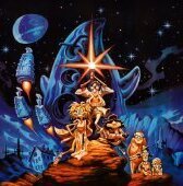
tewo Posted January 29, 2011 Posted January 29, 2011 Just got my hands on this from a cast member of grim fandango! Original One sheet poster. I bet you guys didn't think this existed =) any word about this one? it seems nowhere to be found
Laserschwert Posted February 6, 2011 Author Posted February 6, 2011 It looks like the recent forum crash deleted the posts and edits of the last few days. I've added the Grim Fandango poster back to the opening post, and also a few more new posters:
Jake Posted February 6, 2011 Posted February 6, 2011 any word about this one? it seems nowhere to be found I've seen one of those before, hanging in the Telltale office.
Benny Posted February 7, 2011 Posted February 7, 2011 Many thanks to Chaosman and Laserschwert for the Grim Fandango one. That one will deffo be getting made into a poster. Brilliant stuff.
Laserschwert Posted February 7, 2011 Author Posted February 7, 2011 I just fixed a little error in the upper right corner of the logoed MI4 poster (seems to be my blind spot) and updated the link. You might want to re-download... or not. Edit: Damnit... the "Escape from"-line wasn't centered properly... fixed as well.
Samnmax221 Posted February 8, 2011 Posted February 8, 2011 It looks like the recent forum crash deleted the posts and edits of the last few days. I've added the Grim Fandango poster back to the opening post, and also a few more new posters: I love you so much, if I only had the wallspace.
RobMegone Posted February 8, 2011 Posted February 8, 2011 Copying this over from the ScummVM forums to gather interest from the mojo crowd: I've been collecting graphics for a remake of the 'Last Crusade' adventure game cover. I have enough artwork to reproduce the logo at a nice resolution('INDY' + 'INDIANA JONES and the Last Crusade' Texts). I put this through vectormagic and have a decent clean logo but I am struggling to reproduce the gradient used on the original texts. I have no idea what the texture behind the actors is. While the cover is not painted and not as nice as the others, I wanted to gather interest in this before I spend money on a poster I found which has a higher quality version of the photo of Sean Connery and Harrison Ford that was used for the game cover. I would scan this in as a base for the other art. The original game cover can be seen here http://images-mediawiki-sites.thefullwiki.org/08/1/3/0/40428883295023756.png The poster I am considering buying is here http://www.nexussix.be/SITE6/P1010471.JPG at 40x60CM I would buy this and have it scanned for the purpose of re-creating the LC cover at a higher resolution. Though, that said, recently this high res digital copy of the photo showed up online, is that good enough for a reproduction? http://img222.imageshack.us/i/1258927052110.jpg/ at 2010x3000 I'd like the poster but can only justify this if there are others that would like it too.
Laserschwert Posted February 8, 2011 Author Posted February 8, 2011 To be honest, I never liked that boxart. That being said, I'd say the high res copy of the photo should be good enough to recreate the cover.
Laserschwert Posted February 13, 2011 Author Posted February 13, 2011 I've added "The Neverhood" and "Gobliins 2".
SecMan Posted February 17, 2011 Posted February 17, 2011 <delurk> First of all would like to thank Laserschwert for all the hard work that's been done here! Today I received two framed 30x40cm posters from PosterXXL, the detail in the posters is outstanding but unfortunately they have been printed out far too dark. Taking a photo, even with the flash off, doesn't really show how dark they are in real life. Sorry for the poor quality photos but hopefully its enough to see what I mean. The MI2 one is just about right with the correct lighting in the room, but the MI3 has come out the worst (ironically since it looks the brighter of the two original images). A couple of photos with the flash on make them look so much better: May have to experiment with sending a brighter image to them next time.
sinus Posted February 17, 2011 Posted February 17, 2011 just got 2 prints from posterjack - no problems whatsoever ...
Laserschwert Posted February 22, 2011 Author Posted February 22, 2011 May have to experiment with sending a brighter image to them next time.The photos taken with the flash look perfectly fine to me... stupid thought: Maybe your room is simply too dark?
sinus Posted February 22, 2011 Posted February 22, 2011 yeah well. maybe it's because these prints don't glow like computer screens so you could get the impression that they're too dark!?
SecMan Posted February 22, 2011 Posted February 22, 2011 Nah they were definately dark prints, got two new prints from posterjack today and they look MUCH better, can actually see stuff now. Will try get a comparison photo or two up. EDIT: Photos below. Excuse the bad photos again, taken with a camera phone. They don't really do the new prints justice, but they do show the difference between the two. PosterXXL on the left, PosterJack on the right. I thought at first the MI2 poster was maybe a tad too bright, but compared it to the original JPG and it appears spot on. Also got a MI1 print from Posterjack while I was at it.
Recommended Posts
Archived
This topic is now archived and is closed to further replies.