Lexxbomb Posted February 24, 2012 Posted February 24, 2012 well they should have gone with the above because it isn't over the top and has a somewhat more professional look... also it would probably appeal to more players... it also matches the original image more...
Laserschwert Posted February 24, 2012 Author Posted February 24, 2012 more professional look Really, really not. The cartoony version (while still not great) at least looks like what's in the game, the version that was used looks like some mediocre fan art.
Thrik Posted February 24, 2012 Posted February 24, 2012 Wait, am I missing something? The one Lexxbomb posted isn't the official art is it? At least, that's not what appears in my Steam. I certainly prefer the more exaggerated version Laser just posted to the one I'm familiar with — which is also cartoony, but like the characters' souls were sapped out of them or something.
Laserschwert Posted February 24, 2012 Author Posted February 24, 2012 I think you're referring to this version: And it looks like Lexxbomb made some edits to the image, like Guybrush's face, LeChuck's face and beard, the monkey...
Snugglecakes Posted February 26, 2012 Posted February 26, 2012 Of course, that's not your fault, it looked terrible to begin with (although putting Purcell's Guybrush face in there doesn't really help). And I still don't understand why they used that version (which looks like they couldn't decide whether they want a "realistic", or a cartoony look for the characters), when they already had a cartoony version, which looked much more consistent: I might be shot, but Lexxbomb's poster is, apart from needing a good cleanup, by far the best version I've seen, but a massive, huge, enormous chasm of a margin. LeChuck has a beard. Not a lego beard kit. And Guybrush looks like Guybrush. I don't see this being a bad thing. This is the first time I've seen SE cover art that vaguely resembles anything I can take even halfway seriously. It makes me want to play the game, not get my 4 year-old to play it for me. Love it, but none of these have anything on the original, and in my opinion, only art worthy of gracing MI2.
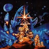
Laserschwert Posted February 26, 2012 Author Posted February 26, 2012 I've added Big Sky Trooper: Does anybody know, who painted it?
Lexxbomb Posted February 26, 2012 Posted February 26, 2012 I cant' take credit for the changes... all I did was blow the image I found up to poster through Gimp... image I used came from http://www.lucasforums.com/showpost.php?p=2715698&postcount=294 The reason I wanted a SE one was to go with my The Secret of Monkey Island SE... the original didn't matchup well colour wise... heres a pic of the 2 new ones next to each other printed at 16x20 inch... excuse the reflections the best I can do is
Laserschwert Posted February 26, 2012 Author Posted February 26, 2012 Still, I don't understand why you upscale them this way... it makes really no sense, as the quality doesn't get any better by that. If you'd print just the original small image, it'll just look just the same. Also, the image is stretched horizontally (or squished vertically), so that can't be used anyway. Sorry if I sound too bitchy here, I'd just like to keep a certain level of quality for the project
Alexrd Posted February 26, 2012 Posted February 26, 2012 Still, I don't understand why you upscale them this way... it makes really no sense, as the quality doesn't get any better by that. If you'd print just the original small image, it'll just look just the same. Also, the image is stretched horizontally (or squished vertically), so that can't be used anyway. I was about to say the same. The image is stretched and there is some macroblocks due to upscaling.
Lexxbomb Posted February 26, 2012 Posted February 26, 2012 well given it seems to be impossible to find good quality original images...the above was created from 3 source images...if you guys can find and do better then by all means...I only posted it as an example of what I can do...given people seemed to think I was the author of the LeChuck SE image.
Snugglecakes Posted February 27, 2012 Posted February 27, 2012 Lexxbomb I think the point is, those images would print just as well, if not better, without the upscaling. The original size image would be crisper. Not commenting on the quality of your work but upscaling kinda ruins it. It's like when people take crappy mobile phone videos and resize them to 1080p, and then upload them to YouTube claiming it's an HD video. They should be shot!
Lexxbomb Posted February 27, 2012 Posted February 27, 2012 don't worry... im not taking it negatively...it really does depend on the software the printer uses to upscale images...the reason I scale images up was that at uni I was told that generally the upscaling algorithyms (sp?) used by printers were not as good as image edditing software - basicly for printing puropes it was actually better to print at images native resolution...ie less printing errors... maybe the Digital Media guy had it wrong... wouldn't be the first time... thanks for the advice...
Thrik Posted February 27, 2012 Posted February 27, 2012 I think it's actually Windows that upscales, but you are right in saying that some gains can be made from upscaling using specialised software. Photoshop's upscaling algorithm is generally considered excellent, and there're also additional parameters that can be used to produce a slightly sharper image (not much different to using an unsharp mask). With that said, the quality is still going to be a far cry from the kind of masterpieces Laser has been putting together as his sources tend to be high quality and he does a lot of hands-on work to get them looking great. It's that hands-on work and restoration that has really made this thread special, particularly with pieces like the MI1 box art that had the the logo removed and the Grim Fandango mural that was previously only available creased on the inside of the CD insert. I think if you've got no other option or the time to do a more thorough upscaling job it's acceptable to just do a basic upscale, but the results are going to be negligibly better than just letting your printer software/Windows handle it and most people can probably do that themselves.
Udvarnoky Posted March 1, 2012 Posted March 1, 2012 Laserschwert's work received some deserved attention here.
Laserschwert Posted March 2, 2012 Author Posted March 2, 2012 Although it's nice, I don't really see why they include all the links there as well... most of the download links don't work anymore anyway, and a link to Adventure-Treff.de would've been more sensible. So it appears more like a hastily put together cut-and-paste article. But I appreciate the warm words, of course...
pollila Posted March 9, 2012 Posted March 9, 2012 Hello, I am one of the artists who worked on the Indiana Jones and the Staff of Kings game cover, we also did the Nintendo Power cover below it. I just was browsing your forums and saw the artist listed as unkown.... you can list our illustration studio as the artist, PicturePlane Imaging. our website is pictureplaneimaging.com Thanks! Great website you got here!!!
Laserschwert Posted March 10, 2012 Author Posted March 10, 2012 Hey, thanks for the info! I've added it to the opening post. Also you did a fantastic job at matching Harrison Ford's likeness for these (and I guess the other promo shots for the game as well). It's a shame the game itself was so crappy.
Baja Posted March 10, 2012 Posted March 10, 2012 Is there a consensus with regards to the best service to get some of these printed that cater to the U.S.?
Samnmax221 Posted March 11, 2012 Posted March 11, 2012 Is there a consensus with regards to the best service to get some of these printed that cater to the U.S.? Posters XXL did both of the ones I had printed very well, so I don't see any reason not to use them again.
N3mo Posted March 22, 2012 Posted March 22, 2012 The Grim Wall Mural! )))) I'm smiling like a child. Thank you Laserschwert
whipwarrior Posted March 31, 2012 Posted March 31, 2012 I nabbed my FOA poster in a bidding war on eBay back in the late 1990's, long before the 'Buy it now' option existed. It wound up costing me about $90+ shipping, plus a small fortune to have it custom framed. Anyway, here's my hard-won FOA one-sheet with a few other Atlantean treasures:
Recommended Posts
Archived
This topic is now archived and is closed to further replies.