Lagomorph01 Posted June 7, 2009 Posted June 7, 2009 Wow, that's really awesome Laserschwerts. Bill Tiller personally sending his artwork. We're really making a good impression as a fan community!
Laserschwert Posted June 7, 2009 Author Posted June 7, 2009 Bill Tiller personally sending his artwork. We're really making a good impression as a fan community! Well, I had to beg him a while Actually he was on board as soon as I told him about the poster-project. But it took a while, as he had to search through all his backup DVDs... as it turned out, it was on an old PC that he hasn't been using for a while. He's quite busy now with "Ghost Pirates of Vujoo Island", so it came as a surprise to me finding the file in my inbox.
Kenko Posted June 7, 2009 Posted June 7, 2009 Love your posters, they are awesome! Do you have any plans of making a SMI poster without the logo?
ThunderPeel2001 Posted June 7, 2009 Posted June 7, 2009 If only he has artwork of all the original scans of the Purcell's MI2 background... Oh to frame those!
Kenko Posted June 7, 2009 Posted June 7, 2009 A sketch of the MI1 cover art was posted on this blog: http://spudvisionblog.blogspot.com/ I think it is Purcell's official blog.
fizzymitsu Posted June 7, 2009 Posted June 7, 2009 I think it is Purcell's official blog. It is, he says he plans on showing the new art for ToMI in stages on his blog. Which is really cool cuz we will get to see the artwork come to life before our eyes.
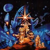
CHAOSMAN Posted June 8, 2009 Posted June 8, 2009 Just got my hands on this from a cast member of grim fandango! Original One sheet poster. I bet you guys didn't think this existed =)
elTee Posted June 8, 2009 Posted June 8, 2009 That thing is excellent - don't suppose you'd like to scan it for Laserschwert?
Laserschwert Posted June 8, 2009 Author Posted June 8, 2009 That thing is excellent - don't suppose you'd like to scan it for Laserschwert? Pretty please?
Kenko Posted June 8, 2009 Posted June 8, 2009 I noticed that Spaff used a different MI2 image for his canvas. (#115, page 3) The image he used is bigger, look at this comparison: The left one is a little wider, but it looks cropped at the bottom and top. Laserschwert, did you make the right one as well? If you did can you please upload it?
Kenko Posted June 8, 2009 Posted June 8, 2009 Thank you Too bad it doesn't have the same high quality as yours. BTW, do you think you could do a no-logo version of the SOMI poster?
elTee Posted June 8, 2009 Posted June 8, 2009 Hmmm... something weird here - on the Bounty pack box there's more to LeChuck than is seen on the MI2 box... which doesn't make sense because Purcell painted it as it is. See what I mean here - the rail of the ship isn't there. This image extends to his left leg on the underside of the box as well. Odd!
Laserschwert Posted June 8, 2009 Author Posted June 8, 2009 Hmmm... something weird here - on the Bounty pack box there's more to LeChuck than is seen on the MI2 box... which doesn't make sense because Purcell painted it as it is. See what I mean here - the rail of the ship isn't there. This image extends to his left leg on the underside of the box as well. Odd! Yeah, but it looks more like a half-ass clone-brush job. Thank you Too bad it doesn't have the same high quality as yours. BTW, do you think you could do a no-logo version of the SOMI poster? It's not that easy without any material for the stuff that's under the logo:
Kenko Posted June 8, 2009 Posted June 8, 2009 Looks good this far. If we are lucky Purcell might post some more pictures on his blog.
QueZTone Posted June 8, 2009 Posted June 8, 2009 thing is i think the composition will be out of balance without new content at that area.... That Grim Fandango poster is truely amazing, CHAOSMAN, could you pleaaaaaaaase supply Laserschwaert with the appropriate scanned material? It's so cool!
Laserschwert Posted June 8, 2009 Author Posted June 8, 2009 Yeah, plus there's nothing in the sky.. but once it's clean I'll add some clouds to the sky to see how that looks.
Kenko Posted June 8, 2009 Posted June 8, 2009 Yeah, plus there's nothing in the sky.. but once it's clean I'll add some clouds to the sky to see how that looks. Yeah, some cloud should even the balance. Perhaps something like this:
ThunderPeel2001 Posted June 8, 2009 Posted June 8, 2009 I like it with the original sky. I now it's a lot of "nothing" but it looks more interesting as artwork without the logo, if you ask me. Anyhoo, I had a quick go at the palm trees for you. (A step in the right direction, but not quite perfect.)
Laserschwert Posted June 8, 2009 Author Posted June 8, 2009 Almost there... only a few parts of the palmtree are missing... I guess I'll fill it in similar to you, using the other tree. Furthermore a quick test with some clouds... although maybe they look too real to match the painting? Don't know...
RobMegone Posted June 9, 2009 Posted June 9, 2009 Its looking flipping excellent! I'll have a quick look at my boxes to see if I have any more of that tree Edit: Sadly I dont have anything that might help fill that tree in. I guess the best bet is to try and fill it in from the other trees The image here might be a decent guide to what it is supposed to look like. http://mixnmojo.com/galleries/gallery.php?gallery=304&image=3836&goback=http://mixnmojo.com/features/read.php?article=lectrip2001 Also I quite like the clouds
spiralout Posted June 9, 2009 Posted June 9, 2009 Wow, the clouds fit in great. You're really talented, Laserschwert.
Laserschwert Posted June 9, 2009 Author Posted June 9, 2009 The image here might be a decent guide to what it is supposed to look like. http://mixnmojo.com/galleries/gallery.php?gallery=304&image=3836&goback=http://mixnmojo.com/features/read.php?article=lectrip2001 Also I quite like the clouds WOW! This is the first time EVER that I'm seeing a photo of the real painting (or possibly a print, but still)... and it was here on Mojo all the time! Plus, I think my clouds look a bit similar... Should I do some color correction to make it match the original better? The one with the logo too?
Recommended Posts
Archived
This topic is now archived and is closed to further replies.