elTee Posted November 27, 2023 Share Posted November 27, 2023 With reference to this thread, and specifically this comment by Laserschwert, I decided to try running some of the localised game titles through Gigapixel AI and then merging them with Laser's cleaned posters from this thread as a proof of concept. I did a VERY lazy cut out of the text, and you will note that the Hit the Road title clips over the bottom because I just matched the position to the box, but I think the results are surprisingly promising! It will be interesting to see what these might look like when handled by someone who really knows what they're doing 3 Link to comment Share on other sites More sharing options...
rhin Posted November 29, 2023 Share Posted November 29, 2023 Hello I made a remaster of the Indy Fate of Atlantis comic cover. It's made with Stable Diffusion Inpaint, Upscale and Gimp, it's not quite original anymore but I couldn't get it any better, so if you like it... https://picr.eu/images/2023/11/29/Rbnfk.jpg Greetings rhin 2 Link to comment Share on other sites More sharing options...
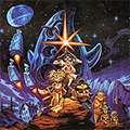
Felipe Posted November 29, 2023 Share Posted November 29, 2023 Just registered to say THANK YOU to @Laserschwert for this amazing work. I remember reading many years ago in (I guess) a different forum about this grim fandango movie style poster, and I think you were trying to scan it (your username does ring a bell). I eventually purchased one from ebay, but when you finally uploaded the scanned and clean version.... it was incredible. Now seeing all this amazing artwork available it just mind blowing. Now, a few things if I may. I read that you are (or were) updating some of the posters using better software, replacing the (I think) brush effect or something like that. Any chance you might do that with The Dig poster? The one with the text at the bottom that looks like a movie poster. I'd love to have that one printed and framed (like my Grim Fandango poster) and the difference between the old and updated posters is huge. Second, that movie style The Dig poster, do you have only the scanned image? Or like...photoshop elements and things like that? I'd like to try to make a mix between that poster and the one with the three astronauts. I like the astronauts art better actually, so adding the movie like text would be perfect. Finally, I found this image that also looks like it could be an incredible poster if someone could get a better quality of it. Thanks A LOT!!! Link to comment Share on other sites More sharing options...
Laserschwert Posted November 30, 2023 Author Share Posted November 30, 2023 I continue working on new versions of the DIG posters on and off, but especially the main art is really difficult to upscale, since it's so detailed, and I don't want to lose too much of that. The advertisement art is coming along nicely, though. 2 Link to comment Share on other sites More sharing options...
Felipe Posted November 30, 2023 Share Posted November 30, 2023 4 hours ago, Laserschwert said: I continue working on new versions of the DIG posters on and off, but especially the main art is really difficult to upscale, since it's so detailed, and I don't want to lose too much of that. The advertisement art is coming along nicely, though. is the second one different from the ones that are already finished? or is it the same without the logo? Link to comment Share on other sites More sharing options...
Laserschwert Posted November 30, 2023 Author Share Posted November 30, 2023 4 minutes ago, Felipe said: is the second one different from the ones that are already finished? or is it the same without the logo? It's a newer clean-up, but it's not finished yet - especially not upscaled to poster size. 1 Link to comment Share on other sites More sharing options...
rhin Posted December 1, 2023 Share Posted December 1, 2023 and also a big thank you for the great work on Laserschwert, GFX and co.. rhin Link to comment Share on other sites More sharing options...
Laserschwert Posted December 5, 2023 Author Share Posted December 5, 2023 (edited) Three amazing contributions, courtesy of Ken Macklin himself: These are scanned from 35mm slides he made prior to sending them off to Lucasfilm, and while the resolution is very high, the quality isn't the best. Still, the Eidolon scan will work as a great source for a complete version of the art. The Maniac Mansion artworks are so weird, though, especially since Ken stated these were commissioned by Lucasfilm AFTER he had already done the MM key artwork. Why further art uses these strange characters is unclear. Also in the works: Based on the original oil painting Steve showed in his recent interview with Daniel, I've decided to create a more muted version of his MI2 artwork, trying to emulate the softer look of the original. This still needs some work, especially in the now brighter dark areas, where some of my touch-ups became more apparent. Edited December 5, 2023 by Laserschwert 1 2 5 Link to comment Share on other sites More sharing options...
Lagomorph01 Posted December 5, 2023 Share Posted December 5, 2023 Brilliant! I've never seen any of these before! You keep amazing me, Laserschwert! Link to comment Share on other sites More sharing options...
Laserschwert Posted December 5, 2023 Author Share Posted December 5, 2023 (edited) The MM artworks I haven't seen before either, but the Eidolon art was basically used on all the releases (still looking for good scans of a few of them): Edited December 5, 2023 by Laserschwert Link to comment Share on other sites More sharing options...
Jake Posted December 5, 2023 Share Posted December 5, 2023 I’ve always enjoyed how vibrant your rendition of the MI2 box is, but that is definitely looking closer to the original. 1 Link to comment Share on other sites More sharing options...
TimeGentleman Posted December 5, 2023 Share Posted December 5, 2023 Hmmm, might have to put my framed print-out in the sun for a while, let it fade a little... 2 Link to comment Share on other sites More sharing options...
ThunderPeel2001 Posted December 5, 2023 Share Posted December 5, 2023 That looks so much closer to how I remember the MI2 cover in my mind... Are you still working in RGB? Have you thought about doing a CMYK version so that it will print closer to your intentions? Link to comment Share on other sites More sharing options...
ThunderPeel2001 Posted December 6, 2023 Share Posted December 6, 2023 (edited) On 11/29/2023 at 6:56 AM, rhin said: Hello I made a remaster of the Indy Fate of Atlantis comic cover. It's made with Stable Diffusion Inpaint, Upscale and Gimp, it's not quite original anymore but I couldn't get it any better, so if you like it... https://picr.eu/images/2023/11/29/Rbnfk.jpg Greetings rhin It's really interesting how much extra detail was added by the AI upscaling compared to the original... (assuming it was added by AI?) Edited December 6, 2023 by ThunderPeel2001 1 1 Link to comment Share on other sites More sharing options...
Laserschwert Posted December 6, 2023 Author Share Posted December 6, 2023 (edited) Well, that's not extra detail, that's just making stuff up. That's pretty pointless if you are trying to preserve existing art. Edit: To be fair, better sources than the one you've used (for all four covers, no less) can be found via Google in a matter of minutes. Removing the smaller text is a breeze with Photoshop's generative fill (I left the logos in for now), and upscaling it with ESRGAN is a couple of clicks. Using one of those generative "upscalers", which change the image completely, is pretty useless in my opinion, since it doesn't leave much of the actual artwork. Edited December 6, 2023 by Laserschwert Link to comment Share on other sites More sharing options...
ThunderPeel2001 Posted December 7, 2023 Share Posted December 7, 2023 19 hours ago, Laserschwert said: Well, that's not extra detail, that's just making stuff up. That's pretty pointless if you are trying to preserve existing art. Edit: To be fair, better sources than the one you've used (for all four covers, no less) can be found via Google in a matter of minutes. Removing the smaller text is a breeze with Photoshop's generative fill (I left the logos in for now), and upscaling it with ESRGAN is a couple of clicks. Using one of those generative "upscalers", which change the image completely, is pretty useless in my opinion, since it doesn't leave much of the actual artwork. I assume you're addressing @rhin, the person who made the upscaled artwork? 1 Link to comment Share on other sites More sharing options...
Laserschwert Posted December 7, 2023 Author Share Posted December 7, 2023 Of course. Link to comment Share on other sites More sharing options...
Jake Posted December 7, 2023 Share Posted December 7, 2023 Love to see they used Lithos for the title of the Fate of Atlantis comic. Thats clearly the typeface that inspired the MI2/FOA-era SCUMM font used in the credit sequences. 1 Link to comment Share on other sites More sharing options...
Laserschwert Posted December 7, 2023 Author Share Posted December 7, 2023 (edited) Oh, I didn't even notice it on the comic, nice catch! I've used it for my upscaled FoA background as well: Edited December 7, 2023 by Laserschwert Link to comment Share on other sites More sharing options...
Jake Posted December 7, 2023 Share Posted December 7, 2023 Yeah, I noticed and appreciated it . The SCUMM version has some embellishments with extra angles and swoops added in places, probably in part to make it read more dynamically as a pixel art font, but is definitely Lithos-inspired. Link to comment Share on other sites More sharing options...
Laserschwert Posted December 7, 2023 Author Share Posted December 7, 2023 (edited) Aaaand, done. I've added alternate color versions of all the Monkey Island 2 posters to the project: Edited December 7, 2023 by Laserschwert 1 1 4 Link to comment Share on other sites More sharing options...
ThunderPeel2001 Posted December 8, 2023 Share Posted December 8, 2023 (edited) 12 hours ago, Laserschwert said: Of course. Just confusing because... how do you know what sources they used? 🙃 Quote: "To be fair, better sources than the one you've used can be found via Google in a matter of minutes." Edited December 8, 2023 by ThunderPeel2001 Link to comment Share on other sites More sharing options...
Laserschwert Posted December 8, 2023 Author Share Posted December 8, 2023 Ah, good point, it was a misunderstanding. You've basically posted a "before" version and I assumed it was a quote from his post. But scrolling up, I see that he only included a thumbnail. The "generative upscale" invented and changed a lot of stuff, hence my assumption, that the source simply wasn't good enough. 1 Link to comment Share on other sites More sharing options...
Udvarnoky Posted December 8, 2023 Share Posted December 8, 2023 The stuff Ken Macklin volunteered is unbelievable. Here's the Gary Winnick concept art that Macklin is elaborating upon with that last piece: 1 1 1 Link to comment Share on other sites More sharing options...
MichaelSon Posted December 11, 2023 Share Posted December 11, 2023 On 12/5/2023 at 12:07 PM, Laserschwert said: The MM artworks I haven't seen before either, but the Eidolon art was basically used on all the releases (still looking for good scans of a few of them): Which versions are you looking for @Laserschwert ? Link to comment Share on other sites More sharing options...

Recommended Posts
Create an account or sign in to comment
You need to be a member in order to leave a comment
Create an account
Sign up for a new account in our community. It's easy!
Register a new accountSign in
Already have an account? Sign in here.
Sign In Now