Leaderboard
Popular Content
Showing content with the highest reputation on 06/05/22 in all areas
-
Miserably failed prompts: "Steve Purcell puts himself in Monkey Island poster" - "band Sparks composes Monkey Island soundtrack" - "Stan sells entire carribbean" - "Mancomb Seepgood's day off" - "three headed monkey goes to tokyo" - "manny calavera gets a real face" "Guybrush's dad eats bananas" at least turned out a little raunchy: "Elaine finally marries LeChuck", here's the good stuff folks: "El Pollo Diabolo kills Hitler": I had hoped they wouldn't show us HOW Pollo kills Hitler. But here we are. Obviously, "Monkey Island Star Trek crossover": Look behind you ... another Spock head is growing out of your shoulder! "Indiana Jones and the Red Sock of Antioch" 10/10 I mean it's all there, more or less "Green T and the Sushi Platters 3rd album cover" "Why the third?", you ask. Well, EVERY AI could generate the FIRST.5 points
-
5 points
-
This must have been the process LucasArts went through for first Special Edition. Zing! Also what @demone said 💯3 points
-
Dom said he knows the Secret now (albeit very playfully), so I'm going to risk being disappointed. I actually never put much stock in the secret blowing my mind simply because the only relevance the secret had was in the title of the first game. My excitement was always for a good game in an amazing series, but when tweets are made about the secret, yes I put stock in them. If it's not releveled, no big deal, but I'm enjoying in the speculation that it might.3 points
-
Well, I'll be damned! Welcome to the discussion, @Dmnkly! Great and surreal to have you here, Dom!3 points
-
Ehhhhhh, in my head, he and I are... kinda the same at this point? 😄 What's funny is sometimes I've preemptively read Guybrush lines in my head that I recorded years and years ago, and they come out the EXACT. SAME. WAY. Y'know, I don't remember. Better question for Larry or Jonathan, who have been pretty active on Twitter lately. My best guess is just that post-impressionism didn't exist until the late 19th century, so he's talking about an art style that hasn't been invented yet.3 points
-
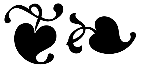
I don't think you need to rebuild the leaf - it's a relatively common glyph in fonts, called a "hedera" or "fleuron" or "aldus' leaf" or - in unicode - "floral heart", and although I'm not sure where this exact design originated, many fonts copy it - or try to. One of the ones I think does it best is "Symbola" (free): https://fontlibrary.org/en/font/symbola But there are many others copying the same design. You'll also find copies of this design in MS Gothic (not quite as well drawn), or in Deja Vu Sans (really badly drawn) and somewhere around hundreds of other fonts (although some will obviously do their own design fitting with the general font design). The sharp corner towards the top of the left glyph here is intentional - and it looks like it's also in the MI manual - an "ink trap". The glyphs are at U+2766 and U+2767 - or you can try just copy/pasting these, and changing the font: ❦❧ A pretty nice version without the ink trap (although I'm not particularly a fan of the way the swirl and the heart meet in the upright glyph) is Bainsley: https://www.fontsquirrel.com/fonts/bainsley2 points
-
What @demone said. "The secret" is likely just a bit of personal background information about Guybrush Threepwood that ties him in some way to Monkey Island. I don't have any great expectations, and I'm not even enjoying the speculation, because it so often is in the very center of discussion when other things could be discussed*. I'm much more keen on hearing more about Guybrush's family background than I am to find out whether Ron has or hasn't placed info in TSoMI and LCR that could be considered hints/foreshadowing about some secret. Whether there is or not is not important, the appeal of the "secret", for 30 years, has always been that no one knew squat about it. Once it's revealed, the whole enigma goes poof and we'll kind of wish it was never revealed. 😬 * You're still waiting for the speculation? Well okay then. Guybrush is actually cannibal no. 4 on a special mission. In Return to Monkey Island, they will heal his amnesia and call him carambolahead again.2 points
-
(Clarification: NOT TRADING!!! 😄 But I do wish I could wipe my memory after recording is done.)2 points
-
If it's any consolation, I'd actually love to know as much about it as you do. I'm one of those people who plugs their ears and goes "LALALALALALALALALA" during trailers for movies I want to see. Seeing the development process is neat. But the downside is that I haven't been able to just experience a Monkey Island game as it's meant to be experienced since MI2.2 points
-
Sorry I'm late! Y'all are some crazy bastards. Some beautiful, crazy bastards. Love this thread. Which I have spent half of today reading. (Well... skimming. And sometimes reading. There's a lot.) Mostly jumping in at the moment to send apologies for not responding to the request for VO for the stump joke. I'm usually pretty good about answering people, so the most likely scenario is that I either first got it on the run and totally forgot to respond, or it fell into the gap when Facebook and Instagram started filtering craptons of incoming messages into a "message requests" folder that I had no idea existed. When I finally found those, some of them were literally years old. Either way, I suck. Copious apologies. Though performing Guybrush in an unofficial capacity probably isn't something I could have done anyway, so no harm done. Except for the non-responsive rudeness 😕 Anyway, do carry on. Please keep being awesome. There are, like, twenty threads in here I'd love to revive but I don't want to sow chaos. (Not yet.) 😄 -Dom2 points
-
Hey all, I thought it could be fun to post and maybe receive requests for images generated by the amazing Dall-E AI. Here's an example of what it created with a Grim Fandango screenshot from the Land of the Living: This set what instead generated from the input string "An oil painting of a mad scientist, his nurse wife, their disturbed son and the two tentacle family pets: And last but not least some odd-looking variations on Guybrush and Elaine: Hope it is acceptable to open such a thread here, personally I'm so excited about this stuff, feel free to request something LucasArts related if curious about it1 point
-
At least this was on theme for today. 👕 I beat #Mojole and all I got was this stupid t-shirt. 3/6 🖤🖤🖤🖤💛 🖤💚💚💚🖤 💚💚💚💚💚 https://funzone.mixnmojo.com/Mojole/1 point
-
That's awesome. Ron seems like such a good guy; makes it all the better that he's finally able to make the game he wants to make.1 point
-
I thought I could die happy knowing that Ron Gilbert was making a new Monkey Island, and now I can die happy knowing that Ron Gilbert liked one of my tweets:1 point
-
1 point
-
1 point
-
@Dmnkly: "Threeeeepwooood! So good of you to join us!" (said in Boen voice) Exciting to have you here. I am curious to see what you will share here. A few behind the scenes infos are always nice (if you can of course). ☺️ I kind of feel the same way. On one hand, I find the question interesting and am curious what Ron has always imagined it to be (as he seems to have a very concrete idea). On the other hand, I can do without the resolution – and the explanation of the MI2 ending is more important to me. I just hope that the mystery isn't too crazy or outlandish. I definitely prefer a less effective, but "logical" or believable solution. Such resolutions or twists don't always have to be big and completely unthinkable. There are many twists that you expect to happen or that aren't really exciting in and of themselves, but then work so great because of the right execution. As for the time travel or time time jumps… I hope they don't go in that direction, that would feel like fan service to me. And as for the "canon" problems (Stan in the coffin): I don't think that everything will beautifully work together canon wise. And they also said, they'll be taking what they like and "change" other things (while being careful to not hurt the fans).1 point
-
Going back a bit in this thread... After all these years, I genuinely never considered Guybrush entering Melee Island through the archway at the top of the mountain before. Now Ron's hinting that it might be important... Another "underground tunnel" entrance would be my guess.1 point
-
Looks at the camera... 👕 I beat #Mojole and all I got was this stupid t-shirt. 6/6 🖤💛🖤🖤🖤 🖤🖤💚🖤🖤 💛💛💚🖤💛 💛🖤🖤🖤💛 🖤💚💚💚💚 💚💚💚💚💚 https://funzone.mixnmojo.com/Mojole/1 point
-
The joke is that that kind of art hasn't even been invented yet, much less become well-regarded enough to be in a museum. They're playing with the fact that everybody in the Monkey Island games tend to blithely accept anachronisms as part of their reality, but in actuality there's no reason a 17th century sailor would know what post-impressionism is. Also, it's funny because King Andre is playing at being the all-knowing villain with a plan the hero can't possibly grasp, but the "foreknowledge" he's claiming is just...what art movements will eventually get big? What's so funny about King Andre to me is how grandiose he acts versus how banal everything he's actually doing and saying is. (And Dave Fennoy's A+ performance of course.)1 point
-
I bet at least it helps with the voice direction. I mean Khris Brown is amazing so I have zero worries about that in the first place, but I guess it's still possible occasionally for the context to get missed and a line read to have a weird emphasis that doesn't make sense in context. But if the writer is there, they should be able to make extra sure all the reads work in context.1 point
-
I would take that to mean that post impressionism paintings haven't yet been regarded well enough to be in museums, as most new art styles would be, "but someday" they would be understood.1 point
-
Guybrush The diamond belongs in a museum! King Andre So do post-impressionist paintings, Mr Threepwood. So do post-impressionist paintings. Guybrush What the heck is that supposed to mean? King Andre Some day you will understand. I think the joke is nothing more King Andre thinking he's saying something smart and clever, but actually he's not. Kind of like a really terrible bond villain. That was always how I took it, anyway.1 point
-
Devolver Digital publishes tons of gems. I remember during last year's E3 I ended up wishlisting their stuff mostly and ignored almost every other game. They seem to love indie vibes and original/obscure stuff, a breath of fresh air between all the AAA stuff. It's no surprise to me that we have to thank them in the first place for RMI. Love'em!1 point
-
Well....finally my starting word just nails it. 👕 I beat #Mojole and all I got was this stupid t-shirt. 1/6 💚💚💚💚💚 https://funzone.mixnmojo.com/Mojole/ Sent from Mail for Windows1 point
-
Hi all ! I'm finally sharing with you my work. I'm not totally satisfied for multiple reasons I will explain but I'm here to make it fully "compliant" with the orignal one so feedbacks will be awesome and maybe some help First of all, anyone who wants to give feedback directly on the pages can use the following link https://assets.adobe.com/id/urn:aaid:sc:US:8b5d7412-9cb3-4e5d-ba65-56d345af1849?view=published If you spot any mispelling or any update needed, please comment it ! Fonts, first version of PDF and original scanned manual I've used can be found here: https://drive.google.com/drive/folders/1y2MQqnaUTx6K2VM611F09XCTwLzVyv5b?usp=sharing Let's explain what I have done and the blocking elements. Things to consider 1°/ This i not a final version, I would call it a beta version of the final manual 2°/ I have tried to use at maximum the inner function of indesign but I've struggle a lot to achieve it (Well I didn't achieve it this way I would say ) 3°/ I used Postantiqua font Roman found on the internet. It have found other PostAntiqua Font that seems a bit different (like spaces or height is different) 4° / The in-game images are a basic screenshot of the manual I've used. So it's not images with a good resolution 5°/ I'm not a designer so i have limited knowledge of those tools (illustrator, photoshop, etc) but any tips or advices for getting better is welcome ! InDesign Configuration The manual is a A5 manual (148mmx210mm) Font size is 9pt Margins (mm) are 16-9-9-9 (Top-Bottom-Inside-Outside) I've used PostantiquaBE and PostAntiquaBE Medium for bold version (see font file I have) I found another "official" pstantiqua font but it was 99$ I have used modified styles for H1/H2 and paragraph but always try to use styles for easy update Working and struggling... I have started by designing the template for the pages with upper line and page number and dividing each page in 2 text columns. I have struggled a lot when trying to calibrate with Indesign hyphen system. To be cleared, I have never managed to use the hyphens system in this context and have good results. The hyphen linebreaks didn't work for every line so I have used manual hyphen and linebreak. I know, it sucks ! By at the end, we generate a PDF so... The right side of the right column has too much space before the end of the column. I have the same font size but as you notice in the attachment, the width between the last character and the upper line is smaller than the one I did. But I don't see any glitch on the fonts and character spaces. So I have 3 main concerns: * Not be able to use the in-app hyphen system and use manual linebreak. * in-games images aren't in in HD * I'm not pixel perfect with the second column, I think the rest of the document is pretty the same as the original one Optimization In-games images: It's just screenshots from the PDF, so the image are not in a good resolutions. If someone can help me on this I'm open. I think it will be good to arrange the contrats and luminosity, etc to integrate it in HD Space on the right column: Try to fix this, any suggestion is welcome Others: Any update or comments is welcome Any feedback is appreciated ! PS: Credit to @Laserschwert for the cover design. I have used to illustrate the cover1 point
-
1 point


