TriggerGod Posted August 19, 2010 Posted August 19, 2010 *drinking a soda, reading through thread, enjoying the pictures. I take a big drink of of my caffeinated beverage...* 5264 polys *Spit take.* 2048x2048 pixels, think it's about 4 or 8 times the size most weapon textures get in the standard game. Mind many high-res mods use this sort of format to give you a nice quality And thats usually the quality I try to make my skins at now. Indeed it's marble: found back 2 PDFs that contained marble samples. I luuuvve using this stuff on saberhilts. Interesting how you are able to put pretty rock in almost every saber you make, and still make it look good.
LDR Posted August 19, 2010 Posted August 19, 2010 2048x2048 pixels, think it's about 4 or 8 times the size most weapon textures get in the standard game. Mind many high-res mods use this sort of format to give you a nice quality I can't see any pixels!
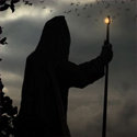
Quanon Posted August 19, 2010 Posted August 19, 2010 *drinking a soda, reading through thread, enjoying the pictures. I take a big drink of of my caffeinated beverage...* *Spit take.* I wouldn't go and spam this beast on every enemy that fights with a lightsaber. Else I fear you might "melt" the game-engine And thats usually the quality I try to make my skins at now. Good, I wouldn't expect less of you As from that size you can add in little extra details, that are nigh visible ingame, but are fun to make Interesting how you are able to put pretty rock in almost every saber you make, and still make it look good. I do my best; mind the first version used more of the rock, but I changed my mind. It's still a hilt, so in a classic conservative move I added back the plain old steel. I can't see any pixels! That my friend is of course the point of making a texture such a size Though, in all honesty, 3Ds Max renders are pure for show off, Mental Ray... yeah, I luuuuve that stuff.... Ahum, don't expect it to look that insanely crisp in the game. But, here, to give you an idea on how it turns out: Show spoiler (hidden content - requires Javascript to show) It's so dang small I'll have to warp to another more well lit area. Taris is rather dark for screenshots. Plus I'll need to try and do a wall hug, to get the camera a bit closer
Quanon Posted August 22, 2010 Posted August 22, 2010 Well; just a small bump. I've started work on the DS hilt. Here's what I got so far. It's less excentric then the last... I think... I like my spiney pointy twist thing. Show spoiler (hidden content - requires Javascript to show) Well, I just don't know it yet... I'll have to work on it some more I guess. Thoughts, anyone?
Sith Holocron Posted August 22, 2010 Posted August 22, 2010 Thoughts, anyone? I love it. My only suggestion is should have the letters D, N, and A somewhere in it's name.
Salzella Posted August 22, 2010 Posted August 22, 2010 you'd have to wear thick gloves to hold it but it is beautiful
Laar_Dha Posted August 22, 2010 Posted August 22, 2010 Thoughts, anyone? The spiny pointy twist thing is nice. Might make for an awkward grip with the spiral, but it sure looks awesome.
Dak Drexl Posted August 23, 2010 Posted August 23, 2010 But, here, to give you an idea on how it turns out: Show spoiler (hidden content - requires Javascript to show) Aww, I wanted blue! Looks great anyhow. I like the other hilt so far too and cant wait to see it textured.
e-varmint Posted August 23, 2010 Posted August 23, 2010 You certainly outdid yourself with that! Very, very nice! Would you consider using the hilt for a matching double-sword?
Quanon Posted August 23, 2010 Posted August 23, 2010 You certainly outdid yourself with that! Very, very nice! Would you consider using the hilt for a matching double-sword? Thanks ^_^ Hadn't thought about swords yet; it fits the warrior character Juhani. I'll see what I can do on that front. Aww, I wanted blue! Looks great anyhow. I like the other hilt so far too and cant wait to see it textured. Well, I just used the green first. Making it blue isn't that hard. Perhaps I should do it in yellow aswell. Like that there's a choice to everyone's liking. And its just more fun to download a mod, who offers choices. you'd have to wear thick gloves to hold it but it is beautiful True, I think I might change the look of the spikes. And make them more internal. Then again it's DarkSide; pain and suffering should fuel your power. Making you stronger The spiny pointy twist thing is nice. Might make for an awkward grip with the spiral, but it sure looks awesome. M'yeah, fighting with these hilts ain't really... euh realistic; but méh to that. Its SW it should look wicked and I wanted to go for something else then the regular cylinder with blocks and ribs poking out.
Quanon Posted August 24, 2010 Posted August 24, 2010 More saberhilt madness; been tinkering and pondering on the next twirly twisty madness. And here's what I find an improved version of the previous... thing... hilt stuff. This hilt looks far more "heavy", a bit macelike even: instead of uber-spikey. It still has 2 variations of spikes on the top of it's emitter. Very pointy look'n ones and more, "broad" flat look'n spikes. What do you guy thinks looks best? Oh, don't mind the center of the hilt, need fill that in with an extra bit. When I get some feedback, I'll decide what to use and proceed to UVWmapping. Show spoiler (hidden content - requires Javascript to show) Pointy bastard: Flat spikes:
Laar_Dha Posted August 24, 2010 Posted August 24, 2010 Both versions are gorgeous. I find myself with a very slight preference for the "pointy bastard". Quite wicked looking.
Sith Holocron Posted August 24, 2010 Posted August 24, 2010 Both versions are gorgeous. I find myself with a very slight preference for the "pointy bastard". Quite wicked looking. I second this opinion.
Quanon Posted August 25, 2010 Posted August 25, 2010 Okay: so I count 3 votes towards Spikey bastard. Zero for the other one. I'll wait a bit longer and check the thread tomorrow again. If nothing changes; spikey will be the choosen one
jonathan7 Posted September 14, 2010 Author Posted September 14, 2010 Spikey Bastard is awesome It's been great working with RedRob and Quanon on our Juhani mod, we all hope it'll be finished and ready for you all soon! In other news I've been tinkering with various things for a Force Fashion K1... BE WARNED YOU WILL NEED TO BE SIGNED INTO LF TO VIEW THESE SCREENSHOTS!!!! Firstly, I wanted to give my Revan a disguise to explain why no-one recognized her on her travels around the galaxy so inspired by this mod by Svosh and Chainz, I came up with the following; And also; Next, I've been also giving a similar treatment to the general Dark Jedi Models, and have reskinned all the Dark Jedi, also creating a little bit of variation, as I've changed them to have alien and different coloured skin... Here is the female variation... I've also bene playing with Dorak's robe, being the chronicler of the academy I have been wanting to give him a robe along the lines of Jocasta Nu's as seen in SWII AotC. The following are my first two trial attempts; thanks to Prime and Xavier2 for the model on the right hand side. I also have had a play with the Sith Apprentice Armour, I used Bandon's as a template and have doubled the texture size, and then turned some of the other panels white again, but made the armour whitish again. I have also given Zhar his own custom robe too; I have also slightly tweaked Bandon's armour, but this was more one or two touch ups and adding texture... Finally my last little projected is trying to turn the "lightside" Star Forge Robes into what looks like an outer robe... Progress is slow and fiddly, but here is a current screenie, of the state of affairs; Thoughts and suggestions are welcome
newbiemodder Posted September 14, 2010 Posted September 14, 2010 very nice clean work J7...They look great//I like what you did with Bandon's armor and Dorak
Quanon Posted September 14, 2010 Posted September 14, 2010 Tumdadum, ladies and gentlemen! May I present to you an early preview on how "spikey bastard" is progressing: Note that this is still WIP, it's bound to change as I see fit. Oh, yeah, it's 2576 polyies and has a texture of 2048x2048.
Salzella Posted September 14, 2010 Posted September 14, 2010 goddamn. nice stuff from both you guys here!
Kyr'am Galaar Posted September 14, 2010 Posted September 14, 2010 I bow to the God that is Quanon! Very nice work you two! Everything is awesome!
redrob41 Posted September 14, 2010 Posted September 14, 2010 Show spoiler (hidden content - requires Javascript to show) And also; you already know that I think that the high saturated purple seems out of place next to the low saturated green. Otherwise, they both look good. I did notice that the white mask kind of looks strange against the skin, like there isn't any shadow along the edge. It kinda gives it the optical illusion that the skin is on top of the mask. Next, I've been also giving a similar treatment to the general Dark Jedi Models, and have reskinned all the Dark Jedi, also creating a little bit of variation, as I've changed them to have alien and different coloured skin... Show spoiler (hidden content - requires Javascript to show) Here is the female variation... They've kinda look like they've got their underwear on the outside of the pants. Or like wrestling trunks. The stripe design really draws the eye down the middle of the character (good? bad? IDK). The yellowish buckle designs on the female's jacket look good. I don't know about the purple skin under that hood though. It seems to me a little over saturated for a Dark Sider. I know we can get away with bright red skin, but that purple looks out of place. I've also bene playing with Dorak's robe, being the chronicler of the academy I have been wanting to give him a robe along the lines of Jocasta Nu's as seen in SWII AotC. The following are my first two trial attempts; thanks to Prime and Xavier2 for the model on the right hand side. Show spoiler (hidden content - requires Javascript to show) I think that either model will look good when finished. You might want to concentrate on the Jolee model, since it would be more compatible for people who don't have Xavier2's model. Just be careful where the little circle designs end up, 'cause when they get too close together, they start to look like a pair of eyes staring at you. I also have had a play with the Sith Apprentice Armour, I used Bandon's as a template and have doubled the texture size, and then turned some of the other panels white again, but made the armour whitish again. I have also given Zhar his own custom robe too; Show spoiler (hidden content - requires Javascript to show) I have also slightly tweaked Bandon's armour, but this was more one or two touch ups and adding texture... The blue area of Zhar's robe looks great. That pattern works well applied like that. The bumpy texture on Bandon's black armour works really well, but the cyan symbol is out of place. If it was me, I'd keep it the same colour as the armour, but use bevel & emboss to make it look stamped into the metal. With the white armour, the grey lines look like they need work. Right now they look painted on, rather than like the shadows in between armour plate segments. Finally my last little projected is trying to turn the "lightside" Star Forge Robes into what looks like an outer robe... Progress is slow and fiddly, but here is a current screenie, of the state of affairs; Show spoiler (hidden content - requires Javascript to show) Thoughts and suggestions are welcome That's gonna need a fair bit of work, 'cause right now it's bland, plus the model edges around the neck and chest stand out like sore thumbs. I never did like that model, because the skirts don't open when the legs move (it's far to restrictive for an athletic Jedi IMO). I wish I was better at merging models, so I could merge the upper body and neck of this one with the lower body and arms of the masked Revan cutscene model (minus the cape & hood of course). Tumdadum, ladies and gentlemen! May I present to you an early preview on how "spikey bastard" is progressing: Show spoiler (hidden content - requires Javascript to show) Note that this is still WIP, it's bound to change as I see fit. Oh, yeah, it's 2576 polyies and has a texture of 2048x2048. Only a true Jedi Master could use that hilt without getting their fingers stuck in between the swirls and only a droid with enhanced vision will see the texture before they get cut down with a saber flurry It's very pretty, and yet the rusty metal spikes make it dangerous too.
jonathan7 Posted September 15, 2010 Author Posted September 15, 2010 you already know that I think that the high saturated purple seems out of place next to the low saturated green. Otherwise, they both look good. I did notice that the white mask kind of looks strange against the skin, like there isn't any shadow along the edge. It kinda gives it the optical illusion that the skin is on top of the mask. I'll look into adjusting the white "mask" - as for the Purple. As for the Purple that's because my Revans favourite colour is Purple They've kinda look like they've got their underwear on the outside of the pants. Or like wrestling trunks. The stripe design really draws the eye down the middle of the character (good? bad? IDK). The yellowish buckle designs on the female's jacket look good. Not too sure what else I can do with the Dark Jedi Model TBH, I really like their hoods etc (the female model is good) but the male model sucks and doesn't lend itself well to looking good. Essentially it's meant to look like a coat which is done up, but the female model actually has a skirt which the male model doesn't have. I don't know about the purple skin under that hood though. It seems to me a little over saturated for a Dark Sider. I know we can get away with bright red skin, but that purple looks out of place. TBH that current head was more me being lazy and just using variations in Photoshop to give me a purple, send me an Alien head you'd like to see as a dark jedi and I'll adopt it to fit in. I think that either model will look good when finished. You might want to concentrate on the Jolee model, since it would be more compatible for people who don't have Xavier2's model. Just be careful where the little circle designs end up, 'cause when they get too close together, they start to look like a pair of eyes staring at you. I have Prime and Xavier2's permission to include their model in Force Fashion K1 Personally I think I'm leaning more towards that for Dorak as I just can't get the flap to match up with the tabard bit on Jolee's robe model. The Other option is I could use the same model for Zhar and use that in a similar way for Dorak... The blue area of Zhar's robe looks great. That pattern works well applied like that. The bumpy texture on Bandon's black armour works really well, but the cyan symbol is out of place. If it was me, I'd keep it the same colour as the armour, but use bevel & emboss to make it look stamped into the metal. With the white armour, the grey lines look like they need work. Right now they look painted on, rather than like the shadows in between armour plate segments. Okies, I'll go back to the original symbol, I was playing around with that on the chest, the lines are easily fixed as they're a separate layer That's gonna need a fair bit of work, 'cause right now it's bland, plus the model edges around the neck and chest stand out like sore thumbs. I never did like that model, because the skirts don't open when the legs move (it's far to restrictive for an athletic Jedi IMO). I wish I was better at merging models, so I could merge the upper body and neck of this one with the lower body and arms of the masked Revan cutscene model (minus the cape & hood of course). Aye, basically I want it to look like a done up Jedi Robe, I think it'd look better with the hood up, but again the model itself isn't great. I think Obsidian did a much better job with their models than Bioware did; Thanks for the input.
redrob41 Posted September 15, 2010 Posted September 15, 2010 TBH that current head was more me being lazy and just using variations in Photoshop to give me a purple, send me an Alien head you'd like to see as a dark jedi and I'll adopt it to fit in. Yeah, I'll try and send you something. Is there any particular species that you'd like to see as a Dark Jedi? I have Prime and Xavier2's permission to include their model in Force Fashion K1 Personally I think I'm leaning more towards that for Dorak as I just can't get the flap to match up with the tabard bit on Jolee's robe model. The Other option is I could use the same model for Zhar and use that in a similar way for Dorak... Well, as long as you're going to include the model in your mod, I'd say that the Xavier2 model is better. Maybe you could use the Jolee model for Zhar, so that they don't have exactly the same shape of robe?
Recommended Posts
Archived
This topic is now archived and is closed to further replies.