Leaderboard
Popular Content
Showing content with the highest reputation on 07/22/22 in all areas
-
7 points
-
The new game absolutely has to be pixel art and if it's not it will be totally ruined! 😠 Oh no, wait... The new art looks really cool and is making me even more excited to play the game. Now that's a plot twist I wasn't expecting considering what a nostalgia-loving-change-o-phobe I am 😁 In other news... I've never been keen on Escape but your comments have made me look forward to playing it again and being open to enjoying it even more this time! 👍 Also, hello everyone 👋 I'm new and I've just read through this whole thread. Right, back to your interesting discussions.6 points
-
I value EMI precisely because of its weirdness. It seems somehow to get the alchemy wrong, in a way that's not easily definable. Its flaws aren't enough to totally sink it in my view, but just enough to ensure it'll always be an odd duck and the subject of fierce debate til kingdom come. That's fun! The Monkey Island games demand a tonal balance that's not easy to strike. They have always presented a world that was self-aware, surrealistic and not above abusing logic for the sake of a joke. (Think of non-sequiturs like Herman Toothrot revealing he had an escape ship all along, or his representation by lawyers via letter-in-a-bottle in his ongoing litigation against the cannibals. Some say the Tremendous Yak and Heavily Armed Clown still rove behind the walls of the governor's mansion to this day.) It seems crazy to call the world "grounded." But I think what was eventually learned is that at some base level the world needs to take itself seriously enough to work up some level of mystery and atmosphere. That was something the previous games definitely had, and which EMI definitely fell short of (despite pockets here and there, often with a huge assist from the music). EMI really brings the lampoonery to the forefront, and I think that handicapped immersion somewhat as a side effect. (And on top of everything, the art direction combined with the limitations of the 3D tech gave the game an overall plastic-y look that compounded the issue.) It turns out fans buy these games because to some extent they want to experience a "legitimate" pirate adventure, even if it's one laden with fourth wall winks and cartoonish swerves and vending machines. But there's no magic formula for riding that line successfully. Heck, some people criticize CMI for the perception that it goes too far the other way, by being too reticent to embrace the ramifications of MI2. I've never really agreed with that (it's still a pirate game that ends at an amusement park), but the variety in the reactions goes to show that it's a tricky business. And in defense of EMI, there seems to be some recognition by the game itself that it was kind of taking a wild turn that wasn't meant to sustain more than one installment. The game ends with Guybrush and Elaine almost literally saying, "Okay, this weird detour where we were acting heads of state has run its course, so it's back to the old ways." I think EMI tried something bold and even a little reckless and wasn't 100% successful at it, but I think it's endlessly fascinating. And for all the complaints that it trashed the joint by retconning backstories and re-envisioning beloved locales, I really think in the end it did no meaningful harm. I have a suspicion that ReMI will make that even more clear than it is now.4 points
-
Well, I guess they better do it now. Chop chop, Ron Uuh, maybe a different thread needs to hit page 100?? The fan art thread maybe? There are only 3 pages! Oh god, everybody, make more fan art! Hurry! Draw, gawdamnit, DRAW!!4 points
-
3 points
-
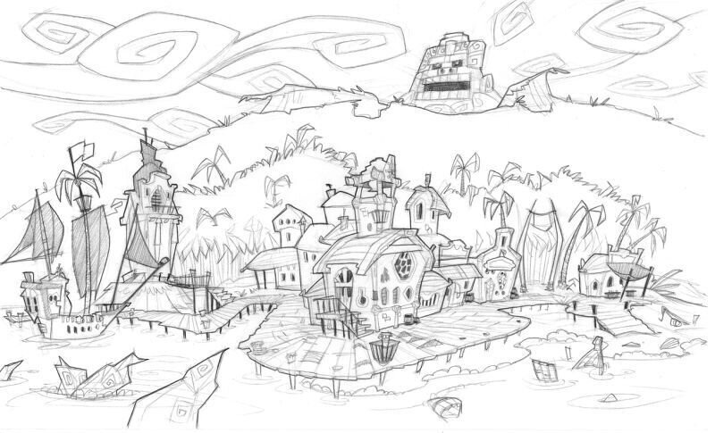
The Wii was tales of MI’s target platform and it was really bare bones even by Telltale standards. There was no way all of Flotsam Town was going to fit in one scene, so it was split into two with a camera cut in the middle (between the courthouse and the glass blowers shop), which has a load delay the first time you visit it in any play session. It meant we could never present the town from a big wide shot like you see in the concept art.3 points
-
I'm constantly making fan art. It's just that a lot is not up to where I'd like it to be. I'll post a swordmaster sketch this weekend. One that I'm mortally afraid to color because I'm way too certain I'll funk it up ...3 points
-
No ... no, I guess they won't. 🐏 I've had a discussion about 'pixel art' these last days on the gog forums. And, of course, at one point somebody drew the wikipedia article out of his back pocket, where the art form is defined by the careful, purposeful and intentional placement of pixels. Which made total sense to me, but of course to just pixelate high res artwork is plainly not "pixel art". It's not what TSoMI did, it's not what the Monkey Island 2 artists crafted out of low res scans, it's not how Thimbleweed Park was made. Guybrush especially scales down or rather pixelates up badly, in my opinion. He looks like a hunchback. The warped anatomy is much more jarring, the eyes way too high in the head and it doesn't look like he's got a nose or a mouth or an ear at all. Guybrush's hand and rim of jacket weld together to a new, incomprehensible form. So ... this wouldn't do as a low res version, really. To make pixelated Guybrush acceptable, an artist would have to repaint the whole Treepwood. Establish contrasts, make the individual elements readable, iron out parts that could be misinterpreted. Even if they could, technically, make a pixelated version at the push of an any key, it wouldn't be "pixel art", and I highly doubt it would be accepted by people who'd rather urinate in Ron Gilbert's living roo throw themselves on the floor screaming than attempting to deal with the new art style.3 points
-
Oh man! This is why Monkey1 is my favorite. You experience Mêlée town and Monkey Island from so many perspectives that both places feel incredibly huge, making you feel like a blip in a universe so big, you won't be able to fully grasp it's scale. I feel like a visitor and not like the main protagonist. I'm just one protagonist next to millions of others (Elaine having her own adventure off screen adds to that so well). I love this so much. They went out their way to make the alley, which is "only" there to meet Sheriff Shinetop. But it also includes that omnious "Employees Only" sign. Chilling! Also it's the only game with an island map that doesn't fit on one screen*. Monkey Island (the island) feels huge in the first game, and missing that scale alone in the other games removed the importance to it. To me, in Curse & Escape it is a place, but the place in Secret. Aw man. I love talking about this. Thank's for bringing it up. *On the other hand, Dinky Island not having an overhead view at all felt amazing too.3 points
-
Heh. Maybe ron should just add a pixellate filter in graphics options. It's amazing how just by pixellating it, my gut reaction shifts from 'this is new and scary' to 'this is old and familiar'. (I love the art style if it wasn't already clear, but it's also very new and so it always feels a little odd at first, just like CMI did I suppose.)3 points
-
I don't think you should have to do that. And I do understand the frustration of liking something lots of other people don't, or don't like as much. Because you want to share in the joy of a thing and it's difficult when there are people who want to criticise it, or not as many people as you'd like to talk about it on the level you'd like to. I get that. There are definitely things in my life I feel that way about. Then again, I think there's always a kind of 'let people not enjoy things' counterbalance to 'let people enjoy things' which is sometimes hard in these discussions. I've been accused in some places, for example, of over-defending Rex's art style when someone has something bad to say about it - I don't think i am, usually, I think I'm just trying to provide a positive counterpoint to some negative comments I've seen, and try to move the criticism at least into a more constructive space than some of what I've seen. But what I have found to be a bit more effective than trying to contradict people's points is to come up with positive points of my own. That's why I spend so more and more time talking about how cool I think the background/foreground details are in this new art, and the animation stuff going on in the background, and less and less time trying to tell people "well I think Guybrush's face looks fine actually" or whatever. (incidentally this is also why I've changed tack from talking about what I dislike about EMI's Melee to what I really like about MI1's Melee) I think there's actually a lot to like about EMI, but if I've taken time to critique a part of it, and given lots of different reasons for it, and tried to be constructive about it, then I guess... it's not really helpful to the discourse for me to hear "well, I don't think that's important." What I would LOVE to hear about though is what IS important to you, and what makes the game really work for you. Maybe not in here because admittedly we're getting off topic. But if it's become your favourite, I would love a breakdown of the stuff that really works for you. I might not completely agree, but I will respect it ❤️2 points
-
Oh I do that sometimes, but only if I'm addressing one topic in a post. I tend to prefer one topic, one post which is why I was getting annoyed with it. Especially with reactions. Y'know, someone might like the thing I said about topic A, but not about topic B, C and D. Thanks for the explanation though!2 points
-
nullOne thing I think is true regardless is that I really do like how much the locations in MI1 said about themselves. Especially looking at stuff like Melee Town in MI1. And that path toward the mansion, behind a huge fort wall and then layers of cliffs along a treacherous path. Speaking perhaps of a time where maybe a governor might have wanted to protect themself and conceal their wealth and privilege from jealous eyes and hands, and just at the time just being a really cool visual. And just the whole thing basically being a study in indigo-blue and yellow, really selling the cool stony exterior vs the warm interior. I think it has so much character. ...good location, IMO.2 points
-
Yes that has been turned on for now, only if multiple posts are submitted within 15 minutes of each other. It prevents the thread being bumped repeatedly, which can also trigger excess notifications for those subscribed to new posts. If you’re looking to address multiple conversations, probably the best way of avoiding confusion is to use the ‘+’ icon next to ‘Quote’. This allows you to build a chain of quotes within a single reply, making it clear which conversation is in play.2 points
-
Oh like I definitely don't think he will or even seriously should. Or if he does, he should just make it really pixellated and call it "crybaby mode" to REALLY bait them 😏2 points
-
2 points
-
1 point
-
Yeah, this is my go-to comparison when trying to show that in some ways MI2 was already halfway toward where CMI would eventually go visually.1 point
-
This background in particular is one of the all-time greats. The way it forces the perspective, gives a real sensation of depth, and all done with such basic tooling at the time. It reminds me a lot of the way Puerto Pollo looks in CMI, looking great as a whole but when ‘zoomed in’ like the MI1 scene so you can only see part of it, it feels so three-dimensional. Phatt Wharf is another example: It’s a recurring motif in the original three games that the two-dimensional backgrounds have a tonne of life and depth breathed into them by clever framing and perspective, and of course the engine’s ability to effortlessly scale and clip the characters so they look part of the scene. (Generally, MI2 and CMI don’t look so far removed when comparing those particular scenes.)1 point
-
Wow, that's got to be the second-nicest thing I've ever read on an internet forum directed at my whining about how people don't like EMI enough! 🥰 Definitely can relate to all of what you wrote. Honestly, I don't expect to change people's opinions, but if I can get even one person to replay the game and have a slightly more positive experience with it then I'll take that as a win.1 point
-
I can totally relate to that. I don't feel that on these forums, of course, because my love for Escape is limited, but there are plenty of other forums where some of my likes, dislikes and subjective opinions are a few degrees of latitude off the forum mainstream. 😬 It happens, and I know all too well how the outsider in just that one topic is sitting in front of her/his screen thinking: Well I SHOULD react to that comment and tell them how I see it and why, I don't know, marihuana legalisation would be a horrible idea in Germany, PC gaming without Steam is and definitely should remain possible, why cars seriously should drive themselves in less than a generation, and ... as soon as you tell them, there's the needless discussion and maybe at the end of the tunnel and after the groundhog day hijinks, the blessed agree to disagree and the why did I bring that up I knew where it would end do I really fit here what if I said nothing again ever. Stay with us, please. We'll do anything. I may even play EMI again. The love for Monkey Island is what unites us and let nothing tear us apart. 🤎1 point
-
ah, c'mon. That's not fair. I know you like that game a lot, and it annoys you that so many people don't. I don't even hate the game. But I tried real hard with it and I have a LOT of problems with it, and I will bring them up from time to time. That stuff might not bother you, but I don't think it's fair to imply people are just picking on Escape for no apparent reason, or that we're being inconsistent. (I keep having to delete edits because suddenly today the forum is attempting to merge my posts, which is annoying when there are multiple conversations happening at once. What's up with that, did something change on the back end?)1 point
-
We've sorta touched on it before but there IS a magic to low res, I think. It adds a natural graininess to art without really trying, and the brain is very good at imagining that graininess as detail. Like I pixellate that window frame or door frame and suddenly it magically looks more instead of less detail because of how many blanks my brain is filling. I think a lot of people don't mean what they think they mean when they talk about detail though. I've heard people say that the new Guybrush isn't detailed enough. But in what sense? If you were to take, say, 'number of discernable facial features' as one plausible metric of how detailed a character drawing is, he's perhaps the most detailed Guybrush we've ever had, certainly in 2D. He's got cheekbone details, stubble detail, eye-wrinkle detail and colour detail we've never seen before. And that's before you even get to the animation detail we've seen before. Similarly for the backgrounds, when you take it in total, including animation, background/foreground elements I certainly think there's more going on in these scenes than there was in MI1, and it holds its own with the others too. So I wonder how much of this is what people are seeing going up against the 'imagined' detail of lo-res art. Pitting what you see in front of you against some imagined ideal is always an unfair contest. Anyway, I really don't want to dredge all that up, what I really wanted to get at is that I really think this style blows up well onto a large screen and as lots of people have pointed out in motion, because you start to notice all the (guy)brushwork much more and all the little animation touches going on, which for this style is as much part of what makes it 'detailed' as anything else. It makes me excited for looking at adventure game backgrounds in a whole new way - not like in 1991 when I was enjoying looking at a handcrafted painterly sort of look which was practically nonexistant at the time. But because to me these scenes really feel truly alive in a way that they've never been able to achieve before. Just that gentle swinging of the SCUMM Bar sign makes me really happy to watch.❤️1 point
-
1 point
-
Speaking of Curse, I discovered for the first time yesterday that Pálido Domingo says different things to Guybrush, depending the date of your computer when you play. After all this time that game still surprises and delights with its density of little touches1 point
-
1 point
-
lol, wasn't there some guy who got mad at Double Fine for adding in a pixel filter to Broken Age as a fun little thing rather than taking the time to make pixel art backgrounds and sprites for every character?1 point
-
1 point
-
1 point
-
I feel the same way about the locations, I don't miss a character and want to play the game again as much as I miss a certain mood of a location in the game. Curse and Monkey1 do this perfectly, the world is alive and the geography makes sense: you can look from the beach in Monkey1 to the little mountain with the vista and vice versa. Small details like this make me so happy. This details are missing in Monkey2 sometimes, but the incredible music makes me forget this. Guybrush being a vessel makes so much sense, he's just guy experiencing an adventure. This way the ending of Monkey2 makes total sense. The game is over, we go back to our lives. About the beard thing in Monkey2: I never made the connection between the beginning of the game (Guybrush loses the beard to Largo) and the ending (Guybrush gets the beard back, now in zombie form). Largo used the beard to revive Lechuck, Guybrush uses it to defeat him again. There's something about this beard in this game (and spit, tons of spit)!1 point
-
There is no law barring you from introducing someone to the Monkey Island series with the special editions. There just should be.1 point
-
Aah, I'm here for these discussions. Love it! Was Dread steering the ship in that last image? 😄1 point
-
Why can't the monkey head that was part of the robot not just be the "third" biggest monkey head that Guybrush has ever seen, conveniently also situated on Monkey Island? I mean, with so many giant monkey heads laying about it's no wonder they named the island after it...1 point
-
Sorry if that came across wrong, and no, I'm not saying people don't have their reasons, but frankly I'm just tired of it. Look back at this thread alone and you will see that it's just a matter of time before EMI gets thrown another punch here or there. And this is Mixnmojo, which as I have said before, is where people are much nicer and articulate their reasons much clearer with plenty of evidence to back up their points. But from my point of view I'm a fan of all the games, so it really sucks constantly having to hear the criticism. To the point where I'm constantly considering whether its worth even engaging anymore or whether I should just go back to being a lurker.0 points


