.png.27778bd189063ef176c68042f0c9300a.png)
Jake
-
Posts
2648 -
Joined
-
Last visited
-
Days Won
103
Content Type
Profiles
Forums
Events
Everything posted by Jake
-
“Monkey Island One” - Xbox style. ❤️ I made those zoom-outs! It was something I’d had in my head for years as something I wanted Monkey Island to try, especially if it ever went full 3D. I loved the maps in Monkey Island 2 especially, how you could see tiny Guybrush on them, and he’d walk under and over parts of the canopy cover. It felt somehow like I was there, very easy to imagine actually walking through the island as the one or two pixels that said “Guybrush” slowly traversed the screen. I thought literally flying up through the clouds from the game scene to the map could potentially accentuate that feeling. (Unfortunately Tales had basically no budget for the maps so they look pretty cheap, especially Flotsam, but I’m glad I got to try the effect.) Given ReMI’s scrapbook vibes I don’t expect the exact same feeling from the maps (no game but 2 has given me that feeling to be honest, even Curse which also had the helicopter view for its map screens) but I’m sure they’ll be beautifully made.
-
Once they say Marius’ animation they had to release the trailer to stay relevant.
-
👍 If people want a spoiler free anticipation thread we can add one, but I’m not sure how much use it’ll get.
-
I think it’s safe to assume that’s a bombastic track whipped up just for the trailer. Love hearing a new version of the theme though.
-
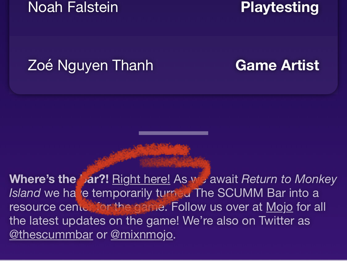
The new website is so good.
-
These are clearly deeply early, they look like layout passes bounced straight out of Maya (3D animation program) as a playblast preview.
-
When I finally got glasses a decade ago I was deeply upset that I could see the pixels in theatrical screenings. What a ripoff!
-
The story was always supposed to have a sea monster eat you in the third episode (mermaids and sea monsters were seemingly always part of the story because of the overall “edge of the map” theme), but I am responsible for it being a manatee. I said the words “giant manatee” in a story meeting basically as a joke, and then it got a ton of traction and I learned my lesson of never contributing an idea you yourself don’t like because you might be forced to live with it. I think it turned out well even though it’s on the goofy side, the writers came up with some of my favorite set pieces and writing within that constraint, and we took it upon ourselves to try and make the appearance of the manatee as scary as possible at the end of 2 start of 3, but there’s no changing it being a manatee. There’s lots of fun concept art of the sea monster in all sorts of forms, ranging from giant terrifying angler fish to lovable borderline-plush manatee, and we landed somewhere in the middle.
-
It’s only changed for the lead-up to Return to Monkey Island. The old site is still there and linked from the bottom of the page:

-
Phantom Menace is probably able to be crisp, as it was shot on film, but episodes 2 and 3 were shot on very early digital video tech that maxed out at 1080p.
-
Agreed 100%. Like @KestrelPi said, there’s a little hiccup each measure to move it from 3/4 to 4/4 time, but if you add that to the original song it basically lines up perfectly.
-
The full throttle one is my preferred one because it had a hole in the middle to see where your cursor was. In Curse the object you’re interacting with is covered by the coin But I do like the wheel interface in general. I’m surprised more things didn’t use it.
-
Dalixam deleted it and wouldn’t let Mojo archive it 😡
-
The 69 reference in mists of time is 100% a Bill and Ted reference, because in that movie Ted meets himself in a time loop and asks what number he’s thinking of and they both answer with “69 dude!!!” There aren’t many movie references that direct elsewhere in the games are there? Where guybrush will straight up quote a movie’s own joke. The one example that comes to mind is giving the Phatt Island librarian “1060 West Addison” as your address, which is the address they give to the cops in the Blues Brothers to throw them off the scent, later revealed to be the address of Wrigley Field. But even that one feels more understated.
-
Telltale's Sam & Max games getting remastered
Jake replied to Udvarnoky's topic in General Discussion
The reason is I did that green swirly design before the game art was done so I didn’t really think about it. Then realized too late I should have done it. -
Which AI tool are you using for this?
-
Anyway, I’ve always liked that the stairwell into the Bloody Lip is dark, and the characters get dark when walking through it. It’s a detail that immediately made Woodtick seem like a real place I was existing in with the characters.
-
I have to imagine LucasArts management was interested in reviving Monkey as a franchise and it was all at least partly strategic on their end, even if it came from seeing some unrelated opportunities and tying them together. But at Telltale, we didn’t feel like part of some strategy, we were just happy to be making a new Monkey game, and happy that LucasArts was interested in adventures and the IP enough again to be doing two projects at once.
-
My memory is too faint to be useful, sorry. I feel like LucasArts must have known about their own SE when they signed with Telltale, but I don’t feel like the Tales team really knew the SEs were a thing. (I feel like if we had, there would have been more synergy with the voice casting, eg not beating around the bush with whether Boen is in it, making sure we use the Curse voodoo lady actor, etc). My memory is that the SE came out after Tales, but that Tales was in preproduction before the SE was announced (and we didn’t really know about the SE or what it was until it was announced). I may be misremembering and we knew it all, and my memory has just eroded, but I don’t think so.
-
Yeah, when Tales was made it was Lucasfilm’s decision to rebrand and update the Monkey Island IP, and they wanted Tales to be part of that. Disney-era Lucasfilm seems to have decided the original logo was already doing a good job of representing the IP so the new logo has been re-binned (or reserved for the SEs).
-
👕 I beat #Mojole #90 and all I got was this stupid t-shirt. 3/6 🖤🖤🖤🖤🖤 💚💚💚🖤🖤 💚💚💚💚💚 https://funzone.mixnmojo.com/Mojole/
-
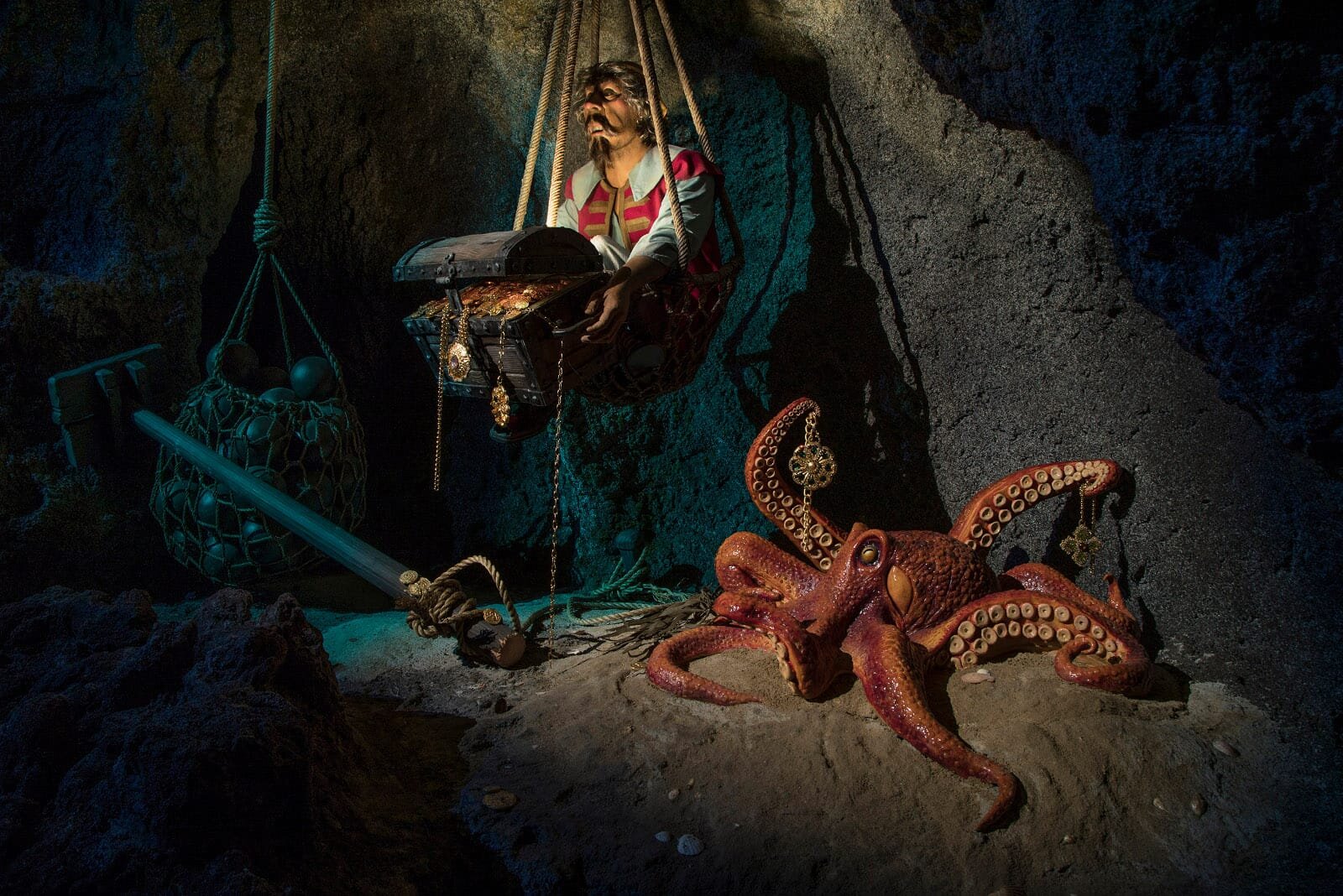
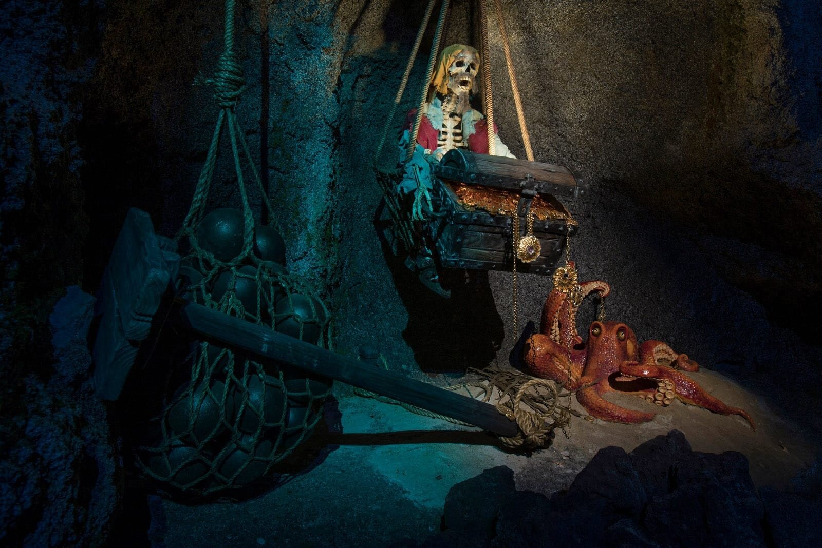
Most of the changes are, IMO, pretty minor. The details of many scenes have changed over what is now decades of revision, but the mood of the ride is fundamentally unchanged. Some recent updates have actually removed some of the movie content and reinstated some of the original audio, and even added some tiny setpiece details in line with the original 60s character designs and style: The dark hallway with the voice saying “dead men tell no tales” and audio of a scared pirate telling you you’ve seen too much and are cursed, was for a while replaced with a video projection of Davy Jones or Blackbeard, but those projector scenes have been removed, the original audio reinstated, and a small vignette added of a skeleton pirate turning into a real pirate as you pass in the boat, and it’s a wonderfully simple trick done with a mirror split down the middle: It directly precedes the reveal of the huge ship vs fort setpiece, a tiny transition moment as you leave the skeleton vignettes for the “real world.” With Pirates I think it’s easy to obsess over the details, and I understand when people have a favorite moment removed or swapped out for something else, but I think the overall tone of the ride is currently in really good shape.
-
Wow, that’s wild.
-
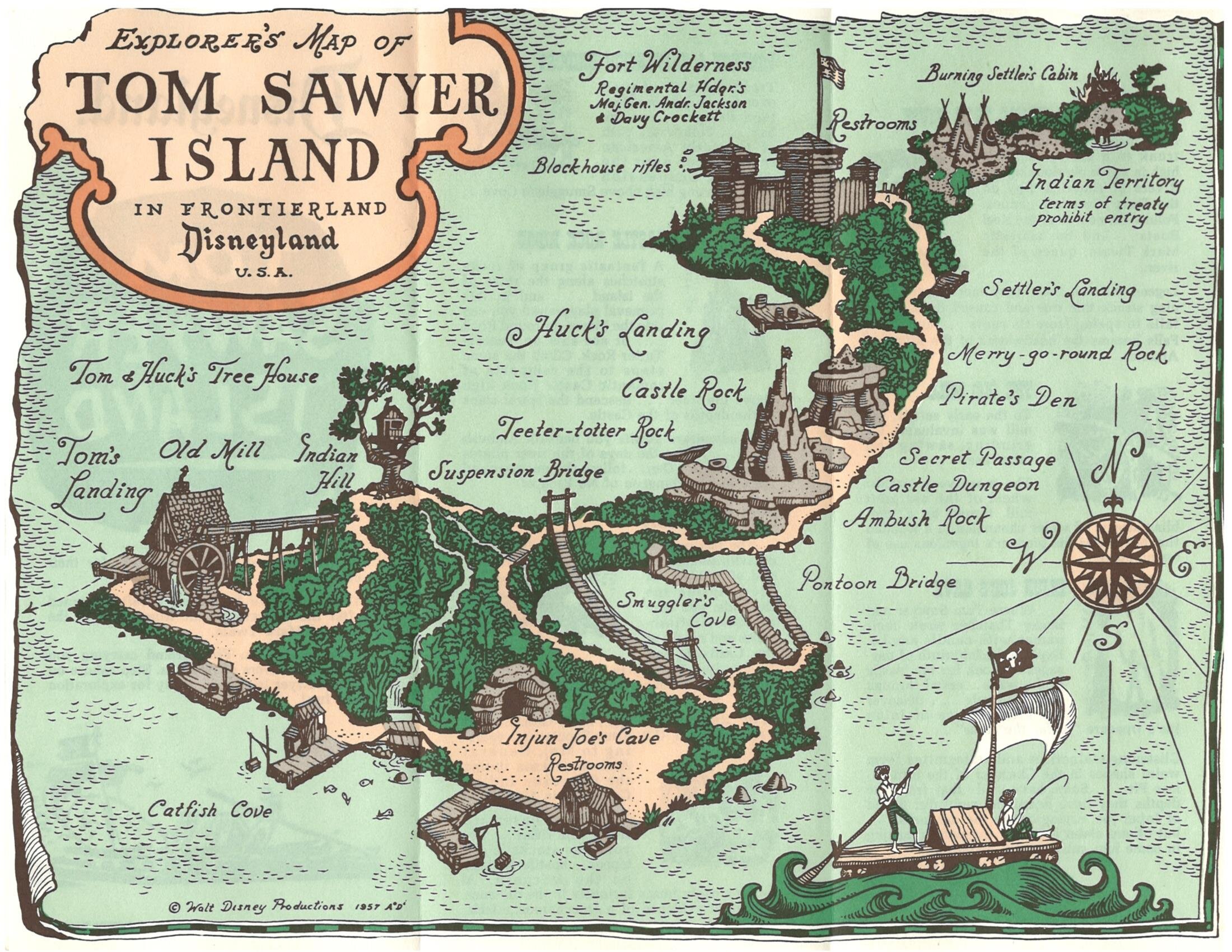
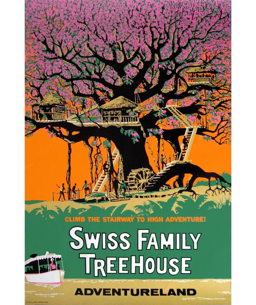
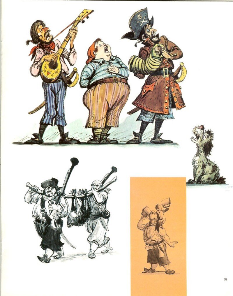
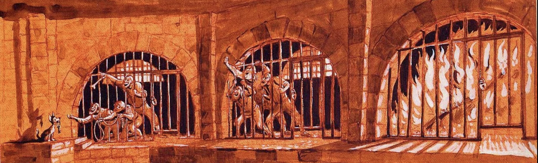
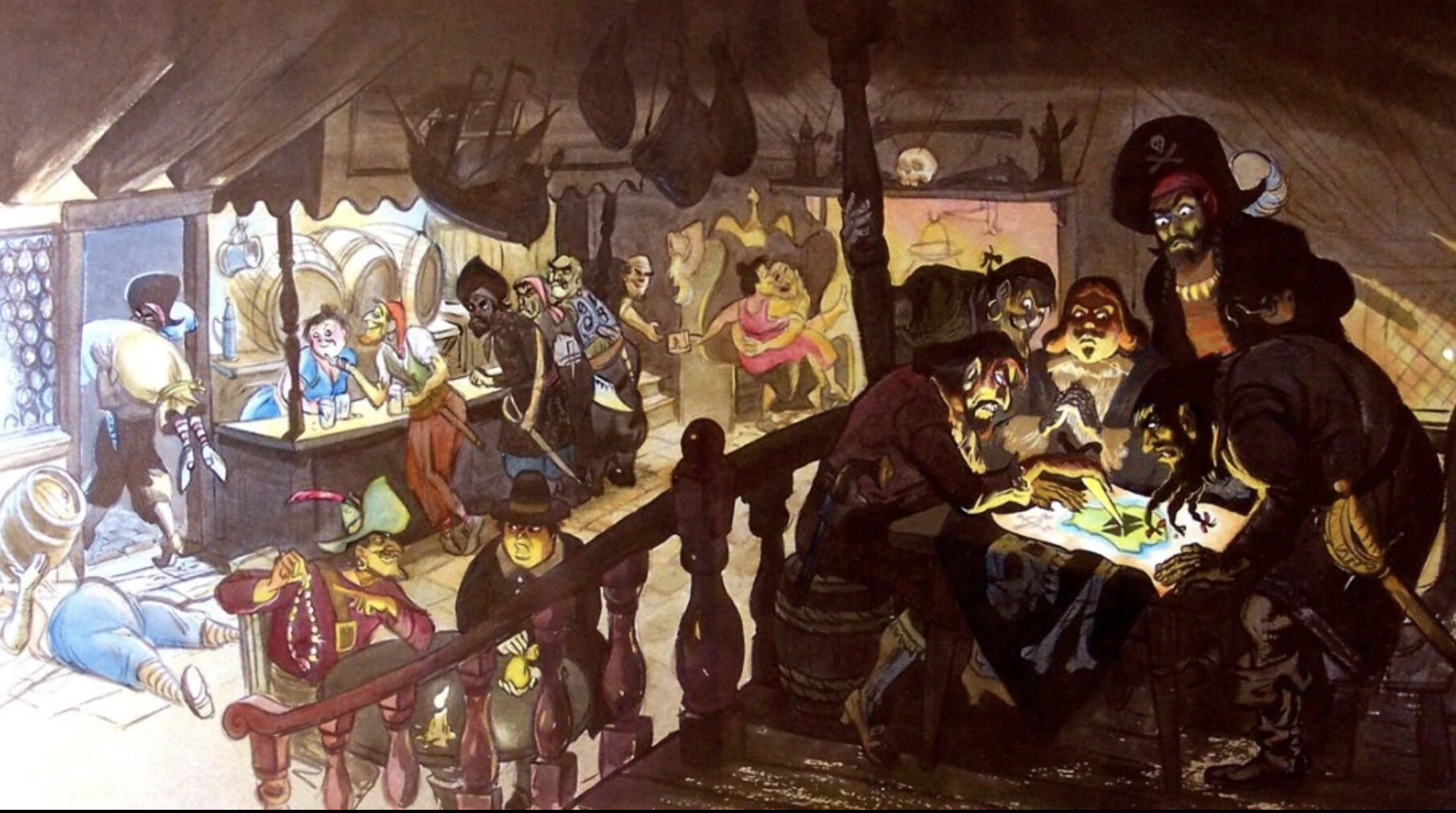
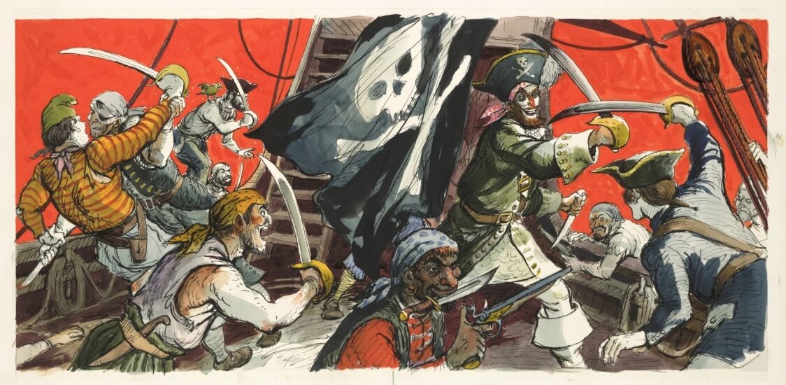
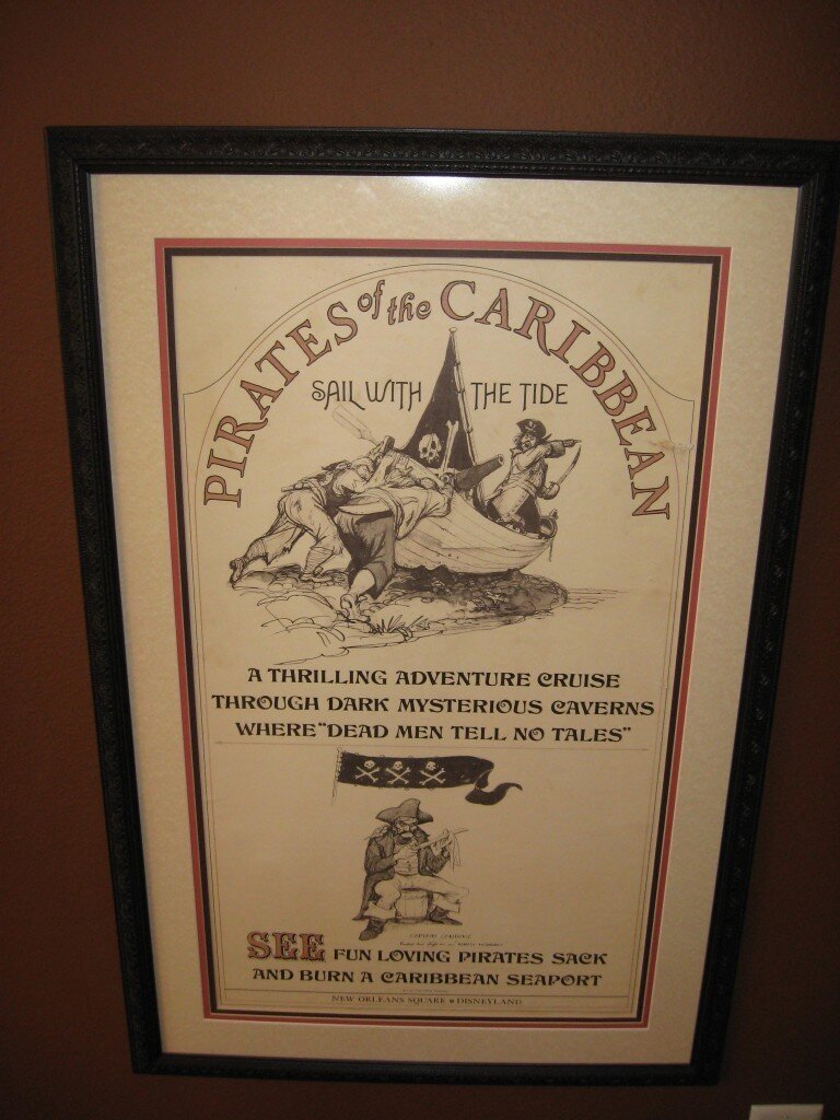
A few more pieces of Disneyland art: the map to Tom Sawyer’s Island, which has always been very evocative of the early Monkey Island maps (especially Monkey 2’s maps) and was @Trapezzoid recently re-shared in the Return thread. And some promotional imagery for the Swiss Family Treehouse attraction at Disneyland, which is very directly alluded to as a location on Booty Island in 2. Also, more generally, if you like the cartooney-with-a-very-slight-edge-of-menace vibe of Monkey Island’s pirates, it’s always worth looking through the galleries of original concept art for the Pirates of the Carribbean ride, all of which is excellent. Here are a couple: I know there is plenty outside Disney parks, but it’s something I’m familiar with!
-
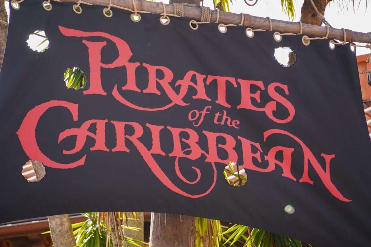
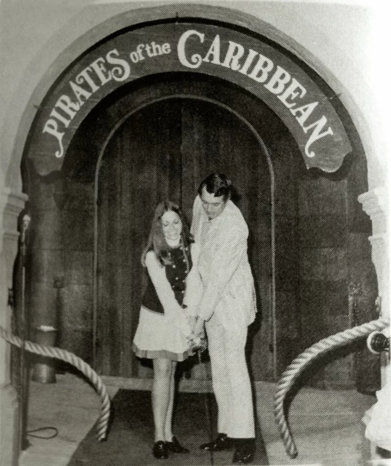
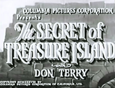
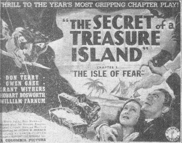
In the unpopular opinions thread there was recently talk about the original vs the SE logos, and it had me start digging up logos from the Pirates of the Carribbean rides, and that took me down a number of rabbit holes until I ended up looking at posters for an old adventure movie (maybe a serial?) called “The Secret of Treasure Island.” I didn’t really know where to post it so I am making a new thread for cultural ephemera that is Monkey Island-ish. Note I’m not claiming these are things that are a confirmed direct influence on the game. Unless cited by a creator, that is impossible to assume, but I think it’s fun to find things that have been in the air, in the cultural consciousness, as predecessors operating in the same space, or things that in retrospect just “feel Monkey Island-ish.” First up are just a few of the logos used for the Pirates of the Carribbean rides (which are fun for how varied they are, and how they all seem “piratey” in different ways) and a couple posters and title cards for “The Secret of Treasure Island,” which while more crude than Monkey Island, are definitely evocative of the cover paintings for the first two games.