.png.27778bd189063ef176c68042f0c9300a.png)
Jake
-
Posts
2648 -
Joined
-
Last visited
-
Days Won
103
Content Type
Profiles
Forums
Events
Everything posted by Jake
-
I think the logo getting more explicitly piratey is a net negative. It makes the possibility space imagined when you look at the logo much smaller. The original is just so crisply designed. It implies a grand scale adventure, and a certain level of attention to detail, and even creative restraint, that you don’t often see in a logo design. When it’s paired with the cover art on the box, it makes the whole thing seem potentially larger than what is depicted. The SE logo knows exactly what it is - a slightly cartooney pirate story - and is worse off for it. I don’t think the On Stranger Tides comparison is apt. Even though it, like the SE logo, has some tattered edges, the Tides logo is still crisp and carries menace. The SE logo is using those visual wear “pirate” signifiers to be playful and disarming, to evoke expressive brushstrokes, etc. Not really the same to my eye.
-
This was a baffling round for me because of what went green when it did. Weird letters. 👕 I beat #Mojole #89 and all I got was this stupid t-shirt. 4/6 🖤🖤🖤💚🖤 💚🖤🖤💚💚 💚💚🖤💚💚 💚💚💚💚💚 https://funzone.mixnmojo.com/Mojole/
-
That’s awesome! Looks great.
-
It was such a sadness, being told we had to use the new logo for Tales. I was glad to see Return… return to the original.
-
It’s rough The later telltale games do away with pretending to be point and click at all, and the earlier telltale games ARE point and click, but this middle ground of fake-direct-control-but-in-a-point-and-click-world is so rough to go back to. Unfortunately it includes Tales of MI and Sam & Max Season 3, two of my favorite Telltale games. I think it’s inaccurate to call this a “telltale thing,” as it only truly happens in Tales of Monkey Island and was 100% due to size limitations of WiiWare games. In the Telltale Sam & Max games for example, the characters say what you pick with very few shortcuts taken (unless it’s a joke that your choice is subverted). Even the later Tales of MI chapters drop this, because it turned out to not save much space but created a notably bad experience. Telltale had plenty of cut corners but this wasn’t actually regularly one of them, it just really sticks out when it occurs, especially in Tales of MI chapter 1. I have no memory of it ending in a weird place, but agree it’s a sad arrangement. I think the music in Tales is under-appreciated because the actual final production of it is done so cheaply, but much of the composition and style of it is really good. The main theme, not as much. I replayed all of Tales last month and had the same reaction. Even when working on it I felt like the puzzles were a little lightweight but replaying it, they’re way more legit than I remember. The presence of jungle mazes is never ever my favorite, but maybe with those aside, I think time has been kind to Tales’ difficulty level. The reuse will always drive me crazy. It’s a thing that Telltale was known for (and was done because new character rigs and acting animation suites are actually very expensive to produce) but in Tales it went into absolute overdrive. The combination of the cast size needed for just the main characters, plus the Wii’s 40 megabyte limit for downloadable games, made it nasty. As you said Winslow is one of the more egregious ones. I don’t think it was known that he’d be a recurring character until the season was underway (but even if it was know, I don’t think he would have got a new model because we were out of both budget and disk space). Same, I was surprised on replay to be reminded of how much there was. Probably the most music interactivity in any Telltale game? I know the team worked hard to do it. There’s no formal interactive music tools in Telltale’s pipeline, or weren’t until post 2013 when I left, so instead gameplay programmers had to write their own music managers in LUA. That code got pretty advanced in Tales and Sam & Max S3, but was mostly gone by The Walking Dead, when music had devolved back down to largely being single loops or fire-and-forget stingers. I like that flotsam town’s music changes as you walk around, and then changes again when the pox blows in.
-
Haha thank you! I’ve always been here. I was on Mojo and these forums for years before working at telltale
-
(Moved some posts about anticipating the trailer to the trailer anticipation thread.)
-
👕 I beat #Mojole #87 and all I got was this stupid t-shirt. 4/6 🖤🖤🖤🖤🖤 🖤💚🖤💚🖤 💚💚💚💚🖤 💚💚💚💚💚 https://funzone.mixnmojo.com/Mojole/
-
😬 Eep ook ack! I failed at #Mojole #86. 🖤🖤🖤🖤🖤 💛🖤🖤🖤🖤 💚💚🖤🖤🖤 💚💚💚🖤🖤 💚💚💚🖤🖤 💚💚💚💚🖤 https://funzone.mixnmojo.com/Mojole/
-
That looks fantastic!
-
Guybrush talks to himself when alone and is 50% of most all conversations, so him having half-ish the script is probably the norm.
-
Loom speedrun 144fps uncapped let’s go
-
This looks awesome! The font you picked looks good but if you’re looking to mess around, you could try Post Antiqua Roman, which is the font used on the original disks and manual, if you want it to feel like an official piece of merchandise, though it might end up looking too “samey” in this context.
-
Awesome! What a find, it looks beautiful. So now that we pooled together to buy these maps we can do NFTs of them right? Isn’t that how this works?
-
I thought that part always played super fast! Maybe I’m misremembering?
-
🤔 👕 I beat #Mojole #83 and all I got was this stupid t-shirt. 6/6 🖤💛💛🖤🖤 💛💛🖤🖤🖤 💛💛💛💛🖤 🖤🖤💚💚💚 💛💛💚💚💚 💚💚💚💚💚 https://funzone.mixnmojo.com/Mojole/
-
Not to sweatily defend Monkey Island as a location, but it being very “normal” in MI1 is kind of cool when the game is called “The Secret of Monkey Island,” in that you’re spending all this time there, in an empty, silent, relatively normal place, all the time knowing that somewhere there is some deep dark secret to discover. (I’d also argue Monkey Island doesn’t stay in one’s memory as well as Melee but once you’re playing it there’s a lot of good stuff. I’d concede Melee is the more memorable part though.)
-
Wow. 👕 I beat #Mojole #82 and all I got was this stupid t-shirt. 6/6 💚🖤🖤🖤🖤 💚🖤🖤🖤🖤 💚💚🖤🖤🖤 💚💚🖤🖤🖤 💚💚🖤🖤🖤 💚💚💚💚💚 https://funzone.mixnmojo.com/Mojole/
-
This thread being packed full of people figuring out these obscure background assets is making me very happy Excited to see the Indy map next!
-
Ive always liked how clean it is. The Rebel Assault box with the iridescent effects is one of my favorite Star Wars boxes.
-
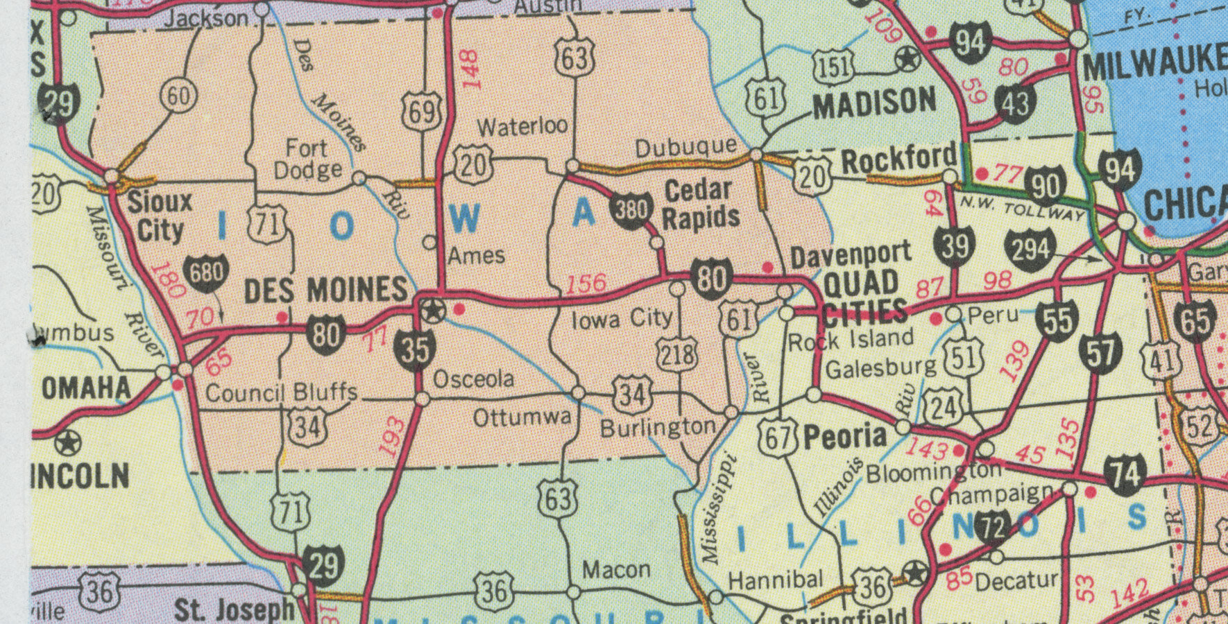
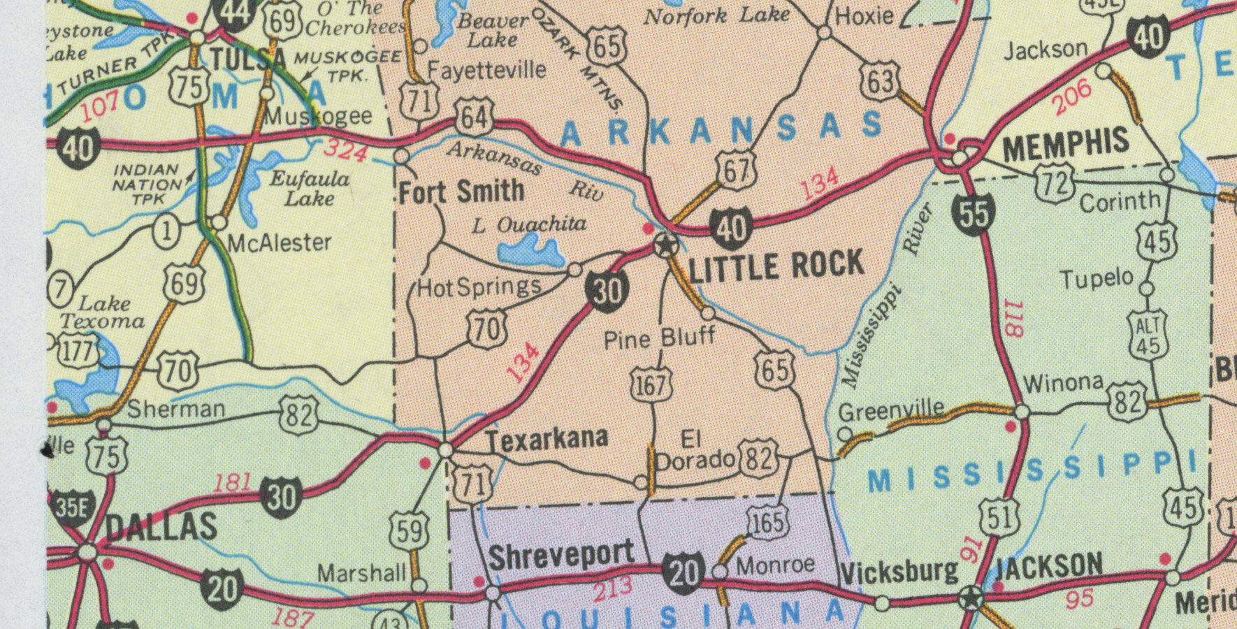
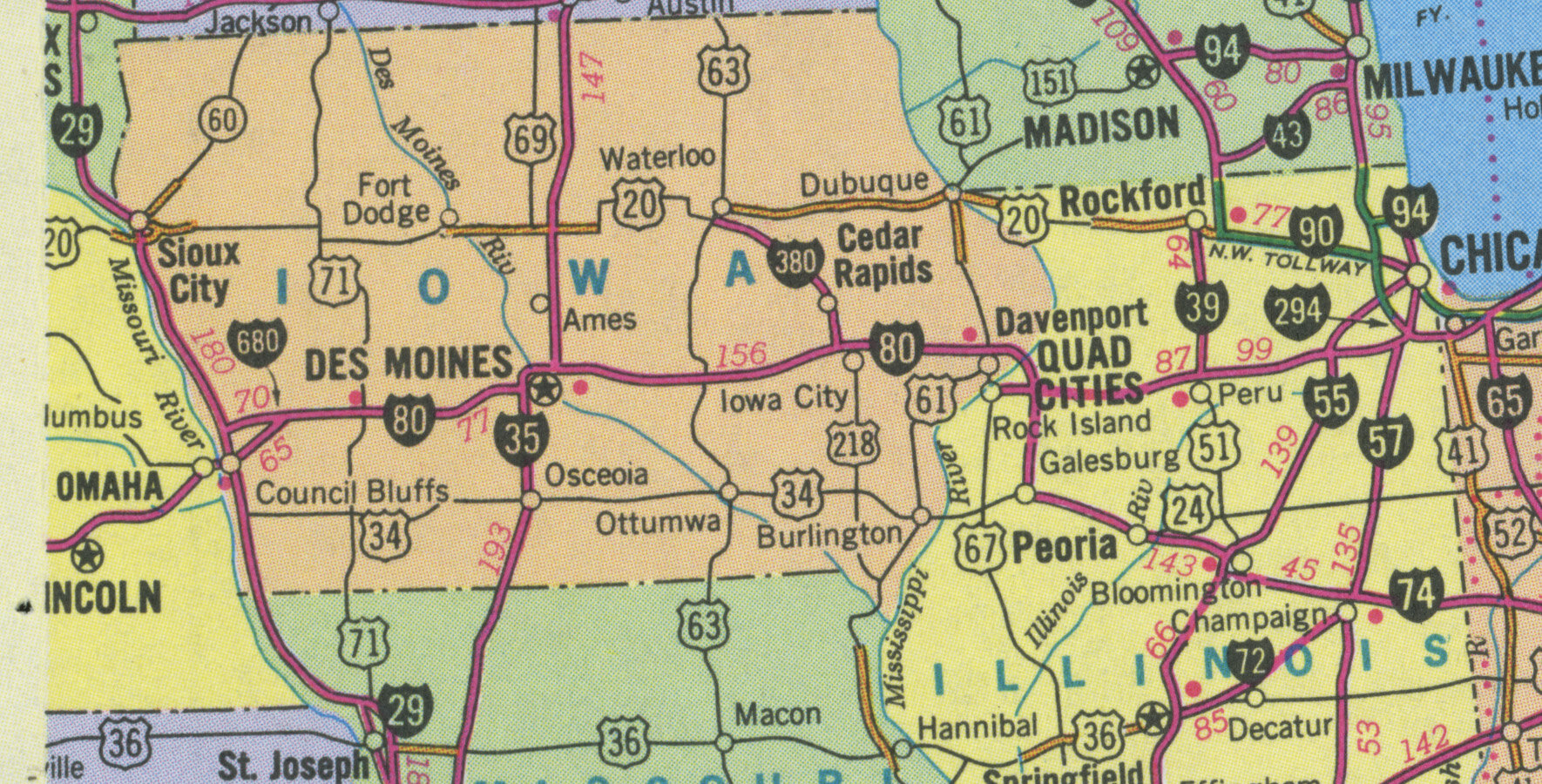
Okay I've scanned in the relevant page of the most accurate one I could get ahold of, which is still not perfect but its pretty dang close. 1990: Update: The 1993 map is actually probably correct? The printing makes it look like there's some subtle differences in line weight, but I dont think there actually are - it really is just the result of the ink going on a little heavier and the color matching being different. 1993: (It's not perfectly correct; the red index numbers above the roads don't line up with the HTR box, but seems to have more of the right roads.) I've uploaded them: Scans of the left and right sides of the 1990 and 1993 map can be found here.

-
My unpopular opinion: I don’t like the new thumbs down emote.
-
I think it’s simpler than that even: The people who are predisposed to talk about it on their own will do that; you don’t really need to give them any more (even though they’ll ask for it). But the people who are vaguely interested (but not totally tuned in or predisposed to care about your thing on autopilot) you only get a few shots at them before they’re over saturated, before your marketing has diminishing returns. If you oversaturate too early you start hearing things like, “didn’t that come out already?” I know it’s not always true, and this might not be what they’re thinking, but I think generally it’s best to keep your powder dry and only do a few sparing attention-grabbing bursts of media until you’re ready to start telling everyone everything close to release (release date, cost, availability) or you lose people and then have to try harder to bring them back.
-
I liked the big blocky one but also never thought the Gold Guy was a good logo. It’s now a little fun in a kitschy 90s way, but it never made sense for the games group. I’m honestly glad they’re back to their original original logo. I think Mojo had a history of gold guy logo at some point that revealed it was foisted off on the games group because it was commissioned for a company-wide rebrand but was rejected, and they wanted to save the design work somehow? Fake edit: Found it, it’s the Gold Guy Exposed article.