Leaderboard
Popular Content
Showing content with the highest reputation on 04/24/22 in all areas
-
It’s clear we’ve been fed very little when very very hungry. People commenting on the lighting choices of one image, or the presence or absence of grit in brush strokes when you zoom in. It’s not bad stuff to talk about, but I’m really really excited for when the full meal arrives. Even if the effect in aggregate isn’t to everyone’s taste, there will be so many more (and much more interesting) things to talk about.5 points
-
I'm guessing the rationale behind the art is to evoke Mary Blair and midcentury Disney. Monkey Island was always inspired by Pirates of the Caribbean, and the film art of that era is a good cousin to that aesthetic. My main worry is that they'll lose the feeling that you could step into the backgrounds and explore. Skewed perspectives can look cool, but moving Guybrush around on a semi-realistic depth field with winding paths is satisfying and makes the game world feel real. As much as PotC gets cited, I'd bet Ron was a fan of Tom Sawyer Island. A whole piratey island to explore with cave passages, fun as hell! The first two MI games often felt like a simulation of this. I really, really hope the art and map-design of the new game are able to scratch that itch.4 points
-
To be fair the fanbase was always a bit like this thanks to all the different iterations to MI we've had. We're an opinionated bunch and that's fine, what I never understood is why it is so hard for some people to view MI as a series that just likes to adapt different art styles. Yeah I have my favorites too and I wouldn't complain if those styles returned but overall I'm just excited for the new things Return will bring, art style included. I'd even play an FMV based MI game, throw rocks at me.4 points
-
I haven't visited Ron's blog in a while, but I remember the kind of comments he would get there and on Twitter whenever he would touch on his plans for another Monkey Island game. I can only imagine the merry nonsense he brought down upon himself now that there's something tangible to react to. My new joke these days is "Now it's Ron's turn to be the guy who ruined Monkey Island." It's a rite of passage, really. There's always been a contingent of fans who have judged the third, fourth and fifth games not on objective criteria, but against what they knew in their hearts Ron would have done differently. Discussing the sequels became an evaluation of their legitimacy. The "real" Monkey Islands vs. the imitation ones, and all that codswallop. And guess what, now that Ron is in fact making his follow up, those same people are going to turn against that one, too. Because Ron's not going to make the game they decided was the correct one -- either because he "sold out" or "lost it" or got soft or committed that unpardonable sin of growing more philosophical about (and thus accepting of) the other games or had to defer to all those modern ideas Lucasfilm forced upon him. There will be a reason, don't worry. It was a foregone conclusion; it can't be helped. The best thing to do as always is just enjoy the ride.4 points
-
All the analysis of MI's art style honestly just makes me want to see some actual gameplay from Return. I very much share the opinion that what we've seen so far aims to "re-establish" continuity with the first two games' visuals but I get feeling that when we finally see this thing in motion opinions will change very much. The teaser just seems so "dynamic" and full of motion compared to MI 1-2's more static presentation that I think animation will be Return's strong point and that's the missing link we need in order to "get it".4 points
-
Yeah, I was thinking the same, the art does much better larger. You start to see the grain of the brush strokes, and it all starts to have a bit more of a distinctly stylistic feel, to me at least. The sooner they can put out a proper trailer where we get to see some of the characters animated and a little bit of how these scenes work in motion, the better I think. I think they're feeling it a little too, because they've implied a little in some of these interviews that when we see the whole thing working, a lot of people will realise that they actually like it. Of course, it's not going to please everyone. Not everyone liked how CMI looked, and that's valid, even if I think it's very pretty. But what I really hope is that we get away from the idea I've seen in a few places that this art is 'cheap' or 'like the MI1 special editions' which I just think really isn't true and makes no sense. You don't hire someone like Rex if that's what you're going for. This is an artist who is a big fan of Monkey Island, trying to do the best interpretation he can of it in his own distinct style. We're not obliged to like it, but I do think that we need to accept that this is the style Ron and Dave wanted, and they like it, and that it's nonsense to suggest that it's just some cheap-out option that they would have avoided if they had more of a budget. I've seen people tweeting mean things at Rex, as well as Ron and Dave, and I hope that everyone here is going to be better than that.3 points
-
I find this hilarious and couldn't agree more. The comment section was becoming a freaking den for delusional psychopaths. It's incredible how entitled some "fans" can be. They just won't stop whining about the new style, like it's gonna change anything. And I'm saying this as someone who is still a bit puzzled by the art style. What a bunch of morons, I feel sorry for Ron.2 points
-
I am not affiliated but helped capture some of the content that was in the stream, and this is one that didn’t make the cut. There isn’t a huge trove of this stuff unfortunately, but that one is really notable and this seemed like a good time to share it.2 points
-
What part of Jake's request are you guys struggling with?2 points
-
I've sent them all several death threats, but I assume they know I was joking. (Seriously, why would people Tweet mean things? Aggressively entitled fans are the worst.) Very aptly put. We're agonising over minuscule morsels like ravenous beggars. Microscopically inspecting every breadcrumb. I hope they give us something more substantial soon.2 points
-
Clearly the only way to solve this problem is with a text adventure demake: Now the art style can be whatever you imagine.2 points
-
Not to sidetrack too far or anything, but when they lightly re-themed the island around POTC, they gave out new maps inspired by this one, and I've had it up on my wall since visiting. In my mind, Monkey Island has always felt like its set in that whole corner of Disneyland. Not just Pirates of the Caribbean, but as you said Tom Sawyer's Island, and also The Haunted Mansion, the Swiss Family Robinson Treehouse, New Orleans Square, the Jungle Cruise and Adventureland as a whole, even the sailing ship Columbia docks right there. It's all visible from right outside the entrance to Pirates. It's also easily my favorite part of the park, and the part that I think is the most evocative and imagination-stirring in general.2 points
-
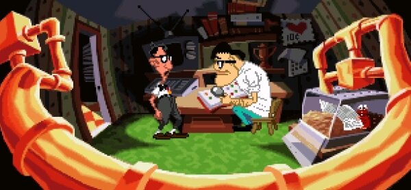
I see. So it could just be for space reasons. It’s not just me though, right? That art looks noticeably more warped and wacky than basically anything else in MI2? It really wouldn’t have surprised me if you’d said it was concept art for DOTT. In particular it reminds me of this scene, thanks to the obvious parallel that is the pipes. 😄2 points
-
May I humbly ask that this conversation end now? I am reading the same few people swirl around the same points now for many many posts. Anyone reading from the outside can clearly see where everyone recently involved in this thread stands on the broad points and many of the specific nuances of their points, and none of you are going to change each other’s minds.2 points
-
The more I look at the images we have (especially in high res) the more it's growing on me. I think it looks worse when it's shrunk down to a thumbnail size, which is obviously not how we're not going to play it. I especially like that courtroom in hires, actually (might have to open in a new tab and zoom in to see all the detail):2 points
-
It's strange. My generation was all about the "Director's Cut". We learned that studios often meddled with a director's vision, and getting that original unfiltered vision became the holy grail for fans. Now it seems it's getting a tailor-made edition that suits your tastes exactly. Creator vision be damned. In a way that's fine if people are prepared to make changes themselves (fan edits, fan mods, etc), but it sounds like the comments must have drifted into flat out abuse for Ron to shut down his website. Although hopefully it wasn't abuse towards the team and maybe just squabbling between fans.2 points
-
What the hell is wrong with people?! I've waited 30 years for Ron to make another Monkey Island game, now he's actually doing it and people are anything other than HAPPY? Gah! I'm sure you won't see this Ron, but from my point of view I just want you to make the game YOU want to make.2 points
-
It was included in MI2 at the time of the rolling demo, according to demo datafiles. However, at that point, besides the concrete pit with the treasure chest, there was no ending in place - not even the frame story from the intro. So the underground tunnels from the ending hadn't been implemented yet. Once those were added, the giant underground tunnel room beneath Phatt Island might have been an easy and logical cut for disk space reasons. (This also raises the question of whether waiting at the acid pit in MI2 was originally a genuine "kill Guybrush" Easter Egg like drowning in MI1, before the frame story was added and Guybrush naturally couldn't die during it.)2 points
-
Ah, that's sad. I know I've said here that I'm not fully onboard with the art we've seen so far, but even if I weren't withholding final judgement until I actually play the thing (or at least see some proper gameplay), I don't feel that as a fan I'm entitled to receive the exact thing I want. I certainly wouldn't go and harass the creators about it.2 points
-
It might be they decided that was a bit too wacky for MI2 rather than just cutting it for disk space/gameplay speed reasons. It is definitely a step beyond.2 points
-
If people haven't seen very much of Rex's art before I really do recommend Knights and Bikes. I think some of the stuff going on thematically should appeal to Monkey Island fans and while it looks like it's not exactly the same style as they're going on for Return, there's obvious overlap and I think what you'll see is that when in motion it really comes together and the character work actually becomes really expressive.2 points
-
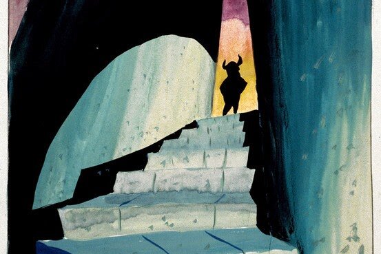
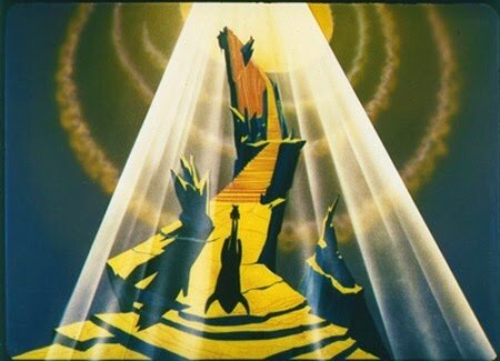
I think it’s a safe bet that “Monkey 3,” had that been made right after 2 instead of DOTT, would have pushed into a more stylized space, but what exactly that space is can never be known. It is clear from everything they did afterwards, the LucasArts art department was interested in pushing the limits into more stylized spaces. They also seemed uninterested in repeating themselves. It’s unlikely that Monkey 3 would have tried to look like a Chuck Jones cartoon, but it’s very unlikely it would have looked like “more Monkey Island 2.” Everything they did afterwards pushed for more illustrative and bigger characters for example. (Except The Dig but that doesn’t count because it started production before all of its contemporaries.) Again that doesn’t mean a Monkey 3 definitely would have shared that, but the odds are decent it would have at least been explored. This image was recovered as part of the VGHF dive into the Monkey Island 1 and 2 source, and nobody was able to divine what it means or what it’s from so please don’t draw conclusions. It’s NOT from any Monkey 3 project. Its impossible to say what it was for beyond a quick style exercise. It was actually found in the source files for Monkey 1, and the reason for that is hard to know (it could have just been a filing mistake, or not?) but it shows that even during production of Monkey Island 1 and 2, the artists were starting to explore pushing into more stylized looks. It really does feel like once scanning paintings was added to their repertoire, the sky was the limit on style exploration.2 points
-
It was fantastic. I got two questions answered, too, which was just icing on top of an already very icing covered cake.1 point
-
For anyone who hasn't seen this, I can't recommend it highly enough. Best $10 I've spent on the internet in living memory! What a brilliant evening it was.1 point
-
1 point
-
Actually it's been a steady rotation of people, like a tag team. But either way, I'm bored now. I'll always remember this quote: It's super important to not be led by your principles when making entertainment! Or doing anything at all. Let that be a lesson for us all1 point
-
I'd put the LAUGH reaction on that video, but the reaction functionality isn't working for me again.1 point
-
Oh, I'm sure we've all taken our turn indulging in that mindset a bit. Hopefully it's gratuitous for me to clarify that there's not the slightest bit of invalidity with preferring the Ron-led games or for feeling that the subsequent ones represented a departure in spirit, or whatever. That's probably a pretty common perspective -- maybe even a majority one for those who played the games in release order? -- but every "take" has its ugliest extreme. It's when people's preferences become tantamount to some sort of purity test that we enter The Dumb (technical term), and I take solace in the fact that it doesn't really show up in these parts anymore. Probably because the median age here is 153 now, but still.1 point
-
1 point
-
Just a few points: - I think it's very much the result of the narrative changes that people hate the added special effects in Star Wars too. With that said in that case I'd restore the original movies as much as humanly possible because of the reason of preserving movie history. - My opinion on perceived authenticity doesn't only come from my personal perspective but (as my comment tried to point that out) also from an analysis of what modern remasters contain. And they contain exactly what I said (updated graphics, cleaned up everything else) so I'd say that's pretty much an objective representation of what the audience expectation is. - As for what's important to me not being important to you: you did say that you prefer the original performance too before so I'm willing to guess that if you were given the option you'd play with the Joey Camen performance. Why can't we just establish common ground in admitting this much? - Yep, I agree that fundamentally Bosco wasn't changed by the voice acting and I didn't say that the change is something super important for everyone, as I've said in my next post I agree that he's still a racial stereotype. What you feel about things is not always rational though, it's mostly controlled by emotions, that's why I was talking about the sense of authenticity and not what actual authenticity would be. I think saying this is somewhat disingenuous. They put their principles before money? Yeah, I guess but the decision also affected a somehwat large portion of the audience's enjoyment and I think that's something we shouldn't forget about. Reading back old posts the change did bother quite a few people, even some Mojo regulars refunded the game and only bought it again after some extensive discussions. Now I pretty much consider Mojo this bubble of Lucasarts love so I'd say that seeing that reaction here most likely means that there were quite a few people who weren't happy about not getting the "100% remaster" they wanted. This is the best part of your comment though, I can't be grateful enough for you pointing this out: Yes, this is exactly how you create an army of trolls that could seem like an army of nazis even but this is also why it's very dangerous to think in principles when it comes to releasing an entertainment product. I'm no game dev, I don't know how that works but I know pretty well how people work: they don't like it if politics cause a disturbance in their lives. That disturbance doesn't have to be huge, it could be something meaningless because it's all about emotions: people fear the idea of censorship so it's enough to do something that could be referred to as censorship when it's being looked at from 1000 miles away. There was a thing, that thing is no longer there, instead there's another thing now = censorship, it's enough. This is why is it that when radical right propagandists / pundits see something like what happened with Sam & Max and Skunkape they are like "oh this is great, they are doing my job for me again, let's make a video and tell people how terrible this is". And yeah, that army of trolls won't really affect the sales of Sam & Max but that audience gets this type of content a lot and you know what they do every 4 years? They go out to vote and they are making the radical right stronger ever since the left started doing this kind of thing. They are like "you think I can't enjoy my old movies again? you're calling me racist? what gives you the right?" and then they go and vote Le Pen, they vote Orbán who all have campaigns built around this thing. So at the end there's this thing that steered a few people away from the product and it ultimately didn't do a huge amount of harm to the product itself but it fuelled a machine that's only running on this thing. This is why I believe that ultimately it's wrong to try forcing a cultural change and it's just much better to ride and support the waves that are naturally heading towards progressive ideologies if not disturbed. I think people actually sense this, I mean it's surely not random that we call it a "war" even though a state of war is obviously not a time of progress but rather the opposite.1 point
-
I read it all, so I guess I'm awesome. This is completely subjective, which was elTee's point. You're just saying, "this was important to me, so therefore I should have the option to disable it". You're trying to argue that there's some objective standard that we all could agree and adhere to, but even if use your Star Wars example, that simply isn't true: Things in Empire and Jedi were changed in order to tie those films better into the prequel trilogy. Dialogue was rewritten. Actors were replaced. Objectively the meanings of several scenes were altered. But the biggest complaint by far, the one that led to fans going berserk, was the one you cited: Han not shooting first in the original film. Which arguably had far less impact on meaning than the other changes but which drew far less ire from fans. It's all inconsistent. And despite what you've said about SFX changes being acceptable to most fans because no "meaning" was changed, there are several high profile Star Wars restoration projects and they're ALL focused on removing every single change that has happened since 1977. Not just the infamous Greedo scene. In fact if there is a project that removes that single scene and keeps the other modern changes, I've not heard of it. But could list the others off the top of my head: 4K77 and Harmy's Despecialised Edition. For the fans who care the most, the ones who are prepared to put thousands of man hours into these projects, it's all or nothing: They want the untouched original. So there is no real consistency: There are just different camps of people who believe certain things are important. And because you belong to one particular camp, you think you represent the majority. Which again brings us back around the original point: This is all subjective. What's important to you is not important to me. And vice versa. And even if you find a subreddit somewhere that is a home to a lot of people who all agree on one point, it does not mean that their opinion is more valid, important or objective. It's just one of the dangers of the internet: It can easily make you feel that your opinion is the only sound-minded one out there by putting you in an echo chamber. And what's worse: You put things out about "censorship" and "wokeness" and other people, who actually don't care as much, will parrot back what they've heard. Like people who only read the headlines of news articles. Objectively speaking, changing Bosco's voice doesn't alter the meaning of anything. Nor does removing references to special needs children. But for you it alters the "authenticity" (the meaning of which could be debated in itself) of the experience. For me it doesn't. It's still all subjective. As for your comment about ignoring "imaginary bad actors", this has been addressed several times already. In short, the dev team did not wish to put their name to something they felt uncomfortable releasing. They were prepared to potentially upset some fans in order for them to be happier with what people played. In other words, they put their principles before money. Anyway this conversation has gone on far too long. I can't believe there's a single point that hasn't been covered by now. And I suspect that if people really do care that someone will release a patch that inserts the original dialogue into the remaster anyway.1 point
-
I see that you managed to get the point. Don't you think that the conversation could do without this aspect though? Honestly it's such weird baggage to have and sort of only hammers home the point that you guys seem to keep coming back to without noticing it: that the only reason for the change is the fight against racial stereotypes. So it's not something that's needed to improve the game's narrative internally but rather it's a message to send out. Well, a few things about that if you may and I'll try to be brief because I really think it's pointless to keep coming back to this road: - Sure, the new voice makes Bosco sound less stereotypical but it also absolutely doesn't solve any of the problems with his character. His lines are still the same, he is still a racial stereotype and the Apu of Sam & Max, the minority store owner character that makes you cringe nowadays. This is a problem that's inherent to the game's narrative and only a full remake could solve it. The same goes for something like ToMI's merfolk giving off suspiciously transphobic vibes, there is no way to fix that, the joke will always be that it's hard to identify their gender. These are old games, these things happened back in the day and none of us noticed. - Coming back to the same point of fighting racism only underlines that the voice actor switch was unnecessary, it kind of gives off the vibe that the audience should put up with a voice that's less authentic to what the character is so that they could feel better about themselves supporting a game that has such an ugly racial stereotype in it. /s I kinda get the feeling that if the game wasn't self published but some kind of publisher oversight was involved then the voice actor would have never been changed because really you can come up with 500 reasons on why not to make the change from minor financial ones to the audience just not being interested in a new voice actor for a franchise that already had problems with that. When it comes to me personally I'm just curious on how cleaned up OG Bosco would have sounded like and to experience that is kind of why I buy every second game and music album remaster under the sun. Yes, I can interpret that what I would hear is a racial stereotype but as an adult customer I think I'd be able to deal with that just like how I can replay Full Throttle Remastered when I know that Darrel is voiced by a white guy doing the "black guy voice" (and he's less of a racial stereotype than Bosco is, I mean he's a black guy in a motorcycle club :D). I wouldn't want that for a new product but the point of the remaster is to hear a cleaned up version of what was recorded back in the 90s, that's what the term remaster means literally. So yeah, I get it, thinking that nazis review bombed the game, that we're in this war to fight on the right side is a comfortable bubble to be in. And I have to admit I see the potential fun in coming up with Proud Boys jokes too but you know, it's just really far from a realistic perspective on how gaming communities and consumers in general work. And yeah, if I made my purchase decisions based on how something appeals to me morally / politically I still wouldn't have bought the game with these changes because Bosco still kinda sucks as a character.1 point
-
I'm just more excited than ever by the idea of Skunkape remastering TMI. Is there someone I can write to?1 point
-
This is something that happens more and more. It’s really depressing what fandom has become… Toxic fandom is really destroying creative processes. This is why many wise development companies (like Nintendo) never really listen to fans. When they do it becomes a sliding slope.1 point
-
Came here just to check that the conversation got heated as I expected. It did.1 point
-
Absolutely! I mean I also turned up my nose to the art style, I'd definitely have preferred something else, but I'm simply happy this thing exists in the first place. It's pretty much a little miracle imho. People there are behaving like Ron owes them anything, it's unbelievable. Love it or leave it, but why the whining???1 point
-
1 point
-
I'm pretty sure it was yet a third item, in addition to the manual and the Grail Diary. It looked like this. And yeah, LucasArts put out some budget reprints of their games around this time, which cut down on the paraphernalia included and exhibited cheaper printing choices. The disk labels on these releases are so generic looking, that sometimes when they show up on eBay people mistake them for bootlegs. Nope, the company was just that cheap!1 point
-
I agree with you there (but I still hate the lighting in the new Melee scene -- although I have grown to like the other two examples we've seen).1 point
-
Yes, it was one of the things I didn't like about Bill Tiller's art direction at the time. The world was never cartoony, it was always very grounded. Can you point me to where you found that image that you said was from the VGHF? I watched the whole thing live and have scanned their webpage... unless I'm going blind (which is definitely a possibility) I cannot see the image you claim came from there? https://gamehistory.org/monkeyisland/ And can we all just stop for a second and appreciate the utter beauty of this image... Look at those shadows, the gentle use of colour. It's GORGEOUS. I love Peter Chan's work. And it still looks beautiful with a limited palette.. Sigh1 point
-
So when can we expect the super-mojo-exclusive dev interview where you guys ask all the hard hitting fan questions™️? I'm excited for when you guys get a chance to chat with Ron & Dave and maybe even David or Rex While writing this I also realized the abbreviation for Ron and Dave is R&D and I think that's pretty awesome by itself1 point
-
Sure, that's fair. I do think that feels like a much smaller leap than the one between 1's purely digital look with straight geometry in a heavily skewed perspective, and 2's marker art with more curvy weird angles going on1 point
-
Monkey Island 1 and 2 both are pretty grounded architecturally, and then push the style of the rendering to exaggerated fisheye perspectives. Curse takes that and starts applying it to the architecture itself. In Plunder Island, the buildings start stacking vertically and haphazardly, so that the architecture is getting increasingly implausible in support of the visual style. It's only a tiny step in that direction really, but I think it's notable. (I dont think this is a bad thing! It's just interesting to watch happen across those 3 games.)1 point
-
Sorry, I don't think it's reasonable security by far. The wackiness of DOTT was appropriate for something that was by all means a reboot of the Maniac Mansion franchise. Monkey Island had solid foundations that didn't need that much of a dramatic change. I suggest you have a look to the design document of the cancelled Indiana Jones and the Iron Phoenix. It was certainly cartoony, but far more serious and proportioned than DOTT. Edit: sorry, you already did. The page didn't update properly.1 point
-
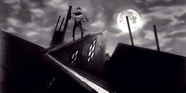
Certainly true. But we can make assumptions, based on what we know for sure. And the assumptions, if correct, can bring us closer to the truth. What do we know for sure? We know that in 1993 Larry Ahern, animator of Monkey 2, and Peter Chan who together with Purcell had designed the backdrops, for the graphics of DooT - the first Lucas adventure to have a real artistic direction - chose the Warner cartoons of the years as a reference. 1950s, in particular "What's Opera Doc", which in turn was strongly influenced by the aesthetics of German expressionism of the 1920s (Metropolis, Dr Caligari etc.). Why did they follow this line? Not by chance. If you remember in those years - before full motion video games like Phantasmagoria - the software house experimentation was directed towards cartoon style games. Sierra had experimented with Leisure Suit Larry 5 (1991) and Willy Beamish (1991). So, knowing all of those informations, we can say with a reasonable security that if Ahern and Chan had worked on Monkey 3 in 93/94, following their research and the trend of those years, they would have chosen the same, deformed and expressionist style. That is what we have now, more or less. I said all this again to say that the style of Return to Monkey Island is everything, but not "contemporary". It is strongly, totally, definitely retro. Thank's God.1 point
-
That's wild. I guess Lucasfilm was just that sloppy. It's probably an irrelevant point to them, since ScummVM forces the security door open in cracked or uncracked versions of the game (though that leaves the impact on the other combos?), and ScummVM is the official intepreter at this point. Pipe dream stuff: It would be ideal if there existed an FTP repository that offered archival builds of every version of every SCUMM game (preferably KryoFlux streams and ISOs, but at the very least complete and unmodified filesets), as authentic builds are the only way you can emulate the games with exactitude. I don't deal with torrents, but my understanding is that even pirated versions of these games that get circulated around are often missing the executables. I suppose that some of the more obvious versions of certain games have uncompromised copies floating "out there," but what about the more obscure versions, the various non-English language builds? Their extancy may well be tied to the lifespan of rotting diskettes in a collector's attic. It becomes an archival issue. In a perfect world, you'd be able to show Lucasfilm a proof of purchase and gain access to that hypothetical repository. "Bought Loom on GOG or Steam? Click here to get as-is copies of all legacy builds to use as you like." Of course, it would be making a big assumption to think Lucasfilm necessarily has all that stuff handy themselves anymore. Maybe there's a hero out there quietly doing this backup work, though of course I would never endorse anything illegal.1 point








.thumb.jpg.2b48c2b7ab1e60b90b94406d1abb50af.jpg)

