Leaderboard


Popular Content
Showing content with the highest reputation on 06/03/22 in all areas
-
Geez! I'm out of town for a few months/years and a new Monkey Island game gets announced?!?! And one actually helmed by Ron Gilbert?!?! Seriously, the guy had decades to do that and his choice of timeframe was now, when I'm off the grid?!?! I demand he cancels the game and reannounces it next week.4 points
-
Good find! Oh man, if I were Devolver I would make it so that the Grog icon dissolves the closer we get to release.3 points
-
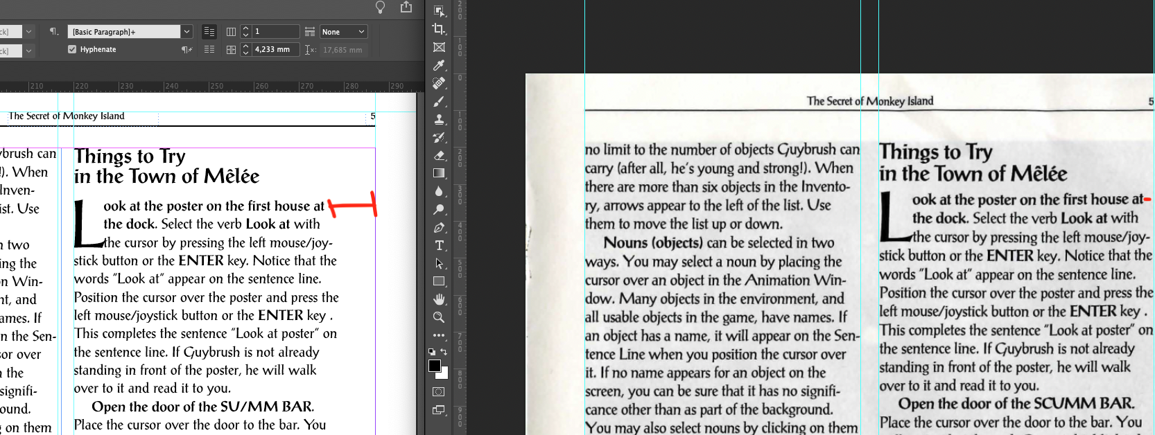
Hi all ! I'm finally sharing with you my work. I'm not totally satisfied for multiple reasons I will explain but I'm here to make it fully "compliant" with the orignal one so feedbacks will be awesome and maybe some help First of all, anyone who wants to give feedback directly on the pages can use the following link https://assets.adobe.com/id/urn:aaid:sc:US:8b5d7412-9cb3-4e5d-ba65-56d345af1849?view=published If you spot any mispelling or any update needed, please comment it ! Fonts, first version of PDF and original scanned manual I've used can be found here: https://drive.google.com/drive/folders/1y2MQqnaUTx6K2VM611F09XCTwLzVyv5b?usp=sharing Let's explain what I have done and the blocking elements. Things to consider 1°/ This i not a final version, I would call it a beta version of the final manual 2°/ I have tried to use at maximum the inner function of indesign but I've struggle a lot to achieve it (Well I didn't achieve it this way I would say ) 3°/ I used Postantiqua font Roman found on the internet. It have found other PostAntiqua Font that seems a bit different (like spaces or height is different) 4° / The in-game images are a basic screenshot of the manual I've used. So it's not images with a good resolution 5°/ I'm not a designer so i have limited knowledge of those tools (illustrator, photoshop, etc) but any tips or advices for getting better is welcome ! InDesign Configuration The manual is a A5 manual (148mmx210mm) Font size is 9pt Margins (mm) are 16-9-9-9 (Top-Bottom-Inside-Outside) I've used PostantiquaBE and PostAntiquaBE Medium for bold version (see font file I have) I found another "official" pstantiqua font but it was 99$ I have used modified styles for H1/H2 and paragraph but always try to use styles for easy update Working and struggling... I have started by designing the template for the pages with upper line and page number and dividing each page in 2 text columns. I have struggled a lot when trying to calibrate with Indesign hyphen system. To be cleared, I have never managed to use the hyphens system in this context and have good results. The hyphen linebreaks didn't work for every line so I have used manual hyphen and linebreak. I know, it sucks ! By at the end, we generate a PDF so... The right side of the right column has too much space before the end of the column. I have the same font size but as you notice in the attachment, the width between the last character and the upper line is smaller than the one I did. But I don't see any glitch on the fonts and character spaces. So I have 3 main concerns: * Not be able to use the in-app hyphen system and use manual linebreak. * in-games images aren't in in HD * I'm not pixel perfect with the second column, I think the rest of the document is pretty the same as the original one Optimization In-games images: It's just screenshots from the PDF, so the image are not in a good resolutions. If someone can help me on this I'm open. I think it will be good to arrange the contrats and luminosity, etc to integrate it in HD Space on the right column: Try to fix this, any suggestion is welcome Others: Any update or comments is welcome Any feedback is appreciated ! PS: Credit to @Laserschwert for the cover design. I have used to illustrate the cover
 2 points
 -
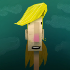
Okay, I know I'm just desperate for news, but has anyone noticed this green Grog before?
2 points
-
Here's the shadow shape interpretation, colored. Yeah ... I really want to up this coloring game.1 point
-
Don't worry, you'll be feeling impatient for more news in no time!1 point
-
Looking good - a quick look, and added a few typo/OCR corrections - sorry for possibly ruining the pristine preview for others. 😉 I'm guessing the difference in character width may simply have to do with PostAntiqua not really being owned by a single foundry, so there'll likely be slight variations between them. Or they might have done a slight no-no, and stretched the design in the original manual. The flowery bullet is a "bit" low-res - but that may be the Adobe previewer. In any event, very well done so far - impressively accurate! 😁1 point
-
If that is true this would be amazing and cute. 😄 Quick, someone check if one of them matches the silouette in the background of the teaser trailer!!1 point
-
My mood hasn't shifted, at all. I never thought it could be the biggest and best thing ever, but, in true Monkey Island style, I think that Return will be the second greatest Monkey Island game I've ever seen. 🐵🏝️1 point
-
Thanks for these, these are awesome!1 point
-
I absolutely love your covers, Since you mentioned your abandonment of the cd format, I don't expect you will be doing back covers with track lists and whatnot, will you? The covers really do look very nice1 point
-
Hey, you do you! If that's the way you enjoy playing adventure games, you shouldn't even feel ashamed for playing them with a walkthrough. They're games, all that matters is that you have fun playing them. i for one do not have much fun playing puzzle-less or casual adventure games (like Unavowed), let alone the more narrative-driven games of late Telltale and company. They just don't hold my attention and I don't feel like I'm playing a game, so I easily get bored and move on to something else. I need puzzles to continue to feel engaged and interested in the story, that's what makes these games *games* to me. If I want a more passive narrative experience I switch on the TV, there's a lot of good stuff there!1 point
-
I suspect melee will be a significant location, since otherwise it would be weird to have it there - it looks like at least the shop, the new key shop, the lookout area, the prison and the governor's mansion will exist, but it also looks to be a lot more run down than before. I sort of like the idea of a melee that has become forgotten and run down. Given that Melee originally had very little music, I'm not even sure if Land will do that island, maybe it'll be one of the others. Time will tell!1 point
-
I’m hoping the game won’t spend too much time on Melee. It’s a very played-out location, so I’d like them to keep it short but sweet. Hit us with some key locations and themes, then move it on. 😄1 point
-
It was the best they could do at the time1 point
-
Sure, no worries! I'm glad that you draw the distinction between the criticism here and elsewhere on the internet because I do think there is a difference. Many people here have had literal decades to sit with their feelings about the game. So where we are now is different from the initial response (which from a lot of Mojo folks was largely positive, if you check the secret history) AND the subsequent reactionary backlash. I think also the whole internet is in a different place from around 2000. There are many more lines of communications between developers and fans, and games themselves have changed. Apart from at the real fringes, indie games just weren't really a thing and the financial models that allow ReMI to exist now in the way that it will - as a probably mid-budget game developed by a small team, didn't exist. I was going somewhere with this and I can't quite remember, but I think my point was that I think it'll be a little different this time. In some ways, it'll be worse, because there are a certain amount of people who decide that the privilege of being to talk to the people involved with the game means they can and should say whatever mean thing that comes to mind at the time - and we've already seen a bit of that. But I think we're also past the point where we expect a new adventure game to be a AAA spectacular, bigger and grander than the last one. Adventure games are firmly in a niche, more than they ever were, and I think one of the challenges EMI had that is more obvious now than it was at the time is that it was in that transitional time when everyone still expected adventure games to be a Big Deal, but also nobody was willing to give them funding to match that. I think the mood for most has shifted a bit from 'It's a new Monkey Island game, this has to be the biggest and best thing ever' to 'It's a new Monkey Island game, I never expected this, I'm just glad it's happening... I hope it's good.'1 point
-
Oh, you made the Cursed version, @AndywinXp? Very nice! I love it and listen to it a lot. Of course I had to make a cover for it. 🥰 I haven't noticed anything negative about it (drums or guitar), but I don't have a great ear for such things... To me they sound perfect. @Romão, although I don't listen to CDs anymore, I'd love to see the CD covers, when they are ready! (If you need help or anything, I'd be glad too, of course). I love the idea to make them under the label "Stan's Previously Owned Soundtracks" btw. 😅1 point
-
Thanks for the nice words about the Cursed soundtrack but I should really find some time to remix it and rerecord some drum and guitar parts... Jeez those are old1 point
-
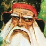
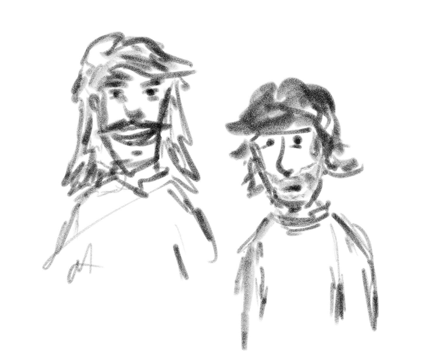
I also had a go at a quick Guybrush sketch. Strangely enough, I can more and more make myself comfortable with a mustache Guybrush. 😬 However, I like the right better (but I'm not a great drawer now, so... yeah).
1 point