Leaderboard
Popular Content
Showing content with the highest reputation on 05/11/22 in all areas
-
8 points
-
(Putting the CMI art in there made me further realise how good this new art actually is. The details are just so exquisite.)8 points
-
In all this excitement I forgot to mention that the plot of ReMI came to me in a dream: So there you have it. Looking forward to playing that.7 points
-
7 points
-
By the way, some time ago I made some comparisons between the graphics of the different versions, that some may find amusing. First the three different graphics styles. I don't remember if I used the VGA or FM Towns version for the rightmost column but for these scenes it shouldn't make much of a difference. (The FM Towns version runs at 320x240 pixels rather than 320x200 pixels, though it's mostly just more wasted black space at the bottom of the screen.) The middle column is the TurboGrafx-16 version, showing both EGA and VGA style graphics, as well as the missing tree in the foreground of one scene. Another comparision, this time of one particular scene. The VGA talkie version really... stands out? And finally one where I added the CGA and Macintosh black-and-white modes. I think the CGA mode is auto-generated from the 16-color graphics. I know the black-and-white mode (only available for the 16-color Mac version) is.7 points
-
6 points
-
6 points
-
That's the big question, isn't it? I haven't even played all versions. 😀 TL;DR - The EGA version is the one I find myself returning to. In some scenes, the VGA graphics look quite nice, but there are other scenes where I think something was lost in translation. I like that we have the VGA version, because it's almost as if two teams were given the same screenplay, sets and costumes, and were asked to make a game. I just dislike that it's the only available versions these days, because to me it's not the best one. And now the long, rambly version... Most of the Looms I've managed to track down, I've gotten from eBay. The only version available for purchase nowadays is the VGA talkie one. I got EGA Loom from the LucasArts Classic Adventures collection, and Mac Loom from the LucasArts Mac CD Game Pack and it remains my favorite. It's apparently a lot easier to find the German version, but I don't want that. The English TurboGrafx-16 version used to be reasonably priced, but seems to have gone way up since I got mine. (The Japanese version was cheaper last time I checked. I don't speak Japanese.) Extracting the game from the CD so that ScummVM can play it is also a bit of work. The FM Towns version has always been horrifyingly expensive, so don't ask me how an affordable one suddenly popped up in an auction one day. It didn't include the box (which probably made the more insane collectors turn up their noses), but it did have both the game and audio drama discs, and the instructions/hint books. The only version that's easy to find is the VGA talkie one. The one sold on GOG and Steam is packaged differently than the original CD, but should otherwise be identical. The EGA version is, as far as I know, the only version that has the Overture that plays when using the Roland MT-32 music. But since this is just a black screen with the word "OVERTURE" and the Swan Lake theme playing, you're not missing that much if you don't see it. The original 16 color Mac version is close to the EGA version, but uses a high-resolution font for the text and notes. The music sounds different too. The instruments are digitized, but not very fancy ones. I don't know how well ScummVM handles it, since the Mac emulator I'm using is having trouble with it. It sounds ok to me, though a bit shrill at times. The later 256 color version is a straight port of the VGA talkie version, as far as I know. The FM Towns version is graphically very similar to the VGA talkie version, to the extent that they show the same scenes. I did notice some minor touch-up in one scene, but I don't know which is the original and which is the revised graphics. Scrolling is done pixel-by-pixel instead of eight pixels at a time. But as mentioned, it plays music pretty much non-stop without adding any new songs, which can get a bit annoying. It adds a few sound effects as well, e.g. a splash when Bobbin falling into the water. The notes you hear are often overlaid with sound effects too, making them even harder to make out. The TurboGrafx-16 version is a bit of an odd bird. Some of the graphics look like the EGA version with a bit less dithering, while others look like the VGA version with less colors. In one scene, a tree has been removed from the foreground. Perhaps having an object you could walk behind like that slowed down the graphics too much? Unlike the EGA version sound effect don't always interrupt the music. The music sounds pretty much the same as the first arrangement of each tune from the FM Towns version. However, some noticeable changes is that when the dragon carries you off it plays the same music as during the final confrontation, and in the caves afterwards it plays the Swan Lake theme. Also, the blacksmith music starts playing while you're still on the plateau outside the Forge. It's weird. When playing in an emulator (not ScummVM), the picture is a bit wider than 320 pixels. This causes glitches at the very end of the game, since some graphics are then visibly cropped. The VGA talkie version is... well, it was the first version I played, so I still have a soft spot for it. Most of the text has been modified in some way (usually made shorter, but sometimes longer). Maybe some of it sounded better when read aloud that way, but I don't know. All of the sound, speech and music was mixed together into one long audio track, which put an upper limit on how much they could fit. (I've seen one game that tried to get around this by putting half of the sound in the right channel and half in the left, but Loom did not use that trick.) Almost all of the ambient music is gone. Most of the distinctive close-up portraits are also gone, though a few new close-ups have been added. There is a bit more character animation as well. Some of it is good, while others is straight from the "Milking the Giant Cow" school of acting. Particularly the Elders and bishop Mandible. I don't have the remaining versions, but I understand that they're graphically like the EGA version. So the main difference is the audio. Since ScummVM can now replace the music, it should be fairly easy to make e.g. the EGA version sound like the Amiga version, if that's what you prefer. Though the sound effects will still be different. The palette may be slightly different, too?6 points
-
5 points
-
After my earlier remark I decided to do the worst thing possible and look up the Scumm Bar's "Curse of Monkey Island Fan Reviews" page, containing a bunch of reviews that went up basically right after people got to play Curse for the first time. Unfortuantely my review is in there, a review with which I find no faults absolutely disagree with on almost every point made, when I read it back today. There are a few people complaining that it should have been 256 color pixel art, and blame the excesses of the new high res production and far-too-fancy art style on why the game is ruined (Of course Curse was also 256 colors but they probably just meant the 320x200 part). And a lot of people really upset that Herman Toothrot isn't in the game (the monkeys paw curls and EMI is born), to the point that it almost seems like it was a meme in the community that people picked up on from each other and said "you know, yeah youre right that does suck!" but it's really hard to wind the clock back and tell. I think the truly old Scumm Bar forums are gone. It's really hard to tell the context of this at all without the rest of the discourse that surrounds it - a lot of the reviews look like they're written in response to hate that didn't get recorded as vehemently in reviews. Anyway sorry for what 16 year old me wrote at the time. He's an idiot.5 points
-
5 points
-
4 points
-
3 points
-
3 points
-
Of all the things I would expect to find out about discourse back then, people being aggressively passionate about Herman Toothrot is not one I ever would've ever expected. Cringing at your past self many years later is a intrinsic and essential part of the internet experience in my opinion.3 points
-
2 points
-
Once I've finished up a few more variants, this one will go up into the thread as well (the dirty edge is just to make the white frame show up on this forum):2 points
-
2 points
-
2 points
-
2 points
-
2 points
-
2 points
-
No! If you squint your eyes and turn your head it totally looks like Guybrush!2 points
-
It would be funny if Stan's jacket is some sort of voodoo knick-knack which turns the wearer into a fast talking obnoxious sales person! That way we'd get a totally unique new LeChuck which is annoying as hell!2 points
-
2 points
-
I should have got this in three, but in a moment of madness I wondered if Remi had employed a new strategy to wreck my head - setting the same question twice. Or, the scenario I actually contemplated, that Mojole was broken and had got stuck. Sorry Remi! That would never happen! 👕 I beat #Mojole and all I got was this stupid t-shirt. 4/6 💛🖤💚🖤💚 🖤💛🖤💛🖤 🖤🖤💚💚💚 💚💚💚💚💚 https://funzone.mixnmojo.com/Mojole/2 points
-
It's grimly relieving that this game was announced well after all the primary creative decisions were under glass. It seems unlikely that a team of professional game developers would ever depart from their own tastes and instincts in response to men's room graffiti, but between Ron feeling the need to put his blog in timeout and Dom directly engaging with Reddit comments to address the feedback, it's unfortunately clear that there is some personal impact here, so knowing that the shrillest voices were denied the ability to have even a subconscious influence on the game's development is satisfying.2 points
-
Oh yes I have, and I love them but there is a difference between action fgures and a figure that was made to have a specific pose and expression, to me at least. I guess I just want a chance to get a cool thing like the Symbiote figure from 2012, it's got such cool poses and has so much personality, if I had known what the internet or money even was when it came out I would have totally bought it without hesitation, my biggest regret in life is not having been born 20 years earlier lol. It's pretty impossible to get nowadays (unless you want to pay more than $1000 on ebay for it). I know it's a pretty selfish reason though, most people would probably be satisfied with the boss fight action figures.2 points
-
The other thing I forgot to respond to on this post is this. And like... maybe I shouldn't try to be Batman. But it's what I was saying before. I often wondered whether I was spending too much time responding to misguided comments on Double Fine's forums. And then I met Tim Schafer one day and was a bit too shy to explain exactly who I was on the forums, and he found out later on and sent me this: And I have to admit I was kind of bowled over, but since then I've always felt like going out of my way to speak up when I have the energy to, because you never know who might be looking and appreciating it from a distance and thinking 'I'm glad someone said it'. I think often times when you're a creator you feel like you can't wade into heated discussions, because of a need to keep a professional distance, so I guess it's nice when there's someone there to say the thing you really wanted to say.2 points
-
I remember that feeling too, and I definitely agree he used to be scarier, but also I suppose part of that comes from... I was 10. I'm never going to feel the same way about LeChuck as i did back then, unless they make him genuinely terrifying, and I doubt they'll do that, so I think this might also be one of those 'you can never go home' type deals. I think enough time has passed though that I'm ready for a less cartoonishly evil LeChuck and more of a legitimate threat. Something I liked about the first couple of games is those cutscenes you got where you'd find out about LeChuck's progress dealing with you. It was creepy as he felt always just a couple of steps behind you and could jump out any moment, especially in 2. And he was menacing, even to his minions. They did a bit of that in CMI too I recall (I don't remember whether it was in EMI and they couldn't do it in Tales for plot reasons) but it wasn't quite so effective because it was played for laughs a lot of the time. It's difficult to take his Guybrush-tracking efforts seriously when they're being led by a man dressed as a cartoon dog who talks like goofy. I hope in return we get some serious 'Meanwhile...' action.1 point
-
I agree with both of you. It would be jarring if they went with a totally different voice for one game but at the same time, a sound alike would be super jarring. I found the tales of monkey island episode 1 voice distracting especially their laugh. I couldn't stop thinking about how Boen would have delivered the line. Whatever the new voice sounds like, i just hope we can get a more scary LeChuck. I felt that LeChuck became less scary in the later games. More goofy. I hope they go back to the terror of the mi2 LeChuck. I remember being terrified of zombie LeChuck. Whenever he appeared in the tunnels i would jump and be full of dread.1 point
-
I just don't want LeChuck's voice to sound really different/off just for this one game. That'll stand out tremendously if practically everybody else feels like (literally) a voice from the past except for him. I hope they get somebody who can imitate Boen's delivieries/voice closely enough while still giving a great performance. Similar to what Kevin Blackton did with human LeChuck in Tales. While we're throwing in suggestions, I remember there was a character in The Devil's Playhouse who sounded similar to LeChuck at times (the squid that lived inside Papierwaite, I forget the characters' name, I'm sorry!) If they can achieve the best of both worlds, I'll be happy.1 point
-
The game is in the testing stages... If Devolver are due to appear at Summer Game Fest as expected (thanks to @OzzieMonkey for confirming it begins 9th June), I don't think it's a stretch to assume we'll have a release date by then...1 point
-
I love this thread, I've been lurking for a long long while. Today's the day I finally ask the question I've been meaning to for like... months. @LaserschwertYou seem to be THE biggest brain in terms of box art assets used in Lucasarts games. I was wondering if you had any idea where one could find this map texture used for the Hit the Road box and manuals (scan found on mobygames.com): I know it has got to be a full map because it's also in the background of this promotional picture here : It's okay if you don't know but I thought I might as well give it a shot, you seem to be the expert in the topic. Do tell me if this is intrusive, I'll gladly delete this post if it diverts the conversation from its original topic.1 point
-
Okay, we've all noticed the prevalence of keys in what we've seen so far. But nobody has noticed that Return to Monkey Island is actually an anagram of Moonlit Nerd Turns A Key I'll let you draw your own conclusions.1 point
-
1 point
-
1 point
-
I keep going back to this thing I posted on twitter as a way of tempering my expectations: Something I've noticed when nostalgic things return is that it never feels absolutely right, because the brain is just not very good at accepting the new. Like... take that picture of the key shop for example. It looks like it's in Melee, just outside the path to the mansion. My initial, gut response to seeing it is 'no. That's wrong. There's no shop there. And there should not be a shop there. And the very idea of a Monkey Island having a key shop in it is wrong.' - never mind that you can see from other parts of the image that time has passed, and there's no reason there couldn't be a key shop there now. Never mind that there's nothing intrinsically too weird about there being a key shop there, and certainly nothing that makes that weirder than there being a circus, or a voodoo shop, or a tourist trap hook isle, or a swordfighting dojo and so on and so forth. But it's not familiar and so my poor, worthless brain goes: nope, reject! This isn't a Monkey Island thing. Obviously this feeling subsides after a while, and the rational bit takes over and you realise 'actually this is a perfectly reasonable thing to put in a game'. Or else you realise that your gut was right all along (Starbuccaneers and Planet Threepwood are just... locations that I do not believe could have existed in the first 2, or even 3 games because of not fitting the tone of what they were doing with the humour). But the initial reaction is always the same, no matter how trivial the change or addition. "Ahh! Something new! It's wrong!" So when I first play the game I am trying to go in knowing that this gut feeling is going to be happening to me ALL THE TIME and not to pay any attention to it, to wait and see once it has settled how it feels about the whole experience later.1 point
-
1 point
-
Haha! If that's how Guybrush is gonna look, i foresee Ron's blog getting shut down again! 🤣1 point
-
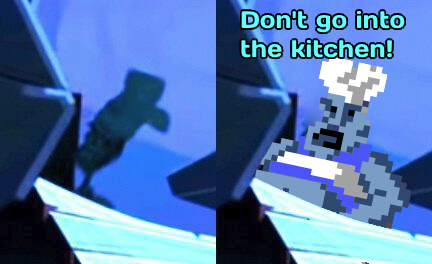
Haha. Yeah I spotted that and wondered. It looks like it could be intentionally reduced in detail to make it ambiguous, however it could also just be someone wearing a hat. This is how my eye saw it at first:1 point
-
Im pretty sure that's a chef with a hat. Otherwise Guybrush has a gigantic head. But who knows...1 point
-
1 point
-
I don't think it's an exaggeration to say that this never ever ever e v e r would have happened in a million, billion, squillion years, so I wouldn't spend time pining for it. Oh yea, those chances are right. One reason is the giant effort this would require. Building games is so hard, and adding things that are not planned from the beginning is an extremely complicated process and kill joy. You would basically need to make the game a second time from the ground up to achieve that goal. Nobody will pay for that (and I can't imagine the team would want to do that anyway.) Also, if the lead artist isn't the one pushing that feature, I think it's simply disrespectful to ask them to do that. Maybe his new form is salesman and he'll wear a check coat!1 point
-
Amazing, thank you for sharing this Jake. It takes a lot of courage to share things the younge-self made.1 point
-
So, we’re supposed to take wrong spelling into the equation now? 😉 I believe it should be an 👕 I beat #Mojole and all I got was this stupid t-shirt. 4/6 💛💛🖤🖤🖤 🖤💛🖤🖤💛 💚💛💛💛🖤 💚💚💚💚💚 https://funzone.mixnmojo.com/Mojole/1 point
-
Oh, well... let's not create some kind of "Release the Snyder-pixelart-cut"!1 point
-
I also Stan is always up to date. For example, when watching Breaking Bad and Better Call Saul, the character of Saul Goodman just reminds so much of Stan. I would even have Bod Odenkirk play him1 point
-
There's a bit of a danger in the first place, whenever this whole narrative crops up of developers changing their games against their will in response to feedback from the internet. I think it fundamentally misunderstands how the creative process works. I mean, we know Ron is making the game he wants to make, but he's doing it with... plenty of feedback. In that last post he talks about how the game has had extensive external testing. Even Return, with its secrecy, hasn't been immune to this, and that's because the creative process thrives on feedback. We have this idea of the genius creator working in their secret factory and emerging with a fully formed work, but it rarely happens that way in reality. And so in the age of social media, whenever a creator is caught in the act of changing their mind, or responding to feedback, suddenly there's an outcry that the purity of the work has somehow been tainted by external feedback. Sometimes it's silly stuff like people arguing against accessibility features that don't affect them in any way. And it's often, but not always used as a stick to beat marginalised communities with, if things are changed as a result of feedback they gave. (Aside - I know this well. I remember asking a well-meant question about whether there was a place for gay people in Massive Chalice, and the response from Double Fine was GREAT and they did end up implementing some stuff based on it. The response from a small vocal section of the community was NOT great, and I was accused of all sorts of ulterior and corrupting motives for my fairly innocent bit of feedback) I think it's actually (and if you think about it unsurprisingly) very rare that creators are willing to sabotage their own vision for what their work should be, in order to please some randos on the internet. What they might do, is see some feedback, and find themselves agreeing with it and making changes accordingly. It's a pet peeve of mine that a significant portion of the internet don't seem to be able to tell the difference.1 point
-
Creators wired that way should avoid reading anything. David Lynch avoids all reviews. Why? Because: "A good review is never good enough, and a bad review will kill you."1 point






.png.2af0c3786bd282c9f70dfd0112cee7f3.png)
(1).thumb.png.c7bf63c29ccf8203c0e7aaa358a63ad6.png)

