Leaderboard
Popular Content
Showing content with the highest reputation on 07/29/22 in all areas
-
Boy, it sure is good that there's a new Monkey Island game by Ron Gilbert and Dave Grossman coming out. Golly gee8 points
-
6 points
-
Ok, this is the last word I'm gonna say on this for now, but lately I've been thinking about the things we learned moderating the DF forums, and Discord. We often talked about how we don't actually have to be for everyone. It's not automatically a virtue to be a debate hall. Some places are just a... cosy hangout, or a bar or whatever, and sure, someone can walk up to the front and say 'here is why you're all wrong and the things you're excited about suck actually' but they're gonna get some funny looks, and if they can't read the room then they are very welcome to leave it. Just because that's not the vibe we're looking for doesn't make a place an irredeemable echo-chamber (we have enough disagreements here to know this to be the case, right?) We don't actually have to be an enlightenment era coffee house devoted to the free exchange of ideas. We can just be some (relatively) like minded people who are happy and excited about a game announcement. Sure we'll disagree on points and debate theories and quibble over details and have different hopes and dreams for how stuff shakes out but as as soon as you shift the mood from 'we're all here to be excited over a video game' to 'this sucks and that sucks and I want you all to talk to me about how much I think it sucks' then you've lost the room. We don't need to be all things to all people, we have no duty to do that, we can choose. It's not weakness, or intellectual cowardice, it's just creating an environment we want to continue to relax in. If someone else wants a different one, they're free to look for it, or create it and see who joins.6 points
-
The easiest fix would just be empathy. No matter how bad you find this or that, just imagine that instead of shouting your feelings on it towards a video or into a social media post, you are sitting in front of Ron or Rex and sharing your feelings about it all with them. The tone would automatically shift to *at least* "This isn't for me, but...".5 points
-
You think we'll visit "Geek Point" in Return? Frank: "We don't know what Geek Point is over here. I don't know if you happen to remember that. " Ron: "I do not remember a Geek Point at all. But now I want to add a Geek Point to my next game." (See 3:29:59)5 points
-
I don't think Ron or anyone from the team decided to make any "safe" choice with this game. I think that they made the choices that they thought were best for the game they wanted to make and for a new Monkey Island game. The music is a very important aspect of Monkey Island (one could argue the most important), all the games had at least one of those composers working on it, seems like a pretty obvious choice to me. The voices were already perfectly cast and I doubt they had someone else in mind to do them, so why would they need to change them? Doesn't seem to me like this is nostalgia pandering, but simply that they had (most) of the casting job already done. The returning characters were a thing since Monkey Island 2 (there aren't many important characters in the first game, but most of them return in the sequel) even though they are few. The UI we don't know anything about really, other than it works with a mouse OR with a controller, and that they worked really hard to make the controller option worthwhile. I think this really shows how really willing they are to modernise the way adventure games are played in a modern era. This leaves the art style, which changes in every Monkey Island games (even between the first two). If there was a safe choice with the art, they couldn't take it while trying to make a modern game. Pixel art is out of the question because they don't want to get the "nostalgia game" label that Thimbleweed Park got, so it was a choice of choosing an art style that suited the game. They decided to go with 2D probably because it gives a cleaner look and ages the game less (look at how Curse aged better than Escape and even Tales visually) and getting the guy who made Ron's favourite fan art and worked as an art director in very good looking games was the best they could do. Also, Steve Purcell, Peter Chan, Bill Tiller and many others who worked on the art of the first 3 games were probably busy with their other jobs so... P.S. Also I'm new here, been lurking around since page 1 of this thread 🙃4 points
-
That's interesting! Brr Muda might be my favourite so far but for the same reason. It's clearly supposed to be a very hostile environment, and all the jagged edges and unstable angles are successful at reinforcing that feeling. The bear trap with severed human leg and dried up blood is also a nice touch. If I had one criticism of CMI's (and later games') background art, is that every location felt like they were sanded down and made child-proof - it was all so darn ...pleasant. I'm glad to see that there are locations in ReMI that gives me unease makes me feel unwelcome for a change.4 points
-
I got my fingers crossed for this. September is perfect for me as its a month before my first child is born and also my Birthday month. 😉4 points
-
ReMI then! Release date: Seeing Devolver has a showcase in September I’m wagering the release date will be… Talk Like a Pirate Day. Original, I know. I’ll also double down on a demo the week before. We’re talking cold hard cash on this.4 points
-
You don’t want to fight? You literally signed up to our forum to post this: …and since then have done nothing but try to argue with people about how bad you think the art looks, seemingly with nothing else to say. And then of course, you don’t really care. You’re just relaxing in the sun. You totally aren't trying to stir the pot. You’re not here to fight. So chill. I’ve been giving you the benefit of the doubt that you’re not a troll who delights in winding people up, but sadly you have given nothing back but toxic negativity and provocation. We’re now getting private messages about the sad turn this thread is taking, so I’ve decided that it’s time for you to drop the art discussion and contribute something else to the discussion. That is a direct command, sailor.4 points
-
The 256 colour version of Monkey Island came out in Dec 1990, only 2 months after the 16 colour release and long before MI2. It's possible they were developed with both games in mind, though. ---- Boo, merged topics I think the most specific thing I've ever seen Ron say about the secret was in the #monkey-island DALNet chat: <Dalixam> Hi Ron, glad to meet you :) The secret of Monkey Island is probably the most well kept secret ever. Can it actually be seen/found in MI1 or MI2? I'm not asking you to reveal it :) <Ron-G> Yes, if you really look at what's going on, you might be able to come close. <Ron-G> There are a lot of jokes, that aren't really jokes. <Ron-G> The problem with the Secret of Monkey Island... <Ron-G> is that it's built up sich a mystic, that when I finally do reviel it, you're all going to go "That was dumb". :-) I can't remember who recently said in an interview that he felt like there's stuff going on in ReMI which is very relevant to how Ron has talked about the secret before, so even if the secret isn't exactly the same as it was in 1991, I think it might be related/close.3 points
-
3 points
-
To add to the point of this form not being an echo chamber - when the trailer came out, I mentioned that I felt like the animation was a bit stiff and that I would have done it differently (a stance that I mostly disagree with now, but that’s beside the point). Rather than bullying me into submission, some people here agreed with me, and others brought up valid counter arguments, which showed me a different perspective. That was awesome and totally non-toxic.3 points
-
I’d love them to bring back the multiple screen concept for Monkey Island’s map, assuming it has one. That island always seemed so vast because of it, and although EMI condensed the maps anyway like a theme park map, nonetheless it still felt wrong seeing it on one screen. Of course they could do some smooth panning this time. 😄3 points
-
Next month is Flamber, the 37 day long month, so maybe they’re onto something.3 points
-
I may be wrong but knowing Ron I'm expecting risks to be taken with the story. I'm expecting something out there like Mi2 and Thimbleweed Park.2 points
-
I feel responsible for kick-starting this with my comment about people hating on the game in other forums. Very sorry for any drama I caused.2 points
-
2 points
-
Oh man I’d love to meet Norman one day. I thought about casting him for the flash film, but first I wanted to see how @Dmnkly reacts if I ask him to record lines in German. He didn’t think about it, like, I told him about the idea and he immediately was like „Oh yeah, sure, yes!“! ❤️ Before the German version came out a lot of people hoped Norman would appear, but I‘m sure everyone agrees that hearing Dom say „I use the root beer to kill myself.“ in German is a super rare treasure.2 points
-
👕 I beat #Mojole #129 and all I got was this stupid t-shirt. 3/6 🖤🖤🖤🖤🖤 💚🖤🖤🖤🖤 💚💚💚💚💚 https://funzone.mixnmojo.com/Mojole/2 points
-
https://twitter.com/grumpygamer/status/1553041302643548160?ref_src=twsrc^tfw|twcamp^tweetembed|twterm^1553041302643548160|twgr^|twcon^s1_c10&ref_url=https%3A%2F%2Fpublish.twitter.com%2F So I think Ron's tweet from this morning was probably partially a joke, but a couple things stood out to me: 1. Ron is OK with the game being referred to as "Monkey6." 2. His abbreviation for the game is RTMI, not ReMI Just thought that was interesting 😛1 point
-
1 point
-
Echo chambers produce people who wander around thinking their opinion matches everyone else's. When they do meet someone who thinks differently, they look at them as if they're part of some long lost tribe, convinced they form part of a tiny (misinformed) minority. "Doesn't this person realise how outlandish their beliefs are?" When they join forums, they make bold statements and can't back them up... because they've never been challenged before. Instead they fall back on their mistaken belief that they represent the vast majority of people, and so don't need to defend themselves. They never properly engage with what's in front of them. Or question their own beliefs. It's essentially a sort of self-brainwashing now that I think about it. (Of course it's human nature to want to feel part of something larger. Something that makes sense. Instead of a chaotic mess. So I get why you'd want to lie to yourself this way.) Nobody leaves Mojo thinking they're part of some right-minded majority. There's too many disagreements, debates and discussions to be convinced . They're just done civilly (although fools don't fare well).1 point
-
This is an interesting point, looking at where Return chooses to hit the familiar, nostalgia buttons, and where it departs from what longtime fans of the series might expect. I thought it would be interesting to look at the art style in contexts of the other 'safe' choices the games make. Hiring back the original composers and classic (since MI3) voice cast, both of which were highlighted even in the teaser reel, are clearly indications that they are looking to appeal to longtime fans, and to honour the legacy of the games. I wonder how members of this forum would feel is they had gotten an entirely new composer, or if they had recast Guybrush. I think it would depend on what creative choices were made. I think it could be exciting, but also risky. I'm often surprised by how vocal many fandoms are about original voice actors being a 'make or break' deal, when other creative talent (art directors, writers, sound designers, etc) can be switched out without as much of a fuss. I like Earl Boen's voice, but I'm not going to lose sleep over who voices LeChuck. Dominic has such close ties with the fan community, that I think a lot of people would be upset if he were recast. There would be outrage, and thinkpieces about it, and certainly petitions to get him to return! His return is perhaps the main nostalgic element they had to get right. The voice actors, and the composers have largely been consistent throughout the series, but 2D, point and click design is more of a throw-back to the first three games. I don't think we would expect anything else from Ron Gilbert, but this is the first game in the series where the UI hasn't been 'modernized' to some extent to keep up with changing technology and tastes. I suppose in a way, changing tastes have made this kind of 2D, Point and Click throwback fashionable again, but it definitely has a 'nostalgia' flavor to it that was not present in the previous games. I mean, it's conceivable that someone would pitch a 'Return to Monkey Island' that was a fully 3D, high-polygon, procedurally generated, open-world adventure game, and swung for the fences. I think that might have pleased some of the fans who are upset about the new art style, actually. I'm not sure that I would be interested in that kind of game, but it would have been a choice. It would have been more expensive, of course, and maybe MI is not the kind of intellectual property that Disney feels comfortable investing that kind of budget in. Perhaps that is at the root of the many complaints I've seen of fans calling the art style "cheap" -- they are forced to reckon with the reality that something they loved since childhood isn't worthy of a big budget, AAA rendition, and is a niche product. I don't think that's the main reason, but maybe it's a small part. They had safe choices available to them about the voices and music, and a nostalgic option for the gameplay/UI that Ron had clearly been thinking about for a long time, but I'm not sure there was a safe choice for the art style. There's no consensus on what a Monkey Island game looks like, and I think the new style does a good job of evoking both the pixel art of MI1/MI2 and the style of MI3. That said, while it succeeds in not feeling like a throw-back, but it also doesn't feel like a natural evolution from any of the previous games -- I think it would be a shocking change after any of the games in the series. The biggest comparable shock would be the transition between MI2 and Curse, but I think in that case the evolution of the technology gave a reasonable justification for the change. The art direction on Curse also felt lush and expensive, "Disney-esque" in a way that only CD-ROMs made possible at the time. For RTMI they've managed to find an art style that IS in continuity with the previous games, but doesn't really push nostalgia buttons the way that the voice cast, music and interface do. I like that, personally, but I can see why it bothers some fans. What else could they have done? More of a faux pixel-art style would have been an option, but that likely would have made the game feel too 'meta' as well as regressive. It would have limited its overall audience, but I imagine the comments on Ron's blog would have been much more positive. A Curse-style animation style would have pleased other fans, but with essentially the same problems as pixel-art. I actually think if they had gone with either a slightly 'softer/cuter' version of Rex's art, or with a more 'realistic/naturalistic' style, less people would be upset. These are tendencies that I've seen in a lot of Monkey Island fan art that tends to be well-received. Either approach would have less risk. However, I don't think Ron Gilbert tends to make games that are particularly cute, or naturalistic. (Even the Humongous Games, while soft, childlike and cartoony, aren't very cutesy, and are certainly NOT naturalistic. The characters don't exactly lend themselves to plush toys).1 point
-
1 point
-
I actually do think a toxic fan backlash was inevitable. It's a conclusion I drew by looking at the reaction towards each new and always radically new art style of every Monkey Island in the past, and present online discussion culture as a whole. In the same vein, I am utterly convinced that any Monkey Island art style is remarkably distinct from any of the art styles in previous Monkey Island games and instead more in line with styles outside the franchises (e.g. EMI looked like Grim Fandango, CMI looked more like a Disney movie, and ToMI, for several reasons, was often compared to Wallace & Gromit). Oh, you think so? I actually hope you're right, but you could still be very wrong. But when it turns out they're doing something radically new with the UI, I won't throw myself to the ground wishing eternal hell to the creators. I see where you're going, and I like it, but I can't fully agree. Because the art style wasn't chosen to shock the fans out of their wits, not just "to risk something". It was chosen because Ron really liked it, he called up Rex first chance he got. It was chosen because Ron assumed that if he chose something he liked, his fans would like it as well. So in a sense, he may have thought that he doesn't take any risk at all, and he was wrong because he underestimated the toxicity in Monkey Island fandom. And that is a highly depressing thought. 😔1 point
-
Huh. Maybe it's just me, but I don't find the change that shocking. I mean, in comparison to what we've had in the previous games. I don't think I'm as surprised by this as I was by say... the character designs in CMI, at the time. I don't find this as huge as a switch to 3D, even though I liked that at the time. MI has a history trying different artists and making different artistic choices, so while the art style is very distinctive and new for the series, as a choice to do that, it doesn't strike me as particularly bold or provocative. A lot is made of Ron talking about how he likes to provoke the audience but in the end he's just going with a style he thinks is cool, and this is hardly the first time that's happened. The MI series has been pulling this for years in the art department (while the music has always had at least Michael Land involved, it's always been an adventure game, and the voices have largely, but not completely remained consistent.) I have a suspicion that when the dust settles, we'll be too busy talking about the story and its ramifications to worry about anything else.1 point
-
Ron's tweets today make it seem like they're putting the finishing touches on the game now. Come on September release.1 point
-
I'm sorry, but I just can't be convinced that "you couldn't satisfy the pixel art fans, or the Curse of Disney Island fans, or even both". I think believing that is a rationalization mechanism to reduce people's frustration by thinking that a toxic fan backlash was inevitable. Risks were NOT taken for the chosen music. Risks were NOT taken for the choices in voice acting. Risks were NOT taken in terms of having a 2D point and click design. Risks WERE taken in using an art style that is remarkably d I stinct from any of the art styles before it and us instead more in line with games outside the franchise (e.g. Knights and Bikes). A lot of people love the art, but they love it because of the distinction and the risk. This game is going to be heavily defined and remembered for its art style, moreso than for its less risky choices, similar to Windwaker I suppose. Ron could have chosen a route that avoided fan conflict and backlash, but he chose the route that was shocking and has risk. Fans of the decision should support and appreciate that.1 point
-
Ah yes, like the Atari review that casually shared all the screenshots of Hell HILL, which as we all know is the real secret of Monkey Island.1 point
-
I take your points and would add to this that talking about the art is not only possible, but has happened several times already in this thread. Here, I'll prove it: I'll do it right now, and given an unvarnished opinion on the latest art we've seen: generally speaking, I've liked the vibe of the Brrr Muda art a bit less than the other stuff we've seen. Of everything we've seen to me it looks the most angular and 'skewed', the hardest to get used to. I'll probably get used to it and it'll be fine, and as usual I think it all looks better in motion than static, and I certainly don't hate it but it's yet to 'click' for me. Maybe it's just because it's so unlike an environment we've seen before in MI, so the unfamiliar style plus unfamiliar environment are a bit daunting to look at. I'm also not sure I love Guybrush's talking animation when seen from the back, but I'd be curious about what it looks like from the front. That's it really. I haven't felt the need to bring it up before just because it's not really a big deal to me, I'd rather just focus on other things rather than talk about how I'm slightly underwhelmed by a single piece of art, and honestly it's more fun to talk about the stuff I'm curious about or excited by. I'm not interested in a discussion about it, I'm not asking for people to debate me on it, or agree or disagree with me on it, this is just a personal take, delivered (I hope) respectfully.1 point
-
Au contraire. You likely watched Tenet with likely lower expectations than them due to their dislike of it.1 point
-
I'm still wondering what Ron's stance is on the press getting advanced copies, seeing as how it was a dot point in his 2013 blog that they wouldn't but he's changed his mind about a lot of things and also there's publisher requirements and all that. Will we be seeing reviews pop up before release? I mean, the Mojo review is ultimately the only one I really care about (as well as what I personally think when I play it), but still, I'm curious.1 point
-
1 point
-
Sure, I think the music sounds great, and I hope the writing is still as good as it used to be! I don't respond to commands though, so I will just wish you a nice Friday as well1 point
-
You keep doing this thing where you go "A lot of people agree with me" and seem to think that somehow proves your point, like if you can get a certain number of people to have the same opinion that automatically elevates it into an objective truth. It doesn't. I don't care how many people like their breakfast sausages with maple flavoring added--I think it tastes vile. Bring me eight million people who live and die by maple sausage, it's not going to change it for me. I don't want my delicious omelettes served up alongside pancake-flavored meat. If I find myself in the minority on that, then so be it. God grant me the wisdom to accept that the mainstream and I are out of step and the fortitude to live my life without materializing in the middle of pro-maple communities to call them all intolerant fanatics. I have better things to do than sit there Seething while everybody else Wolfs down their breakfast. As to my tone, I apologize for straying from the standards of civility and mutual respect you established previously:1 point
-
1 point
-
Or there's the third option, which is that he made the exact movie he intended to and it happened to be something you disliked. I didn't like Tenet either--I haven't liked a thing Nolan's done since Inception--so believe me when I say I'm not going out of my way to defend it, but saying a director you liked must have either aged out of his talents or forgotten how to use them without even considering that you maybe just weren't the target audience for his recent work is ludicrous. You're of course welcome to insist on viewing every piece of media you dislike as an instance where the creator has failed you personally, rather than as a place where your tastes and theirs simply diverge, but that's a great way to spend your life miserable, bitter, and spiteful. It's also the default position of a child who still thinks the world is there for the express purpose of meeting all their needs and who screams when told they can't have ice cream for breakfast, so don't be shocked when people react to you the same way. We're all here because we're interested in this upcoming game and have relatively optimistic expectations. The fact that you aren't and don't isn't going to change that, no matter how put out you are by our unwillingness to drop everything and go "Hey, Ramen hates how it looks! Let's talk about that for a while!" My strong recommendation would be to either adjust your expectations accordingly or, as I did after seeing Tenet, conclude that you've wasted your time on something that wasn't for you and go do something that brings you more joy. (Have you tried the Adventure Gamers forum? They've got a "Guess the adventure game scene" thread that a lot of people get a kick out of, and there have been plenty of newcomers joining in lately!)1 point
-
It was the worst! Wasn't even released on ST. I totally get the responses and can relate. I do love the different flavors and personalities of the islands. The crossword analogy is a good description of the feel for players not knowing the solution. My (what it looks like indeed!) unpopular opinion definitely comes from my POV of knowing the solutions by heart. What I meant was that I don't get the journey-flavor I crave, you know. Like, mainly, my brain travels between the islands in order to solve puzzle chains. But narratively, it is so fast it breaks the illusion for me. I can't imagine Guybrush having enough patience to spend ages on sea back to Scabb just to pick up a green drink. It's still better than Fate of Atlantis though . Casually flying back and forth between countries just pulls me out of the experience. I don't have that issue with the other Monkey Island games. Maybe it's another unpopular opinion, but I LOVE how much I have to walk in Mêlée Town in the first game. The place feels so real I don't mind the slow walking speed and the absence of fast travel.1 point
-
Devolver will be bringing a collection of games to Pax West from 3rd - 6th September. Pretty much guaranteed they’ll bring ReMI and we’ll see more promo/gameplay in action.1 point
-
1 point
-
Yeah, I agree. I did say the difference came from both experience, and working in a professional capacity. Its not just artistic improvements, its that the new design is official work and not fanart. The design has to do different things, its is for a different purpose. Rexbox is extremely talented, even in his projects from over a decade ago. LittleBigPlanet is a gorgeous game. Tearaway is stunning. I would agree. I still think there's clear artistic growth throughout his work, but that doesn't make the old stuff bad. I don't think he didn't know how to show emotion in the past. I already acknowledged that it was fine for the face of the old fanart to not be capable of showing many emotions. I called it "fine for a one-off artwork". I would think some looking back and reimagining the old piece was involved. Its a fair guess that the piece landed him this job, to a degree. It feels like the fanart would have been discussed. But I also can't speculate about if that actually happened or not, what was going on in anyone's head, or what exactly happened behind the scenes there. It just seems like a likely scenario to me. I also don't think it was a linier "my old work sucked and I must fix it lol" design process or something (i dont think anything like this was thought or said, simplified for example purposes, yadda yadda). The old portrait would have shortcomings if used as the final design in a new MI game. Obviously. And as I outlined. But its a fine piece of fanart. And the new, official design is so good it's so good. Its such a huge improvement.1 point
-
I'd suggest that possibly this is less about experience and more about function. Rex was already a pretty experienced artist a decade ago, and around that time he was artistically leading projects like Tearaway and was already winning awards for his work. Of course, artists of all kinds are always developing and growing, but I'm still somewhat sceptical of an idea that he looked back on that old piece of art and decided to fix what he saw as issues. He clearly made the new version with reference to it, that much is obvious when you compare the colours and the hair shape and so on. But context is important. The portrait as you point out wasn't a commissioned piece of art, and nor was it something intended to work within a game. It was simply a piece of fan art, which he made out of love for the character. Clearly Ronzo thought that original portrait was good enough to call it the coolest guybrush he's ever seen, and while we're free to disagree (I think it's fine, but the portrait doesn't blow me away like it did Ron), there's no denying he's something of an authority on the subject of Guybrush. But yeah, anyway I guess what I want to say is that I think it's a bit unfair to compare the merit of the two images, similar in many ways though they are, and then attribute the differences in the second one to experience and artistic growth. They were both made for very different purposes, and I think that's the best explanation for why they hit different. (e.g. I suspect the reason that the portrait 'doesn't look like it could show a lot of different emotions' is that it doesn't need to, it's a static portrait, not because Rex figured out how to draw expressive-looking faces with 10 more years of art experience)1 point
-
By the way, I *think* it might have been possible to get Norman Matt for those few lines, since he's a fan of MI himself. A few years ago I got him to do a few minutes of Guybrush narration for an audio-birthday-card I gave to a friend, which he was totally up to.1 point
-
1 point
-
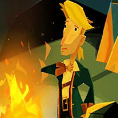
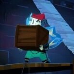
Oh okay. Guybrushes nose doesn't look like a penis, his body proportions are in keeping with kind of storybook/scrapbook feel the art style is going for, animation similarly, and it's also looking like it's going to be probably the most custom animation we've seen in any of the games including the 3d ones, colours are bright but well-chosen and in keeping with the style, backgrounds are heavily stylised and angular, but have a great sense of life especially while in motion, characters have very expressive faces in a way that we've never seen in a 2D Monkey Island before, even Curse where characters weren't very expressive outside of cutscenes. Look. Anyone can list a bunch of things and call them facts. Don't pretend you're taking the intellectual high road by doing so. Nah. What you're doing is not art criticism (if it were, you'd notice that the approaches between this and the MI1 special edition are EXTREMELY different and that this style is a lot more detailed and took a lot more effort), it's your own feelings about the art, which you've wrapped up in faux-critique in order to that you can act wounded whenever anyone refuses to engage with you on it. You know, I've talked to a lot of different people about this art style, and you know the ones I've talked to who are the MOST excited about it? Often, they're artists. By all means don't like the art. Just stop pretending that you have access to some higher level of critique that makes you 'correct' about it. Since you missed my sarcasm the first time round, let me be absolutely clear: I am not going to engage with this line of argument any more.1 point


