Leaderboard


Popular Content
Showing content with the highest reputation on 06/06/22 in all areas
-
El Pollo Diablo:5 points
-
Antropomorphic dog and rabbit, Freelance Police agents.4 points
-
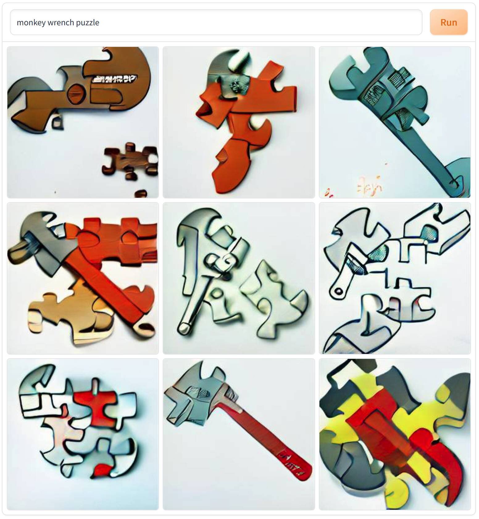
Wow, my memory of the monkey wrench puzzle is completely off.
 3 points
 -
Well I did generate a rubber pulley with a chicken in the middle recently.2 points
-
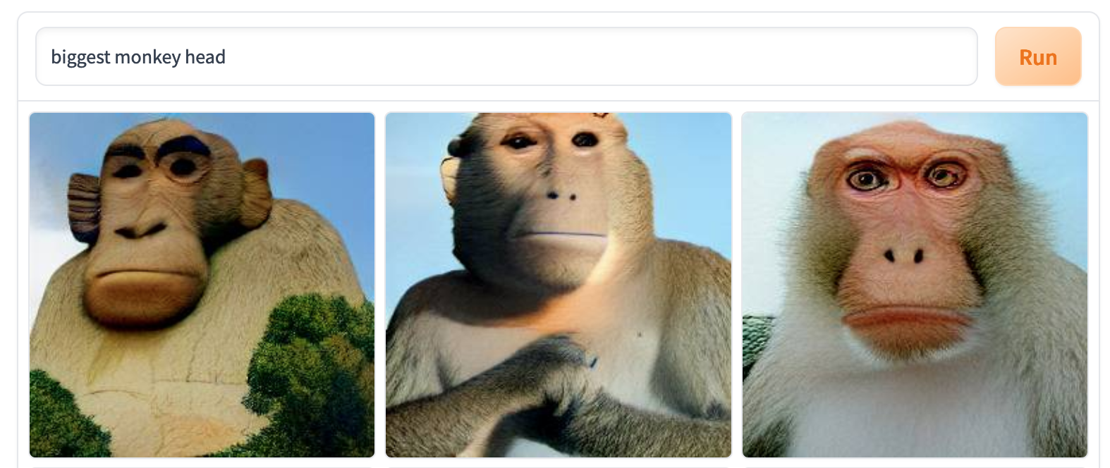
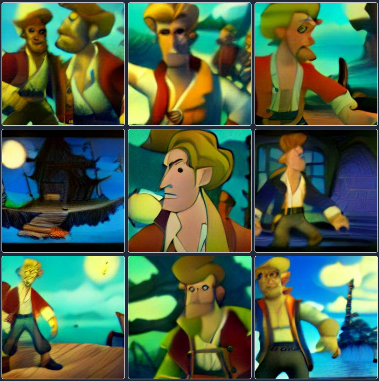
Huh. The first one does look bigger than the one on Monkey Island.
1 point
-
Yeah Death's Door is definitely high priority on my soon-to-play list, seems like a real treat!1 point
-
This tool is really going to put all those Ghanan movie poster artists out of business!1 point
-
I've tried the "LeChuck explaining" prompt with Dall-E 2.0 but sadly I can't share results because it returned photorealistic pirate dudes and it's currently forbidden to share photorealistic faces. All I can say is thanks @Marius for the idea because I'm laughing out loud at this shit!1 point
-
Luckily for you, I suffer from no such fears, so I've made the sacrifice for you...it was a really boring result.
1 point
-
Well, this is certainly not how I pictured this meeting in my head.
1 point
-
Based on the prompt 'the secret of monkey island revealed'
1 point
-
Hahaa the wedding photo 😂1 point
-
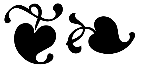
I don't think you need to rebuild the leaf - it's a relatively common glyph in fonts, called a "hedera" or "fleuron" or "aldus' leaf" or - in unicode - "floral heart", and although I'm not sure where this exact design originated, many fonts copy it - or try to. One of the ones I think does it best is "Symbola" (free): https://fontlibrary.org/en/font/symbola But there are many others copying the same design. You'll also find copies of this design in MS Gothic (not quite as well drawn), or in Deja Vu Sans (really badly drawn) and somewhere around hundreds of other fonts (although some will obviously do their own design fitting with the general font design). The sharp corner towards the top of the left glyph here is intentional - and it looks like it's also in the MI manual - an "ink trap". The glyphs are at U+2766 and U+2767 - or you can try just copy/pasting these, and changing the font: ❦❧ A pretty nice version without the ink trap (although I'm not particularly a fan of the way the swirl and the heart meet in the upright glyph) is Bainsley: https://www.fontsquirrel.com/fonts/bainsley
1 point
-
At least this was on theme for today. 👕 I beat #Mojole and all I got was this stupid t-shirt. 3/6 🖤🖤🖤🖤💛 🖤💚💚💚🖤 💚💚💚💚💚 https://funzone.mixnmojo.com/Mojole/1 point
-
That's awesome. Ron seems like such a good guy; makes it all the better that he's finally able to make the game he wants to make.1 point
-
I thought I could die happy knowing that Ron Gilbert was making a new Monkey Island, and now I can die happy knowing that Ron Gilbert liked one of my tweets:1 point
-
I am also looking forward to playing Card Shark, after the PC Gamer write up by, I believe, Christopher Livingston, who is one of my favorite gaming journalists. His phenomenal Living In Oblivion and Elder Strolls series, among others, have left me laughing so hard.1 point
-
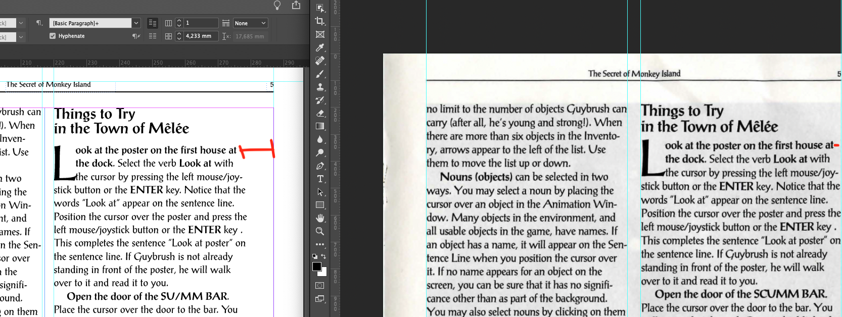
Hi all ! I'm finally sharing with you my work. I'm not totally satisfied for multiple reasons I will explain but I'm here to make it fully "compliant" with the orignal one so feedbacks will be awesome and maybe some help First of all, anyone who wants to give feedback directly on the pages can use the following link https://assets.adobe.com/id/urn:aaid:sc:US:8b5d7412-9cb3-4e5d-ba65-56d345af1849?view=published If you spot any mispelling or any update needed, please comment it ! Fonts, first version of PDF and original scanned manual I've used can be found here: https://drive.google.com/drive/folders/1y2MQqnaUTx6K2VM611F09XCTwLzVyv5b?usp=sharing Let's explain what I have done and the blocking elements. Things to consider 1°/ This i not a final version, I would call it a beta version of the final manual 2°/ I have tried to use at maximum the inner function of indesign but I've struggle a lot to achieve it (Well I didn't achieve it this way I would say ) 3°/ I used Postantiqua font Roman found on the internet. It have found other PostAntiqua Font that seems a bit different (like spaces or height is different) 4° / The in-game images are a basic screenshot of the manual I've used. So it's not images with a good resolution 5°/ I'm not a designer so i have limited knowledge of those tools (illustrator, photoshop, etc) but any tips or advices for getting better is welcome ! InDesign Configuration The manual is a A5 manual (148mmx210mm) Font size is 9pt Margins (mm) are 16-9-9-9 (Top-Bottom-Inside-Outside) I've used PostantiquaBE and PostAntiquaBE Medium for bold version (see font file I have) I found another "official" pstantiqua font but it was 99$ I have used modified styles for H1/H2 and paragraph but always try to use styles for easy update Working and struggling... I have started by designing the template for the pages with upper line and page number and dividing each page in 2 text columns. I have struggled a lot when trying to calibrate with Indesign hyphen system. To be cleared, I have never managed to use the hyphens system in this context and have good results. The hyphen linebreaks didn't work for every line so I have used manual hyphen and linebreak. I know, it sucks ! By at the end, we generate a PDF so... The right side of the right column has too much space before the end of the column. I have the same font size but as you notice in the attachment, the width between the last character and the upper line is smaller than the one I did. But I don't see any glitch on the fonts and character spaces. So I have 3 main concerns: * Not be able to use the in-app hyphen system and use manual linebreak. * in-games images aren't in in HD * I'm not pixel perfect with the second column, I think the rest of the document is pretty the same as the original one Optimization In-games images: It's just screenshots from the PDF, so the image are not in a good resolutions. If someone can help me on this I'm open. I think it will be good to arrange the contrats and luminosity, etc to integrate it in HD Space on the right column: Try to fix this, any suggestion is welcome Others: Any update or comments is welcome Any feedback is appreciated ! PS: Credit to @Laserschwert for the cover design. I have used to illustrate the cover
1 point
-
Let's see: MI1 MI4(GP) MI6(F) MI5(RN) MI3 MI2 We are talking about Mission Impossible movies right?1 point
-
For me it's never not been Monkey Island 2. The only thing that has fluctuated in my mind is how thin the margin is. The original is an undisputed classic, the game that showed off the true potential of a SCUMM adventure game and more or less represents the best of a genre and the halcyon days of LucasArts as a spirit. I don't think the series ever really did fully recapture that kind of Princess Bride storybook flavor it had going here. I can't imagine arguing with anybody who would rank it first, though I find it hard to find any new way to sing its praises at this point. Monkey 2 feels like it builds on the first game and offers a deeper, richer, more ambitious experience. It ups the ante in every way, and to this day you can pit the Four Map Pieces segment against pretty much anything the genre has produced since. Again, three decades worth of discussion sort of leaves me at a loss to come up with some kind of original take on the thing, but for me this is still my favorite game. CMI is an undeniable departure from the first two in overall feeling for reasons both unavoidable (major technology gap, different creative personell) and chosen, and it probably honors the template of the original a little too much in the first half (get ship and crew, insult sword fighting) but it's just such a well-made adventure game top to bottom, with stupid good production values, that I doubt a convincing, objective argument could be made for it representing any kind of misstep from a strict quality standpoint. It's another installment where I can't object to it being ranked first. It is also as influential as the first game in a certain sense as it seems to have spawned, or at least been released at the right time to soak up, that initial burst of online fandom. Many people seem to have met the series through CMI. EMI is the least of the games, but I think it deserves reappraisal in terms of what that really means. What I see is a satisfying, rock solid adventure game with a lot of funny moments, good animation and very possibly the best voice acting in an LEC game -- and that's really saying something. On the other hand it delivers a somewhat off brand story for a Monkey Island installment, it comes dangerously close to making the world feel too small (that Tri-Island Area map: hilarious) and it unquestionably fails its pedigree on the graphics front (both because using GrimE to create a cartoony-yet-lush 3D world with the target specs of the average turn-of-the-century Windows user isn't setting yourself up for success, and because Chris Miles, by all accounts a talented animator, probably wasn't the guy to sit in the Art Director chair for the series' delicate transition to 3D.) But visuals aside I think it's held up reasonably well, and I would like to think its status as a kind of "side trip" story will gain some appreciation/perspecitve now that it is a middle installment and not the last game, which admittedly was not a good look for it. Monkey Island is an exceptionally good series, and in this case being the worst of five great games still leaves you: a really good game. TMI is a bit of a rebound that to a large extent feels like a course correction or return to form, especially in terms of a moody atmosphere and a general sense of captivating piratey-ness (both of which were a bit lacking in EMI as a consequence of its story), and the Telltale engine really upped the ante on the "performances" in my opinion, allowing the installment to go into some new emotional territory. On the downside, the decision to develop the episode with WiiWare in mind and general corner-cutting absolutely and unnecessarily hurt the production values. The art direction is good, but the 3D is up against limitations it should not be up against, and it is kind of funny how the Xerox-character-designs-for-background-NPCs strategy never really improved on Monkey 1. And while the MIDI score has a certain nostalgic feel that I like, it is kind of shameful that Michael Land's excellent compositions were not given the respect of a proper production, which might well have resulted in something that could have usurped the CMI score. The game's qualities more than overwhelm these drawbacks, it's just frustrating that they feel so self-inflicted. On the quibbles front, the equal-sized chapters necessitated by the episodic structure made me weirdly sad, I object to the absence of Alt+W, and the abruptness of the last moment felt like the one real shortcoming of CMI wasn't learned from. Short version: All these games are great, and I question the value of rankings, but I give the crown to MI2 if coronating one is a life or death matter. And I look forward to buying them all yet again in what promises to be a truly absurd anthology package in October.1 point
-
Sure, provided that TMI stays at the last position!0 points