Udvarnoky Posted April 5, 2021 Posted April 5, 2021 Those pencil lines are such an elemental part of CMI's overall art style that it seems heretical to smooth them out. It's why I found Bill Tiller's proof of concept for a hi-def CMI a little threatening. Independently it looks lovely, but it doesn't really feel like CMI. 1
Blondebeard Posted April 5, 2021 Posted April 5, 2021 2 hours ago, Udvarnoky said: Those pencil lines are such an elemental part of CMI's overall art style that it seems heretical to smooth them out. It's why I found Bill Tiller's proof of concept for a hi-def CMI a little threatening. Independently it looks lovely, but it doesn't really feel like CMI. You can find the high resolution version here. He actually created 2 versions. I prefer the dark one as it's more similar to the original. I kinda like it, it just takes a bit to get use to it.
Udvarnoky Posted April 5, 2021 Posted April 5, 2021 Thanks for the better quality images! I agree that the darker version is better, but it still seems more kindred to Ghost Pirates than CMI. Bill's contribution to CMI as Lead Background Artist is immeasurable, but Larry Ahern was that game's art director, and I feel like any hi-def revisit of the game should be done in collaboration with him. Maybe he'd surprise me by signing off on this, but to me making CMI so smooth just feels wrong, and at any rate a new interpretation. I would love to see what CMI would look like if the black and white backgrounds were rescanned in hi-res and Bill redid the digital painting as faithfully as possible. It strikes me as the appropriate method of doing a hypothetical remaster. I'll get back to you when I figure out where the financing is coming from, though. ;
Laserschwert Posted April 6, 2021 Author Posted April 6, 2021 (edited) Here's a look at the original pencil layer of the painting, both before and after upscaling: For upscaling I used the ESRGAN model I've trained on posters by Drew Struzan, so the pencil work is interpreted based on his style. But I'd say it appears very faithful to what can be seen in the low resolution scan of Tiller's Ahern's original drawing, even if the detail is just created artificially. If the original background paintings were built the same way as the cover, they could probably be upscaled the same way as this (plus they'd still be at full color depth without dithering). If only those Photoshop files still existed somewhere... Edited October 8, 2023 by Laserschwert 1 1
Lagomorph01 Posted April 6, 2021 Posted April 6, 2021 The detail is very impressive! I can't even see it's an upscale (and that's 4 years of graphic design school talking)! Also, I agree 100% with Jason. The proof of concept looks way too clean for a CMI remaster. I guess I'm just a sucker for hand drawn art. Most of the time digital just doesn't have that rough, human quality.
Udvarnoky Posted April 6, 2021 Posted April 6, 2021 It's not even a question of taste, I would say. One can prefer Bill's new interpretation of the Barbery Coast to the original, but the fact is that's just not what CMI looked like. I think there must be a way to bring CMI up to high resolution without forfeiting its distinctly "scratchy" style.
ThunderPeel2001 Posted April 9, 2021 Posted April 9, 2021 Ah hell, just give me a CMI SE. I'll buy it! 1
Laserschwert Posted April 18, 2021 Author Posted April 18, 2021 (edited) A little request for those of you who own any of the two-part big boxes with marbled borders (like SoMI, MM, Indy, etc.) AND have a way to do proper 600dpi scans: Do the lower parts of the boxes (so not the lid, but the bottom part) have the marbled patterns on their sides without logos or text? Those might provide great sources to recreate the borders (with much more "meat" around them than the fronts of the lids). Edit: Little update, I got a source who is going to scan these from his collection, so we'll see what I can do with those. Edited April 18, 2021 by Laserschwert 1
Scummbuddy Posted April 18, 2021 Posted April 18, 2021 (edited) That's a really good idea as source material and perhaps using Adobe Photoshop Content Aware tool, it would be able to replicate it outwards? All of my boxes are still in storage until I get my house (this market is ridiculous!) so I probably won't be your source for scans just yet. As for the edging of the boxes, the bottoms has the logo, the UPC box and some other items blocking the marble. All the sides appear to at least have the logos/titles of the games. I do wonder about how much the marble pattern wraps around into the inside of the box lid but I don't think it is all that much. 😕 Edited April 18, 2021 by Scummbuddy
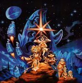
Laserschwert Posted April 18, 2021 Author Posted April 18, 2021 On a side note, I've acquired a bunch of new scans from more "exotic" releases of MI1, which would potentially allow me to extend my current MI1 poster a bit on all sides. I haven't done more than this little inventory check though: 4 2
ThunderPeel2001 Posted April 19, 2021 Posted April 19, 2021 Nice! Are you any closer to getting your hands on the scan that VGHF used?
Laserschwert Posted April 19, 2021 Author Posted April 19, 2021 2 minutes ago, ThunderPeel2001 said: Nice! Are you any closer to getting your hands on the scan that VGHF used? Not yet, unfortunately... that one hasn't been cleared yet. 1
kiddomanteca Posted May 2, 2021 Posted May 2, 2021 Hi have the Monkey Island 2 Poster from U.S. Gold. If I can help, let me know the best options to scan it. I'm a begginer in here. 4
Laserschwert Posted May 2, 2021 Author Posted May 2, 2021 2 hours ago, kiddomanteca said: Hi have the Monkey Island 2 Poster from U.S. Gold. If I can help, let me know the best options to scan it. I'm a begginer in here. Posters are difficult to scan. The best way would be to have me scan it. Would you be interested in selling the poster, or lending it to me for scanning? 2
Laserschwert Posted May 7, 2021 Author Posted May 7, 2021 (edited) Thanks to the AMAZING contribution by @kiddomanteca we now have a high quality scan of the MI2 poster from "The One" magazine. This is by far the highest quality version we have of the artwork (brush strokes and canvas texture included), and after cleaning it up, I'll try to use some AI trickery to add the missing parts to this scan to create a textless version of it as well. Behold this incredible beauty: Edited May 7, 2021 by Laserschwert 4 5
Laserschwert Posted May 14, 2021 Author Posted May 14, 2021 (edited) I've added the new version of the "LeChuck's Revenge" artwork (based on @kiddomanteca's amazing scans) to the thread, replacing all the other versions (which are still available on the GoogleDrive though). The bump in quality is massive. Just check out these comparisons of the new scan with my old v1 and v2 versions: For painting out the logos and extending the edges, I again resorted to training my own AI model, which in turn tried to apply the style and detail of the new scan to my (textless) v2. I then used this to paint out all the unwanted parts, keeping as much of the new scan as possible. Edited March 23, 2022 by Laserschwert 3 3
SubElement Posted May 15, 2021 Posted May 15, 2021 @Laserschwert Thanks for posting the updates! Just checking in case I'm blind, but is some of the content missing on the Google Drive link? I can't see the MI 1 and 2 Special Edition posters nor the MI2 Rear Box.
Laserschwert Posted May 15, 2021 Author Posted May 15, 2021 3 hours ago, SubElement said: @Laserschwert Thanks for posting the updates! Just checking in case I'm blind, but is some of the content missing on the Google Drive link? I can't see the MI 1 and 2 Special Edition posters nor the MI2 Rear Box. Merely an oversight on my part. I'll add them to the drive soon.
Recommended Posts
Create an account or sign in to comment
You need to be a member in order to leave a comment
Create an account
Sign up for a new account in our community. It's easy!
Register a new accountSign in
Already have an account? Sign in here.
Sign In Now