Leaderboard
Popular Content
Showing content with the highest reputation on 08/16/22 in all areas
-
7 points
-
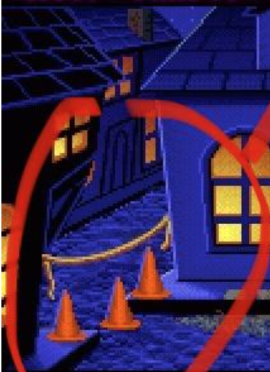
I am so happy that we already have a evidence-board-like image with multicolor lines and circles. That‘s what I was hoping to see in this thread. I love this forum. ❤️6 points
-
Wow too bad Ron and Dave are wrong about their game. ReMI already down to 99/100 and it’s not even out.5 points
-
We've got official confirmation! (Apologies I shared your drawings on Twitter @Marius - I hope you don't mind!) If that wasn't enough, Ron chimed in with a canonical answer and a possible spoiler...!5 points
-
5 points
-
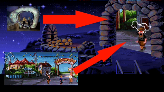
The connectivity between places is something that fascinates me, and I constantly draw maps in my brain when I walk through them. My head has a clear idea where the Mêlée Town alley is after passing the store (Drawing 2). But what about you? The E stands for the elevator Guybrush comes out of at the end of LeChuck's Revenge. The little street cone marks the position of the "under construction"-barrier in the same room. Some drawings quite don't make sense, especially number 3 and 4 where the elevator is inside the church. However, since the interior and exterior of the Mêlée Town store contradict themselves heavily, I think it's ok to put those options in. I'm mostly interested what your brain tells you when you enter the alley and the screen changes. Doesn't have to make logical sense. Maybe you have multiple maps in your mind?! And if you have a completely different idea of the placement, please share it!4 points
-
Can I just say how much I love this site and Marius specifically4 points
-
Bah, doesn't prove anything! I always imagined Fester running further into the alley when he sees Guybrush approaching. Probably giggling the whole time. By the way, I always love that you can see his sword peeking out from behind the corner the whole time until he jumps out of his "hiding spot".4 points
-
This is a ridiculous thread and only ridiculous people would have an opinion about this. So let me start with video evidence that clearly will show that #1 is the correct answer. To repeat: Number one. It's open and shut, of course -- we all see where the "Pssssst" is coming from. Need more? #3 makes no sense. The street the alley veers off from would be too narrow. #4 and #5? Wrong perspective. #6? We can wait and see if ReMI makes it canon. #2 then? That's the only other conceivable choice, but the "Pssssst" suggests it cannot be it either. There, I'm closing the thread now we all agree I'm correct good thread!4 points
-
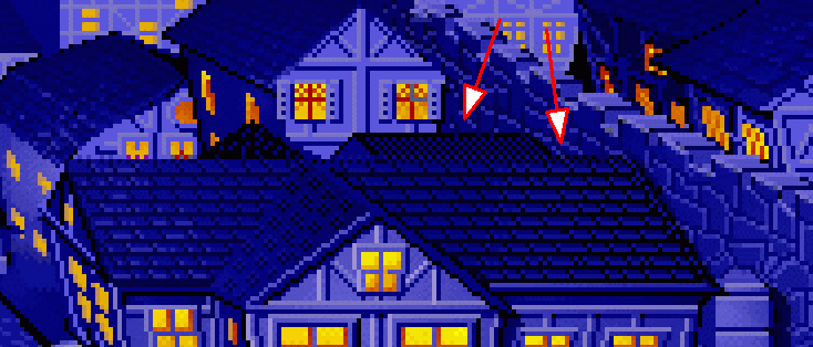
This is some mind-bending stuff. I have always thought #4 and never even considered other possibilities. Looking at the two scenes more closely, the only way l can sort of make sense of it is by paying close attention to the store. Part of the building juts out and is supported by a diagonal beam, which we can also see in the alley: The only problem is that this puts the lift in the church, and the side of that building simply doesn’t line up with what we see on the street. It also makes it strange that Shinetop is able to lure Guybrush in and then get the drop on him by following him in. Of course LeChuck could do this, but it seems more likely this is just a second alley further back a la #5. However, unlike your #5 I’d expect the store to extend all the way back, hence we can see the jutting out and diagonal beam.4 points
-
In the new clip, Guybrush says: “I’m putting together an expedition... I mean, raiding party.” That gives me strong LeChuck’s Revenge Guybrush vibes. He’s still a bit insecure about his image.4 points
-
3 points
-
Also the closeups are about 0.5% of the graphics in the game. Surely everyone loves that EGA sunset.3 points
-
Speaking as a citizen of the gingery persuasion myself, I think there *may* be a simpler explanation for red patches on the arms of a man with Wally's hair color...3 points
-
Wow, so my original belief was right, even though this thread made me revise it!2 points
-
I love this thread and much as it pains me to say it Remi is right, it's deffo #12 points
-
Maybe. That's like saying maybe Nixon perjured himself on the tapes.2 points
-
I agree. It's obviously A. Drawing A Drawing B2 points
-
2 points
-
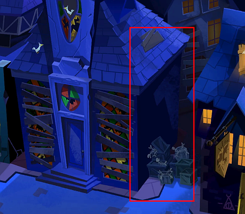
I would like to also add that it really seems like you're watching the side of the church, at least how it's seen from the outside. There's that little part I highlighted, even though it should be much higher, it does seem to me like they were trying to keep the structure of the street intact, even if the inside of the church doesn't much up. The outside of Mêlée and the interiors were probably done by different artists, so that could explain the inconsistencies. The church could actually have a hidden elevator inside a wall, used by LeChuck to come and go from Monkey/Dinky Island whenever he pleases, which would explain how he gets so fast to Mêlée Island without his ghost ship to deal with Guybrush and then comes with the ship to kidnap Elaine. I always felt that Escape translated Mêlée Island fairly well in 3D. I did play Escape before Secret though, so that might be why, but even going back from Escape to Secret it never felt "wrong" to me and I recognized the key places quite easily. To me it always felt like the same place, and not only because they tell you that it is.2 points
-
That's actually what I was thinking, but if it is this part doesn't match up... You know... I just have to say that these things were obviously not too important to the artists, especially with the differences between the outside of the shop and inside, etc. Makes me wonder why people can't give the same leeway to the artistic differences with Melee in EMI vs SOMI. (Not that I want to engage in a huge debate again or anything 😅)2 points
-
Hey, I was tempted because I really like it... but as much as I like it, the version I'll always prefer is the VGA floppy. That's the one I've grown up on and played 95% of the time.2 points
-
Neil Ross is 77 years old, he was 65 during the Special Edition, and he was 50 when he did COMI. I wouldn't say that the older tone is deliberate 😛2 points
-
I love these responses. The logic in my mind's map also crumbles the more I think about it. But it never destroys the illusion. Even the contradiction of the shops exterior and interior doesn't do any harm. Both places are connected, and are not just seperately made background paintings. Thank you all for sharing!2 points
-
My instinct always said #3 (which makes no sense to me, now that I think of it…). I’d go with #4, with how I see the backgrounds.2 points
-
It might not mean anything, but I'm intrigued by the idea of Wally running "the best map shop in the caribbean and beyond". Could we end up going to whatever "beyond" the caribbean is? Is that where Brr Muda is located?2 points
-
There should probably be a poll option for the best version of them all: Ultimate Talkie Edition2 points
-
Me, I always played the VGA version before, but the twitch stream by @Jakeand @Marius really made me appreciate the EGA version and I think I really like it more now. 🥰 Especially since someone mentioned that it often looks like they just used a gradient of the color for fillings – and I somehow can’t unsee it anymore. It just feels a bit “sloppy” designed at times… And Stan’s music: never liked it for the same reasons as mint others here.2 points
-
When do we get a version of MI 1 with all of the closeups of Guybrush replaced by photos of @Dmnkly ??1 point
-
I think we're going to have to agree to disagree and move on with our lives.1 point
-
Let me add a controversial "evidence" that the wall with the circus poster (and the windows and the door) can't be the church: In my opinion, it's "A". It's an alley behind the shop. Also, city walls have no windows. Since the rightmost side of the alleyway shows another building, the building with the circus poster on it can't be one attached to the city walls: EDIT: so no, it can't be "A" neither. I retract my previous statement and vote for "6".1 point
-
“Enjoy”… 👀 What I am totally missing in this discussion is the whole aspect of realism/cartoonism. 🤓 (Okay, I’m outta here…)1 point
-
I made a video for everyone to enjoy.1 point
-
Remi, I am disappointed you pulled that card! Killjoy!1 point
-
If you can't agree that EGA SOMI looks less photorealistic than VGA SOMI then I think you're at an impasse with reality 🤷♂️ It doesn't matter the REASON why one looks more cartoony than the other, the bottom line is that one looks more cartoony than the other... (and it is still possible to look more realistic in 16 colours)1 point
-
1 point
-
( @Thrik only now I recognized that whirl in your image. 👏👏👏)1 point
-
What rock?! Have we overlooked taking a step back for the bigger picture?1 point
-
I may attempt to draw a map later this evening, but for now the elementary problem is clear, we don't have that much room to navigate behind the church, because we only have a few dozen feet before we hit solid rock. I don't think there's a street running behind church and prison. There's no space.1 point
-
This was always my interpretation: a building behind the church.1 point
-
Not necessarily. There could be a building behind the church we can't see. And the Fester could be hiding in the shadows, waiting to pop out once Guybrush has turned the corner. It's always been #4 to me!1 point
-
You get a much fuller set of buttons on a desktop size screen, however I believe the forum supports most classic BBCode. You can wrap things like b and spoiler in [square brackets].1 point
-
We should also take into consideration, that the store isn’t even consistent in itself (comparing inside and outside). 😅1 point
-
I always interpreted the whole “canon” thing by Ron/Dave, that they will add stuff from the other games as they like (e.g. Murray), but that it doesn’t mean that everything will be acknowledged. Therefore I don’t think, that anything from CMI to Tales (story wise) will make it in ReMI. And I don’t think we’ll be able to put the game (or parts of the game) before or after one of the sequels acter MI2. Many things point in that direction, too, in my opinion, for example the monkey head on Monkey Island. (But maybe it’s also just my hope, that leads me to that conclusion. 😅)1 point
-
Oh no, I clicked 3, but I think 5 would make more sense? I don't think that the building with the elevator is the church, so it has to be behind the church? The 'pssssst' came out of the alley, so my brain just decided that it's right there. The same location where the fish crates are in the new Meele Town screenshot. I love stuff like this! Thank you!1 point
-
1 point
-
I found one of the conversations I had recently: https://forums.thimbleweedpark.com/t/ron-declares-he-is-working-on-a-new-monkey-island/4993/1673?u=barongrackle I asked to verify: he liked the realistic covers but not the realistic portraits? Bonus - while searching, I found this other random forum. They were arguing about MI6's art style compared to the more "standard" art in MI1's portraits, which pivoted into a side-discussion about Secret's EGA art vs. VGA art. https://www.resetera.com/threads/return-to-monkey-island-announced-by-devolver-digital-lucasfilm-games-2022.569392/page-20 Stuff just comes up in relation to the art direction in various Monkey Islands, with this new release.1 point
-
There are correct answers, by the way: Amiga, Amiga, and unnecessary.1 point
-
If you see a verb coin on the ground and try to Pick Up Verb Coin, Look At Verb Coin, or Bite Verb Coin, will your game crash?1 point


